TACCIA is a Japanese stationery company, that – as far as I know – is now part of the Nakabayashi group. They offer high-quality fountain pens, inks, pen-rolls, notebooks, etc. More specifically, TACCIA produces a line of inks, inspired by the unique look of Ukiyo-e prints from Japan’s Edo period (1603-1868). Ukiyo-e prints are woodblock prints where the work of an artist is carved into wood by woodworkers and pressed onto paper by printers. This allows for the production of multiple prints of an artwork with some different colours as well.
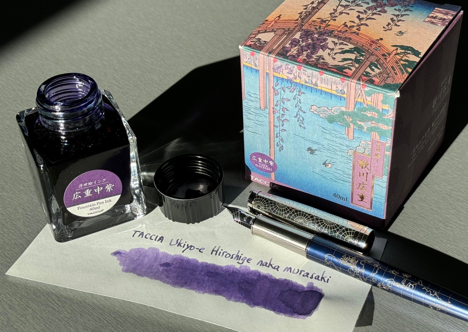
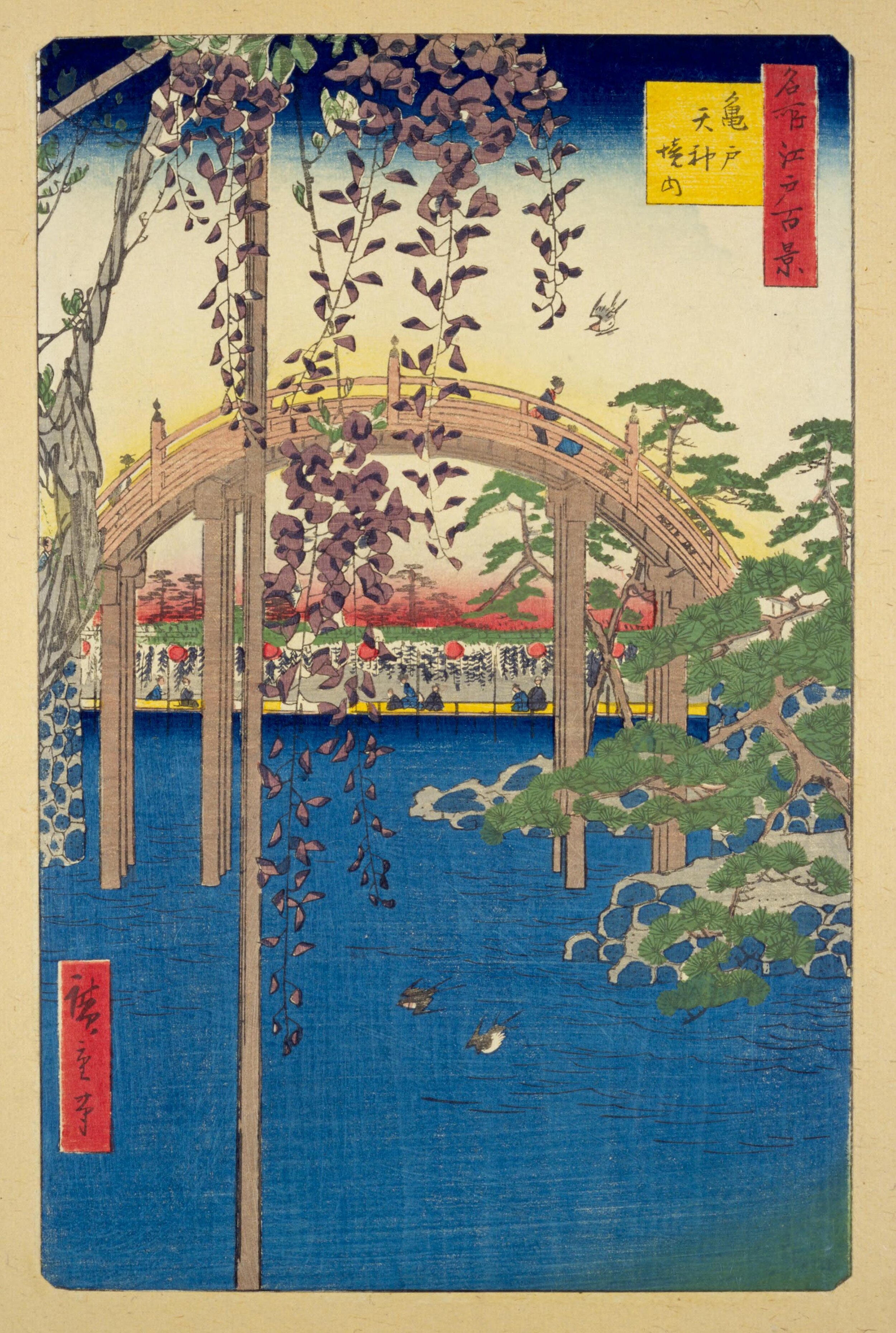
In this review, the centre stage is taken by naka murasaki, a dusty grey-leaning lilac ink, inspired by the colours of the wisteria blossoms in the 1856 painting “In the Kameido Tenjin Shrine Compound” by Utagawa Hiroshige. It is painting n°65 from the print series “One Hundred Famous Views of Edo”. In the 1660’s, Kameido Tenjin was placed at the eastern bank of the Sumida river in order to protect a new urban expansion project from evil spirits. In Hiroshige’s painting, the shrine is merely suggested by one of the two bridges within the precincts that mark the path to the shrine. The shrine was renowned for its wisteria blossoms with their beautiful lilac colour.
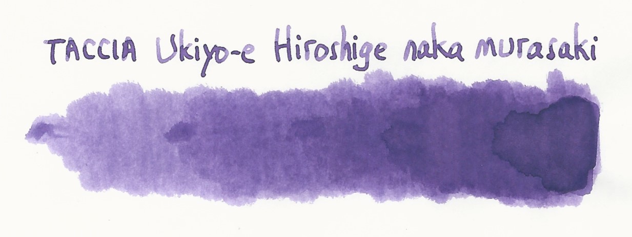
This naka murasaki is for me an ideal colour to mark the start of spring. The lilac tones bring a playful touch, and also the much needed colour after the greys of winter. And the dusty grey-leaning undertones indicate that spring is just breaking the darkness of winter but hasn’t reached its full-on vibrancy yet. The resulting colour is just perfect: a really nice lilac – both playful and restrained – that looks serious enough to be usable in the workplace. Technically, the ink is a moderately wet and smooth writer, that works well with all nib sizes, and that can handle all types of paper. A superb ink, and another winner in the TACCIA ink series.
The ink comes in a 40 ml bottle, that is packaged in a beautiful box showing the corresponding Ukiyo-e painting. Lovely packaging for an excellent ink.

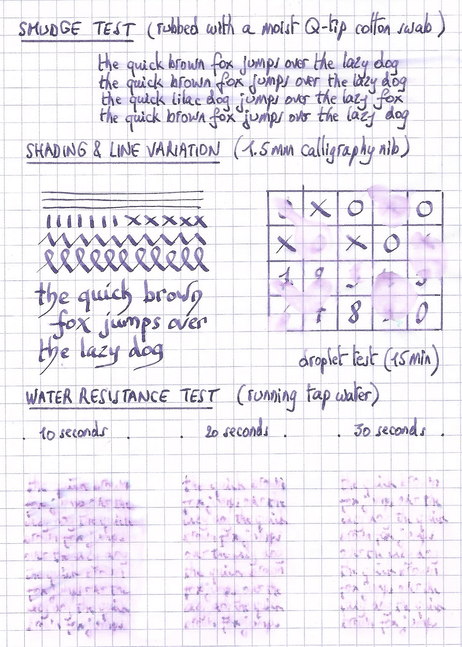
To show you the impact of saturation on the ink’s look & feel on paper, I made some scribbles where I really saturated portions of a strip of 52 gsm Tomoe River paper with ink. This gives you a good idea of what the ink is capable of in terms of colour range. Naka murasaki has a medium dynamic range, without too much contrast between the light and darker parts. This translates to just the right amount of shading, not too heavy but definitely present, bringing that extra character to your writing that is the hallmark of the fountain pen. Shading is present in all nib sizes, just a hint with the EF nib and firmly present with F nibs and above. Well done!
The ink’s chromatography shows a colourful mix of dyes: rose-pink, green and sky-blue. And these really bright colours combine in a mysterious way to create the dusty lilac looks of naka murasaki. A masterful mix – kudos to TACCIA’s ink masters!
From the bottom of the chroma, it looks like the ink has some water resistance, but unfortunately that’s not the case. After coming into contact with water, your writing totally disappears, leaving only some rose-pink smudges on the paper. So if some measure of water resistance is on your list, this is not an ink for you.
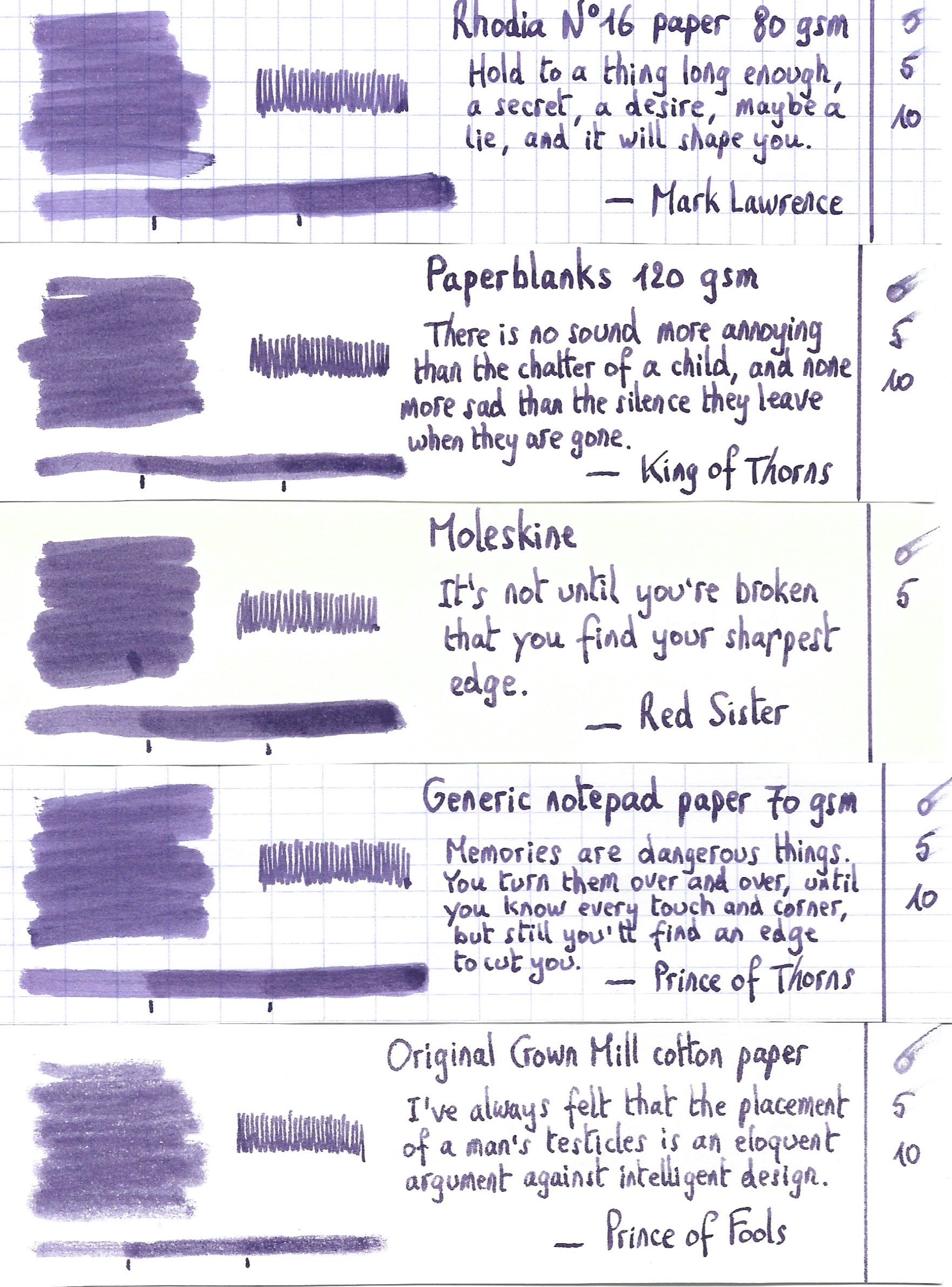
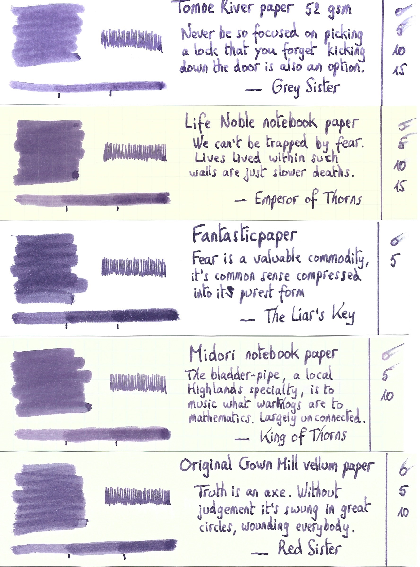
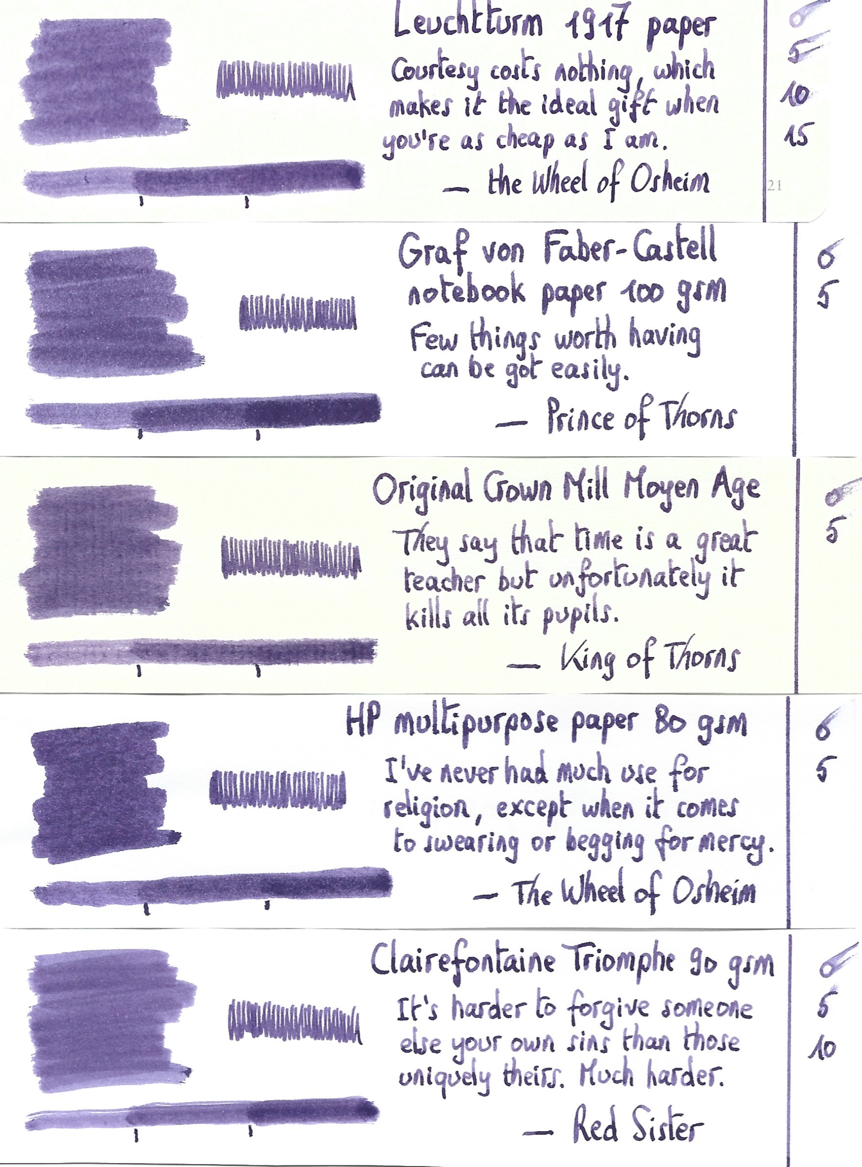
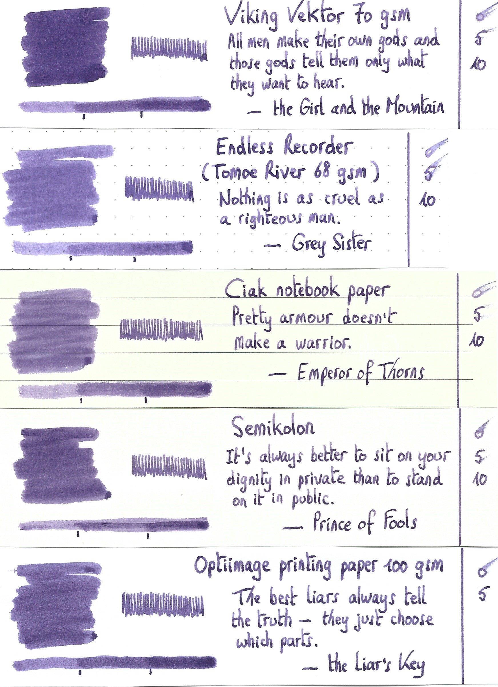
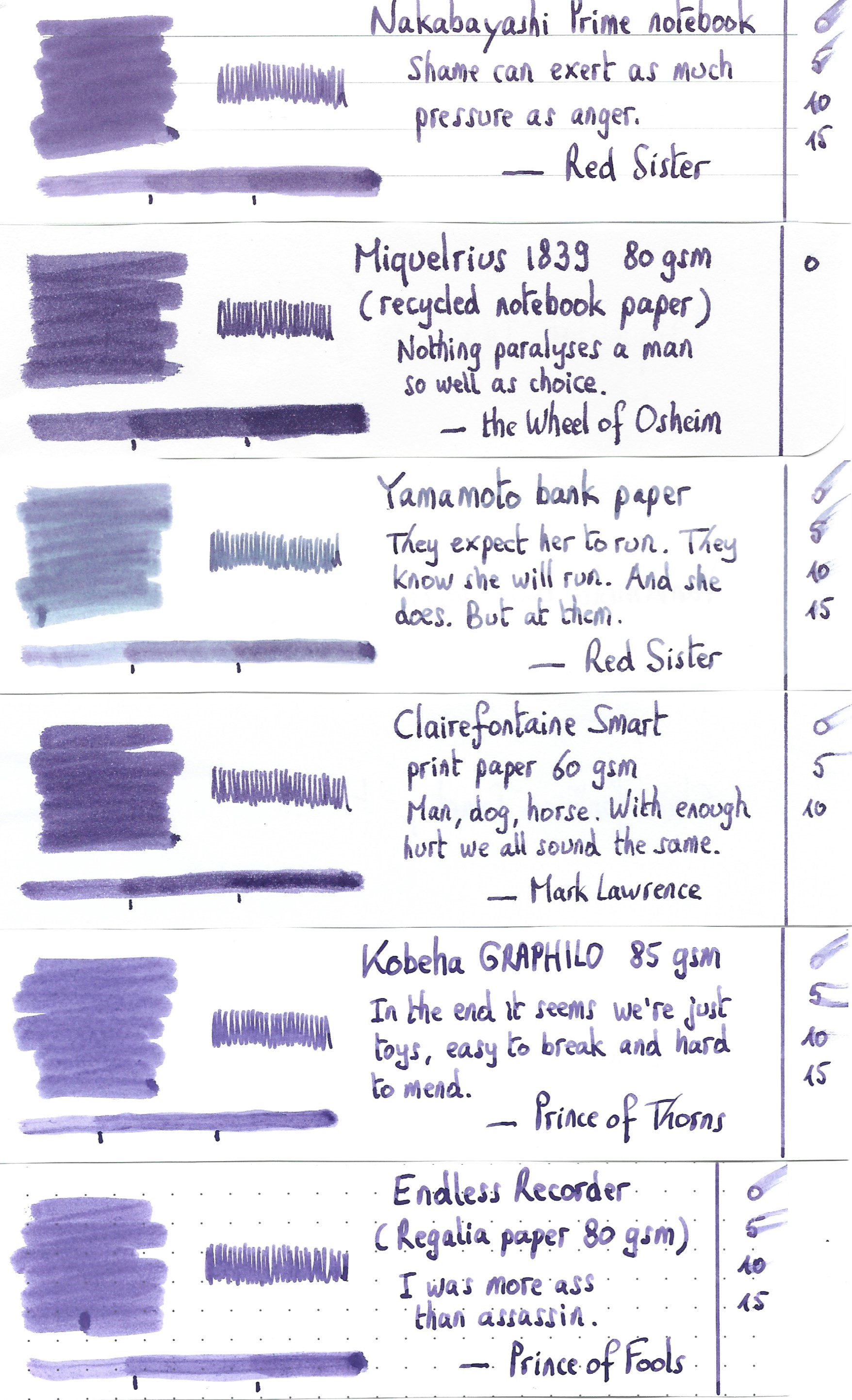
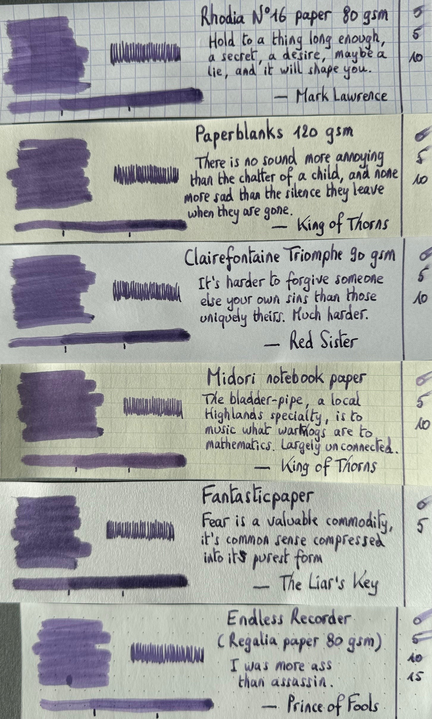
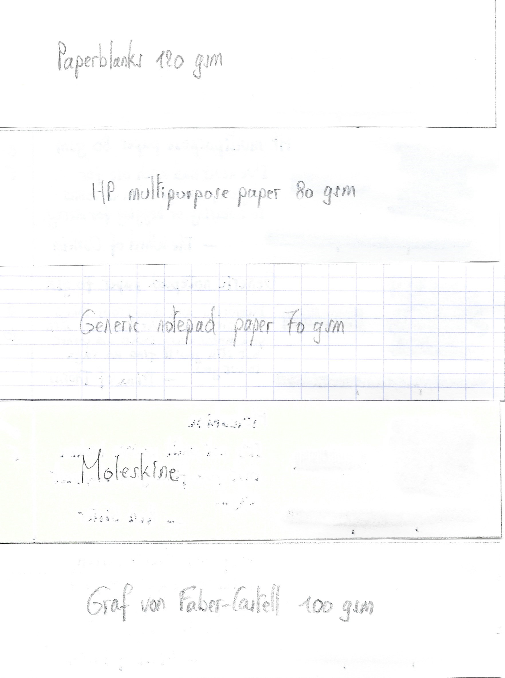
I’ve tested the ink on a wide variety of paper – from crappy Moleskine to high-end Tomoe River. On every small band of paper I show you:
- An ink swab, made with a cotton Q-tip
- 1-2-3 pass swab, to show increasing saturation
- An ink scribble made with an M-nib Lamy Safari
- The name of the paper used, written with a B-nib Lamy Safari
- A small text sample, written with the M-nib Safari
- Source of the quote, written with a Pelikan M400 with F cursive italic
- Drying times of the ink on the paper (with the M-nib Safari)
Naka murasaki looks good on all types of paper, but I personally like it most on pure white paper, where the soft lilac colour looks at its best. There is a tiny bit of feathering on low quality paper, but nothing too distracting. With the low-quality paper, you also get a small amount of see-through and bleed-through – meaning that you won’t be able to use both sides of the paper.
On the Yamamoto bank paper, some strange chemistry is going on. The ink shifts a bit into purple and blue-grey tones, losing the lilac in the process. Not at all bad-looking, but also not what the ink is meant to show. Just something to be aware of. Drying times are fairly low – in the 5 to 10 second range, moving up to 15 seconds for the really smooth Japanese papers.
A new year, a new set of quotes. For 2024, I’ve selected the works of Mark Lawrence. I love his writing – dark medieval fantasy, often brutal and violent – definitely not for the faint of hearth. The characters in his novels are real-to-life – you get to know them in all their aspects, both good and bad. And the stories themselves are masterfully written, keeping you glued to the page for hours on end. Highly recommended!
I’ve also added a photo to give you another view on the ink. Scanned images and photos often capture different aspects of the ink’s colour & contrast. That’s why I present them both. In this case, scan & photo are very close-matched.
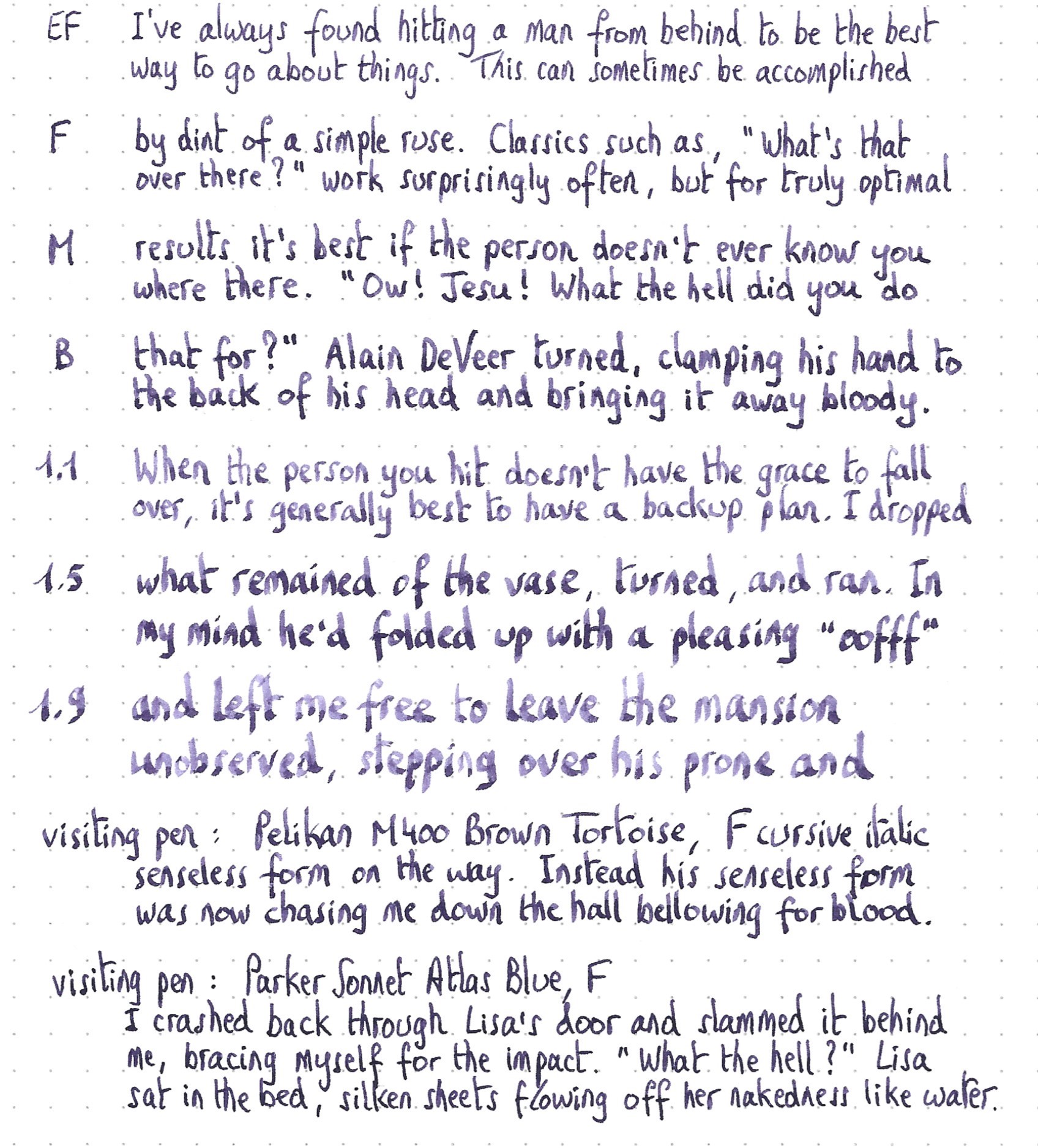
Writing with different nib sizes
The picture below shows the effect of nib sizes on the writing. The EF-nib already hints at the shading that the ink is capable of. But this shading really shows itself in all its glory in F-nibs and above. The ink handles all nib sizes with ease, but I like it most in my Pelikan with F cursive italic nib – just perfect!
Related inks
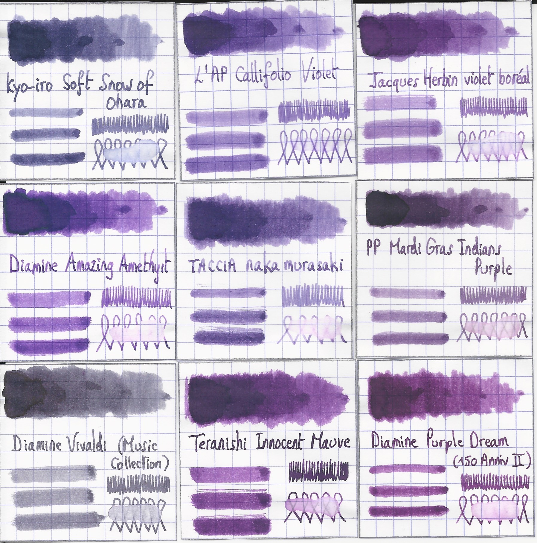
To compare naka murasaki with related inks, I use my nine-grid format with the currently reviewed ink at the center. This format shows the name of related inks, a saturation sample, a 1-2-3 swab and a water resistance test – all in a very compact format. The closest I have to this TACCIA ink is L’Artisan Pastellier Callifolio Violet. But where Violet has more of that full-spring vibrancy, the TACCIA ink maintains a muted and subdued character, due to its dusty-grey undertones.
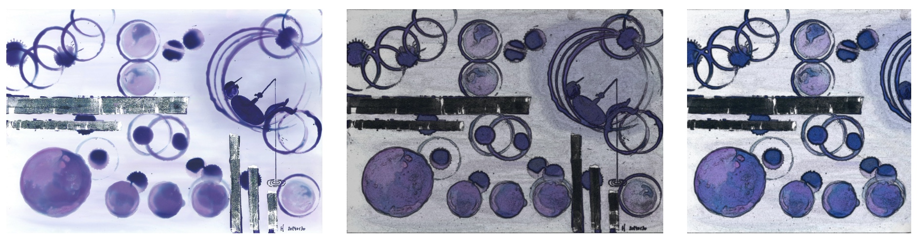
Inkxperiment – Geometry 101 Circles
With every review, I try to create a drawing using only the ink I am reviewing. These small one-ink pieces are an excellent way to show you the colour-range nuances that are hidden within the ink. And I simply enjoy the fun couple of hours these inkxperiments provide me: playing around with the ink in a creative way.
Inspiration for this inkxperiment comes from the field of mathematics. I’m currently reading a book on the history of this pillar of science. Its foundations rise from early efforts on discovering the rules of geometry: lines, circles, triangles, … Fascinating stuff! For this drawing, I decided to focus on circles.
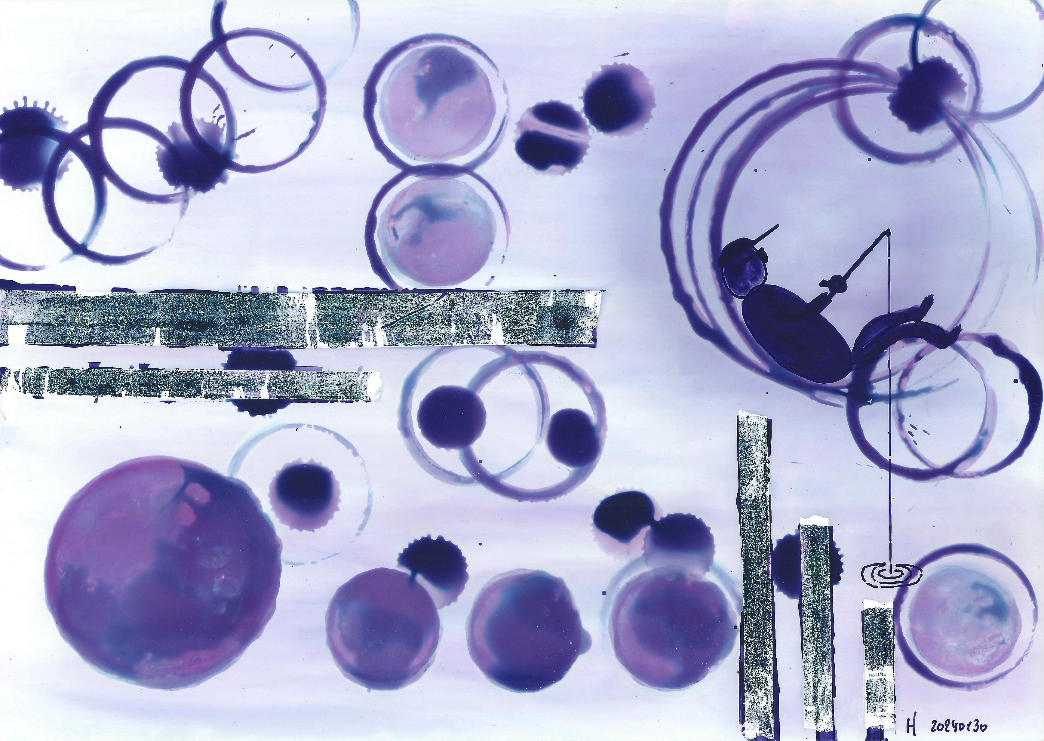
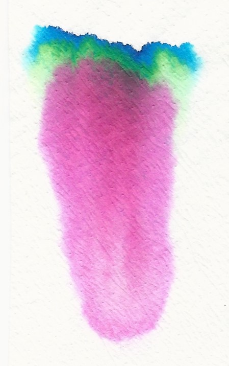
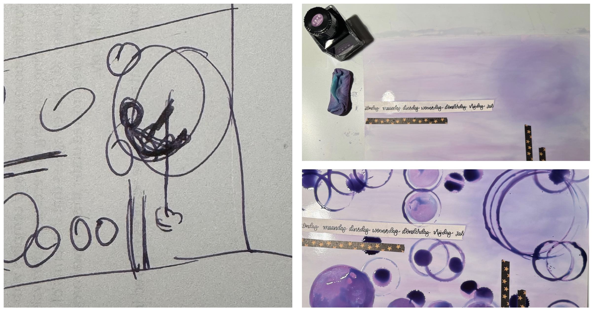
For this drawing, I started with an A4 piece of HP photo paper. I first painted the background with heavily water-diluted ink, applied with cotton swabs. For the filled-in circles, I used self-made rubber stamps and slightly diluted naka murasaki. For the other circles, I used bottle and tin caps of different sizes as stamps, dipping them in pure naka murasaki. As a final touch, I added the drowsy fisherman, lazely resting in his circle, enjoying the early spring sun. The final picture gives you a good idea of what can be achieved with naka murasaki as a drawing ink.
Inkxpired – computational art
I love experimenting with pen/ink/paper and have added another layer as part of the hobby. I’m exploring computational art, inspired by the ink drawings I do during ink reviews. Another fun offshoot of the hobby… and all that starting with a few drops of dye-coloured water on paper.
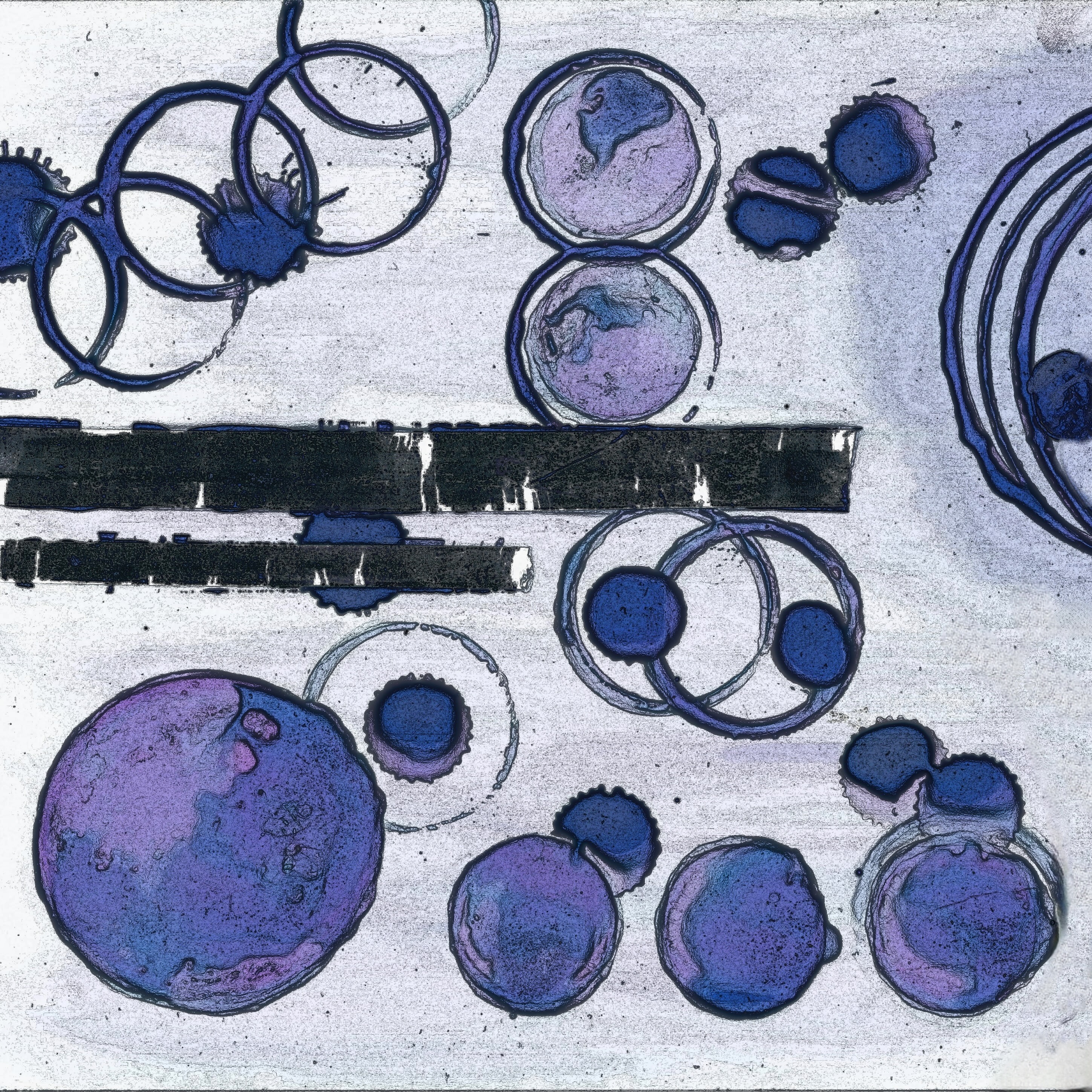
I first applied a “comic art” filter, which accentuates lines and added a bit of grit to the drawing. I then used a filter to move the colour to a bluer hue. For the final picture, I did a square cut-out, and brightened the result a bit. I like the end-result which perfectly fits the circle geometry theme.
Conclusion
TACCIA Ukiyo-e Hiroshige naka murasaki is a great writing ink – beautiful colour and with excellent behaviour on a wide range of papers. Also, an ink with some lovely shading, that is present in all nib sizes. Another great ink from TACCIA, and one that certainly deserves a place in your ink collection.
Technical test results on Rhodia N° 16 notepad paper, written with Lamy Safari, M-nib
Back-side of writing samples on different paper types
[Originally published on the Fountain Pen Network, on 02 February 2024]
