Teranishi Chemical Industries was founded during the Taisho period in 1918, and got quite some fame as one of the earlier ink producers in Japan. The Taisho period is often remembered as a romantic period. For their 105th anniversary, the company introduced some stylish retro-inks hinting at this exciting start-up period. The inks come in stylish – almost art deco – boxes, containing a nice-looking 40ml bottle of ink.
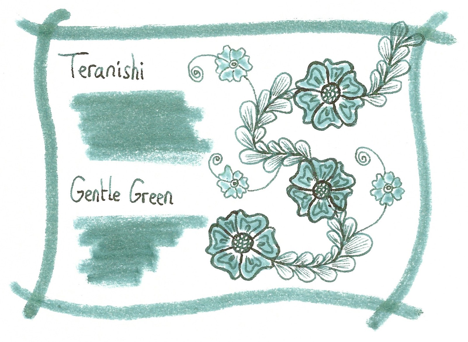
I discovered the Teranishi inks in 2022, so it’s time to do the reviews. These inks are well saturated, but at the same time manage to look muted and toned-down. This combination works quite well, and I’m becoming very fond of this brand. In this review, the spotlight shines on Gentle Green, a wonderfully complex blue-green, that leans towards teal territory without quite getting there. A type of colour that’s easy to mess up, but Teranishi’s ink creators know their craft and succeeded in producing a lovely mix. Well done!

Gentle Green writes wet and well saturated. It also has a trick up its sleeve: the ink writes quite blue, but turns to a soft green while drying – a really cool effect. It’s also a heavy sheener, showing a reddish-purple sheen on the right kind of paper. This ink can handle all types of nib – from EF to ultra-broad – and looks great on both white and cream paper. A great writing ink, that I enjoyed using.

To illustrate the colour span of this Teranishi ink, I did a swab on 52 gsm Tomoe River paper, where I really saturated portions of the paper with ink. Gentle Green has a medium colour span, without too much contrast between the light and darker parts. This translates to aesthetically pleasing shading. The more saturated parts of your writing will also show a red-purple sheen on the right kind of paper, making your writing look extra interesting. Wet pens will push the colour towards the more saturated part of the spectrum, resulting in a fairly dark green look. But even in this case, there’s still some shading left. A beautiful ink on paper!

On the smudge test – rubbing text with a moist Q-tip cotton swab – a lot of the dyes get displaced, but the text itself remains quite readable. Water resistance turned out to be good enough. Most of the colour dissipates, but a light blue residue of your writing survives, even after 30 seconds under running tap water. That’s better than most non-waterproof inks. This is also evident from the chromatography that shows light-blue dyes clinging to the paper at the bottom part.

I’ve tested the ink on a wide variety of paper – from crappy Moleskine to high-end Tomoe River. On each scrap of paper I show you:
- An ink swab, made with a cotton Q-tip
- 1-2-3 pass swab, to show increasing saturation
- An ink scribble made with a Lamy Safari M-nib fountain pen
- The name of the paper used, written with a Lamy Safari B-nib
- A small text sample, written with the Lamy Safari M-nib
- Source of the quote, written with a wet Pelikan M101N with F-nib
- Drying times of the ink on the paper (with the M-nib Safari)
Because this is my first review of 2023, you also get a new set of quotes. This time they originate from Jim Butcher’s “Dresden Files” – well-written stories of a wizard in present-day Chicago. I you enjoy fantasy writing with a good dose of humour, these books come highly recommended.
The multi-paper writing test shows that Teranishi Gentle Green interacts well with all paper types. It can even handle crappy paper like Moleskine with only barely visible feathering, which is quite a feat. On low quality paper you get some bleed-through, but nothing too excessive. This is an ink that handles paper very well. The ink shows a muted blue-leaning green on most papers, except the high-sheen kind. On high-sheen paper, the ink looks much more blue (see e.g. Kobeha GRAPHILO and the Tomoe River 52 and 68 gsm paper). Drying times are all over the place – below 10 seconds on absorbent paper to very high on high-sheen paper.


Because scans don’t always capture an ink’s colour and contrast with good precision, I also add a photo to give you an alternative look on this Teranishi ink. In this case, both scan & photo capture the ink well. The scan seems to give the best colour indication.

Writing with different nib sizes
The picture below shows the effect of nib sizes on the writing (written on Rhodia N°16 80 gsm paper). All samples were written with a Lamy Safari. I also added a couple of visiting pens: a wet Pelikan M101N Grey-Blue with F-nib, and my very wet-writing Yard-o-Led Viceroy Standard Victorian with an F-nib. As you can see, Gentle Green can handle all nib sizes with ease, showing great-looking shading in them all.

Related inks
To compare Teranishi Gentle Green with related inks, I use my nine-grid format with the currently reviewed ink at the center. This format shows the name of related inks, a saturation sample, a 1-2-3 swab and a water resistance test – all in a very compact format. Gentle Green shares a large part of its DNA with TACCIA sabimidori – the same colour shift from blue to green during writing, the same high sheen characteristics. But the TACCIA ink is definitely more blue-leaning. Both are great looking inks!

Inkxperiment – Little Red Riding Hood
As a personal challenge, I try to create interesting drawings using only the ink I’m reviewing. For me, that’s where the fun starts: experimenting with the ink to see how it behaves in a more artistic context. I love doing these little drawings – always good for a fun couple of hours.
Inspiration for this drawing comes from the Brothers Grimm tale of “Little Red Riding Hood”. I recently saw the “Brothers Grimm” movie – on Netflix, I think – and thought that this specific fairy tale would make a nice subject for an inkxperiment. The drawing shows the little girl on her way to grandmother’s cottage, deep in the woods. And boy, is she scared – what with all these stories of a giant wolf lurking around in the dark forest.

If you can’t believe your eyes when seeing the drawing, you’re not alone. I couldn’t believe that all these colours were hiding within this single ink. Amazing!
I started with an A4 piece of HP photo paper. I taped out the tree trunks and squares with washi tape, and then applied water-diluted ink to the photo paper through a paper towel. The towel apparently absorbed most of the blue dyes, with green and yellow components settling on the photo paper. This created a very interesting looking background. I then removed the washi tape, and used a plastic card dipped in pure ink to draw the tree trunks and branches. The washi tape left some glue residue on the photo paper, which creates a sparkling effect in the tree trunks. I then used a dip pen to draw in the little girl and cottage, and coloured the square background with a Q-tip dipped in pure ink (which reacted blue with the photo paper). The end result is a very colourful little painting – quite nice, and not at all what I expected when starting with this inkxperiment.

By the way. If – as I expect – you were looking for the big bad wolf … it’s not in the painting 😉. But just the feeling that it must be there somewhere is making you anxious. Which was also the purpose of the story: scaring little children, so they don’t go playing alone in the woods.
Inkxpired – computational art
I love experimenting with pen/ink/paper, and have added another layer as part of the hobby. I’m exploring computational art, inspired by the ink drawings I do during ink reviews. Another fun offshoot of the hobby… and all that starting with a few drops of dye-coloured water on paper.
I started by abstracting the inkxperiment drawing a lot, using a filter that removed most of the background, and using earthy brown tones to emphasize the dark forest. Next, I coloured the little girl red because – well – it’s Little Red Riding Hood. Finally, I used a mosaic overlay, and removed some of the squares. I quite like the end result, which keeps only the essential parts of the story, without too much clutter.

Conclusion
Teranishi Gentle Green is a great ink. Period. A wonderfully complex blue-green that combines good saturation with muted and toned-down looks. And on top of that it can handle all combinations of pen-nib-paper without any problems. And if you like to draw with ink, you’re in for a treat – this is some seriously good stuff! Highly recommended.
Technical test results on Rhodia N° 16 notepad paper, written with Lamy Safari, M-nib

Backside of writing samples on different paper types


[Originally published on the Fountain Pen Network, on 08 February 2023]
