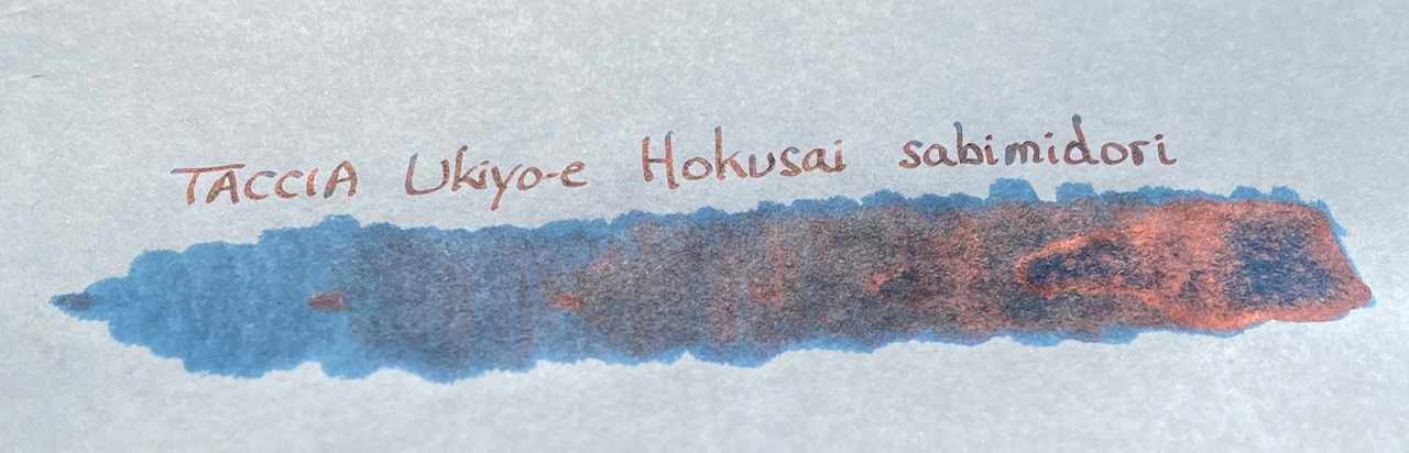
TACCIA is a Japanese stationery company, that – as far as I know – is now part of the Nakabayashi group. They offer high-quality fountain pens, inks, pen-rolls, notebooks, etc. More specifically, TACCIA produce a line of inks, inspired by the unique look of Ukiyo-e paintings from Japan’s Edo period (17th century). Ukiyo-e prints are woodblock prints where the work of an artist is carved into wood by woodworkers, and pressed onto paper by printers. This allows the production of multiple prints of an artwork with some different colours as well.

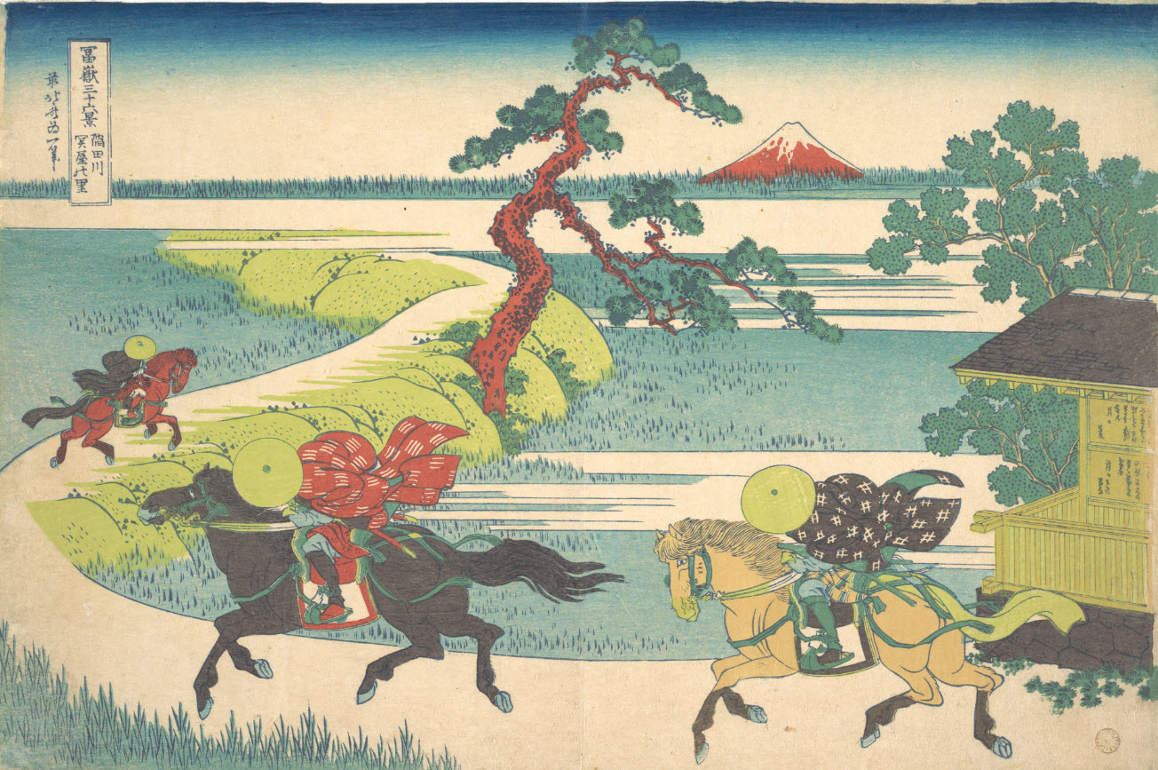
In this review, the centre stage is taken by sabimidori, a rust-green ink with a strong copper sheen, inspired by colours appearing in woodprint paintings from the Japanese artist Katsushika Hokusai (1760-1849). Hokusai is best known for his “Thirty-Six Views of Mount Fuji” series of prints, with the mountain appearing as a central theme. In this case, the rust-green colour is inspired by the colour of the tree-leaves in the painting of “the village of Sekiya on the Sumida river”. The Met museum describes the scene as: “the speed and urgency of the galloping horsemen stand in contrast to the solitary and static image of Fuji capping the horizon like an omniscient observer and marking that which is eternal. The raised road that winds into the depths of the print directs our gaze to the mountain, as do the trees that function as a framing device.”
Sabimidori is not only a beautiful green-leaning teal, but also one with a number of tricks up its sleeve. Most surprisingly: the wet ink looks bright blue, but quicky dries to a muted blue-green. It’s definitely a teal, but one that leans strongly towards the green side – I really like the colour that coalesces from the bright blue liquid. Next, sabimidori – which means “rust green” – hasn’t stolen its name: the rust comes from the heavy copper sheen that the ink shows on many types of hard-surfaced paper. This TACCIA ink is also a heavy shader. Usually, I’m not a fan of heavy shading, which can look harsh and angry, but with blue-green inks the result can work really well. With sabimidori, you get an aesthetically pleasing look with blue undertones in the light parts and a green-copper look in the darker parts. These complement each other wonderfully well. As you might guess, this ink is totally to my liking and surely one of the better inks I tried this year.
The ink comes in a 40 ml bottle, that is packaged in a beautiful box showing the corresponding Ukiyo-e painting. Lovely packaging for an excellent ink.
To show you the impact of saturation on the ink’s look & feel on paper, I made some scribbles where I really saturated portions of a strip of 52 gsm Tomoe River paper with ink. This gives you a good idea of what the ink is capable of in terms of colour range. Sabimidori has a medium dynamic range, without too much contrast between the light and darker parts. The ink is special though: blue-leaning in the lighter part of the spectrum, and becoming greener the more it saturates. The red-copper sheen appears in the most saturated parts, and is even visible in a scan. The result is an ink that almost looks multichromatic, with really nice contrast in the shading. Shading is most obvious in wider nibs, but you already get some with the EF nib, which is quite impressive. The aesthetics are superb, and add tons of character to your writing.

If you use high-sheen paper – like Tomoe River – and look at your writing from an angle, the “rust” component is very obvious. Sabimidori then looks like a blue ink, with a very prominent copper sheen. Wonderful stuff! TACCIA’s ink makers have really outdone themselves with this sabimidori.
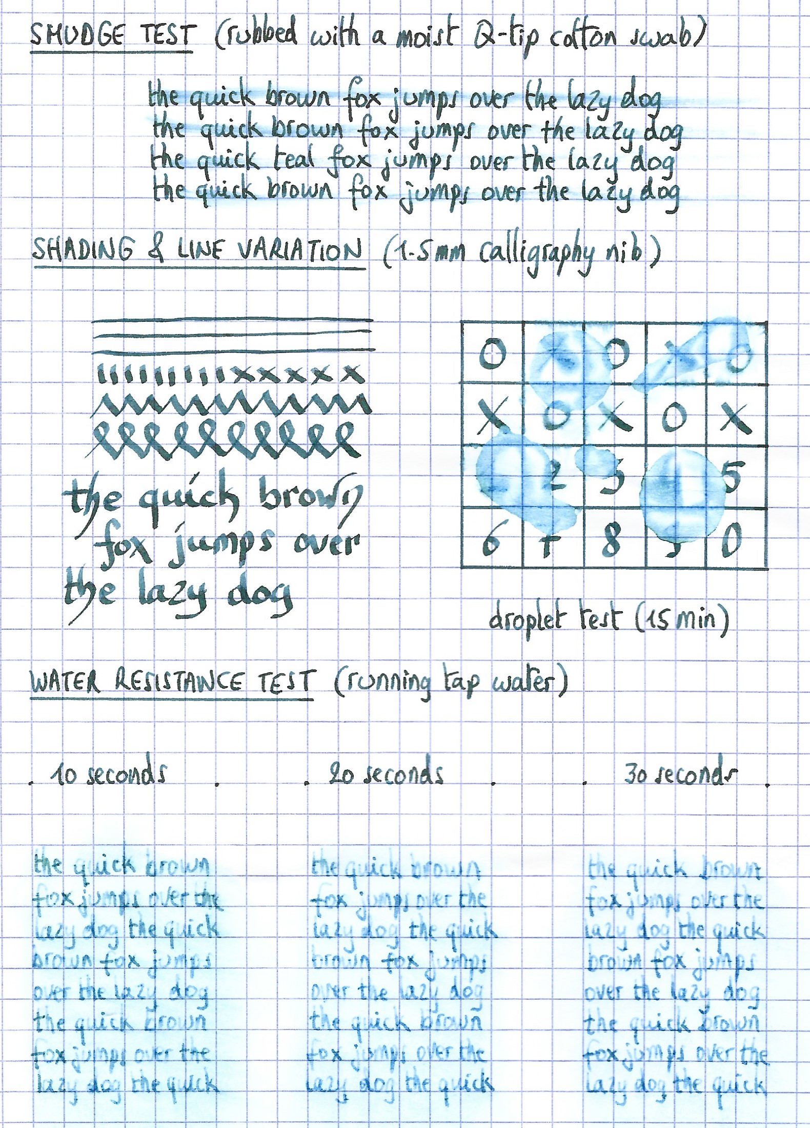
The ink’s chromatography shows a blue-heavy ink with yellow in the mix, which results in the green-looking appearance. From the chroma, I would have expected a more blue-leaning ink, not the rust-green teal that appears on paper. There definitely is some complex chemistry going on here! The bottom part of the chroma shows the bright blue that remains when water washes away the yellow dyes. This is confirmed in the water test: the ink is fairly resistant to water, and can survive an accident. A lot of the colour disappears, but a bright blue ghost of your writing remains that is quite readable, even after 30 seconds under streaming tap water. That makes sabimidori an ink you can use at the office – where it will certainly attract some well-deserved attention.
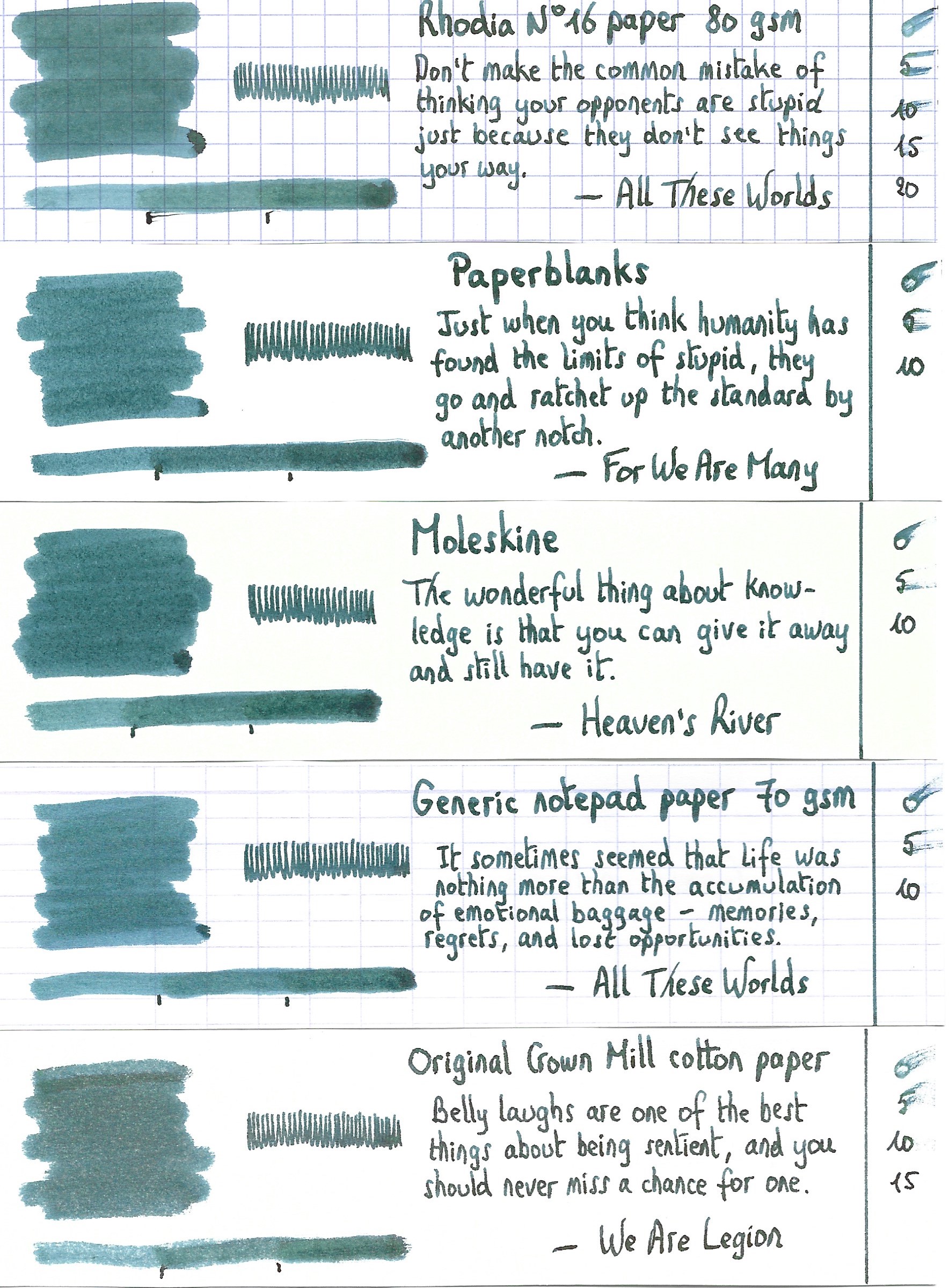
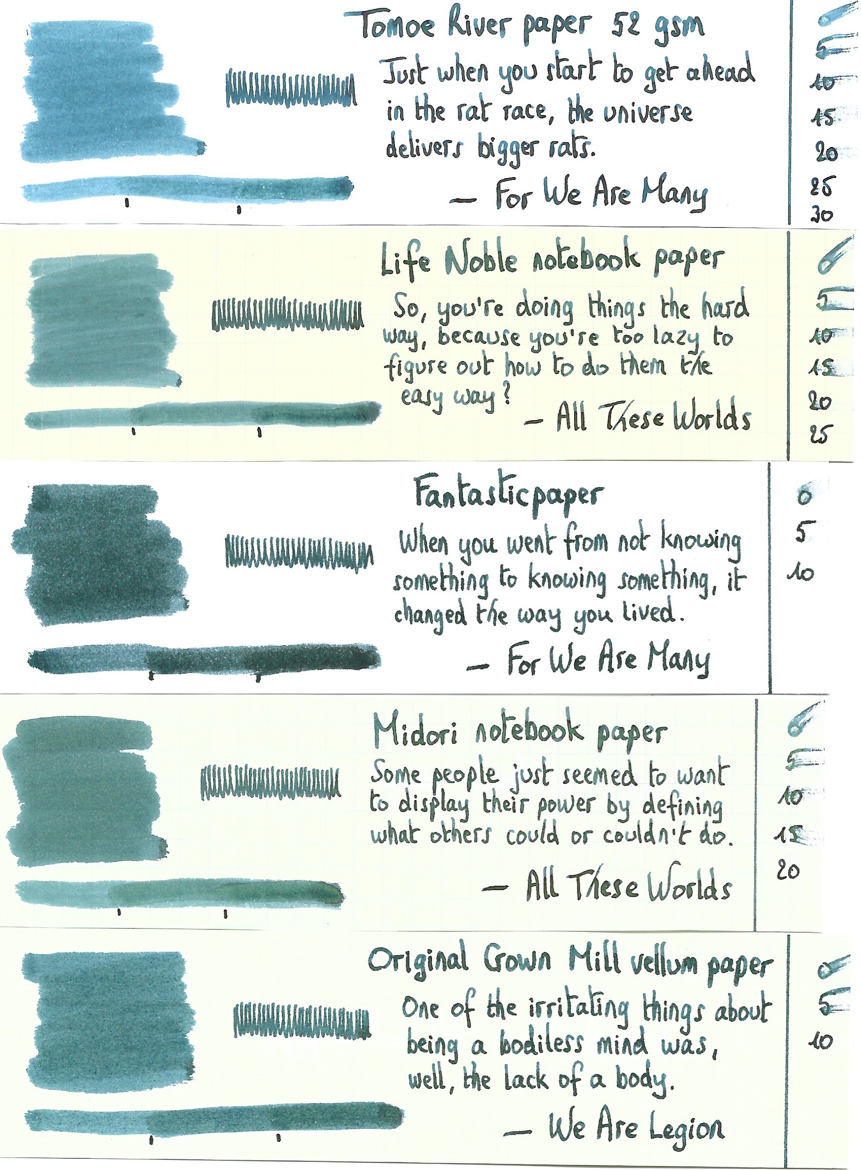
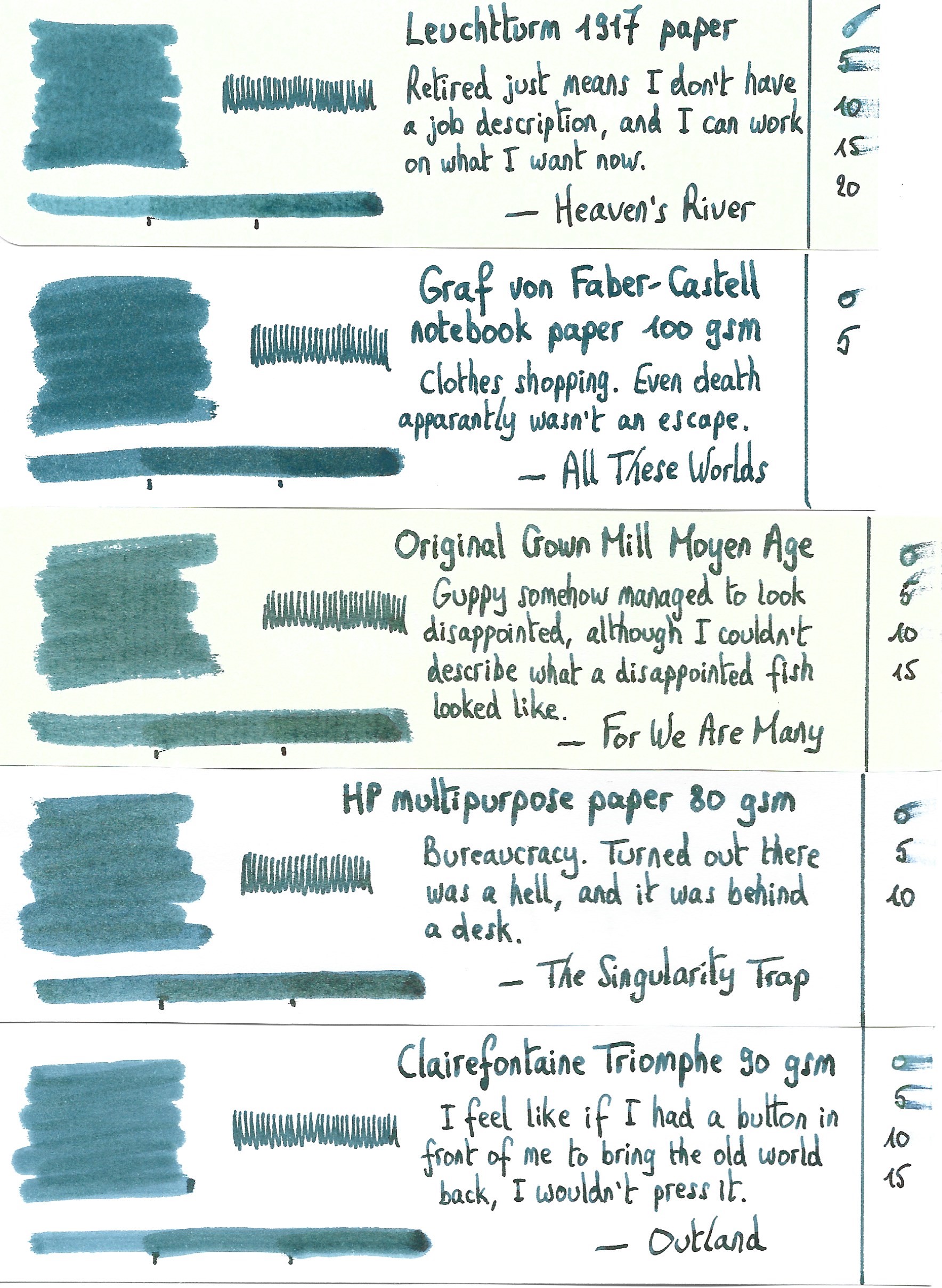
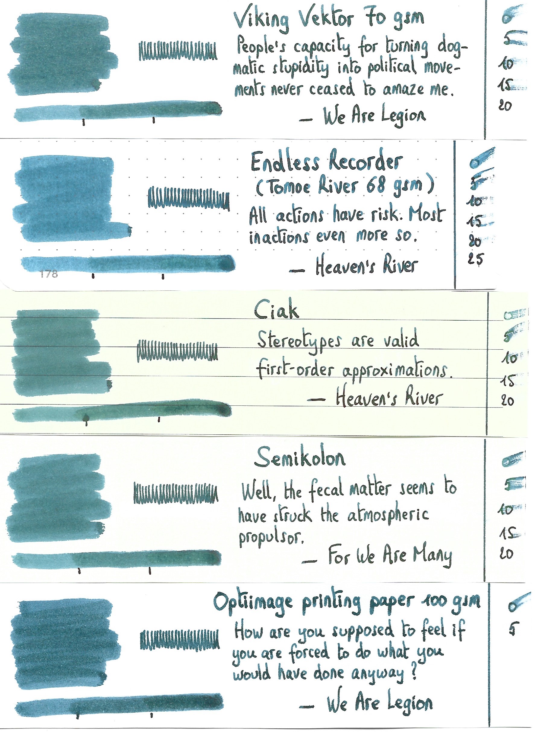
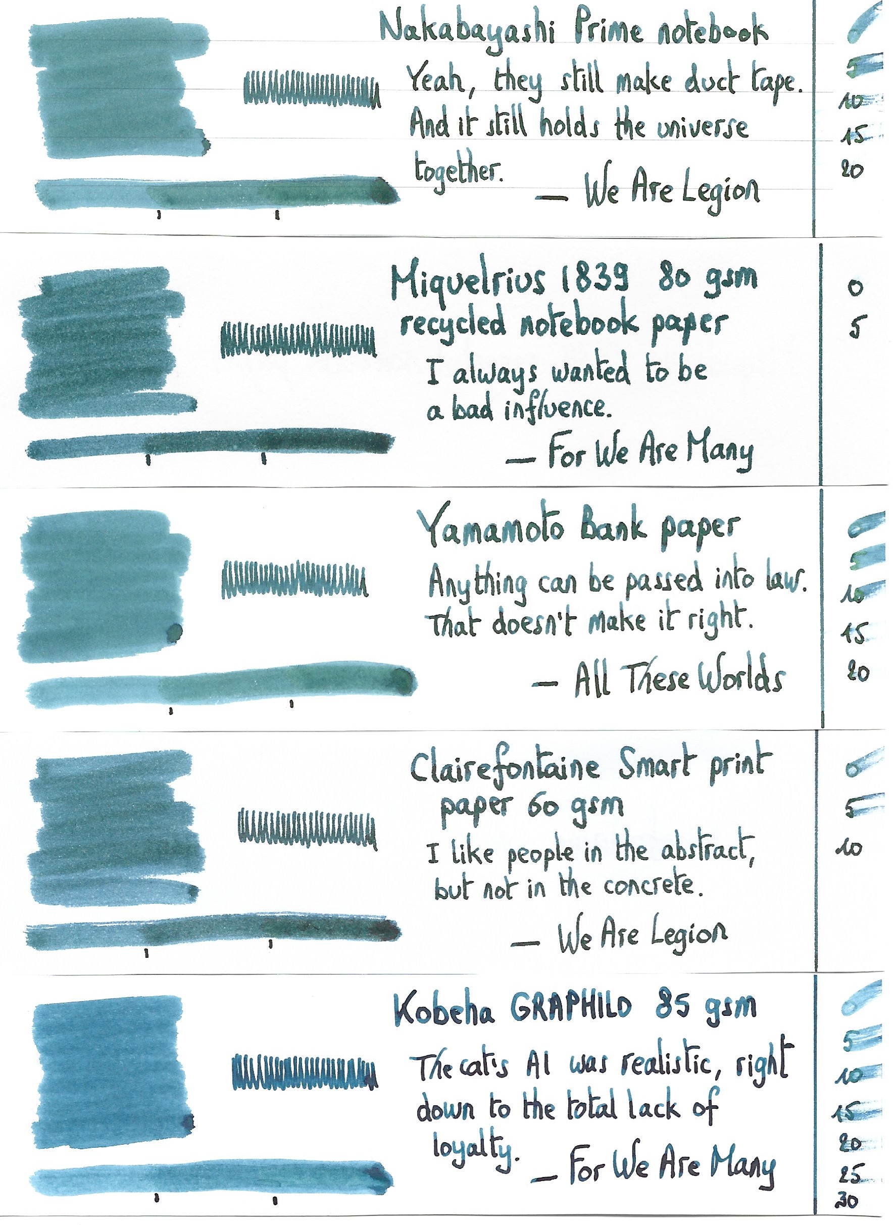
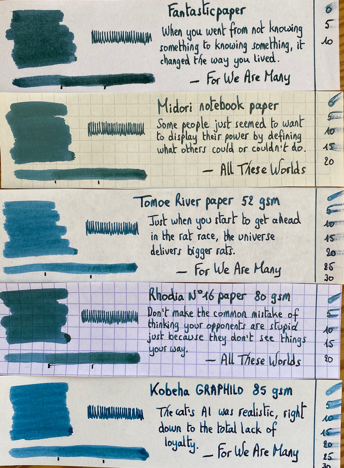
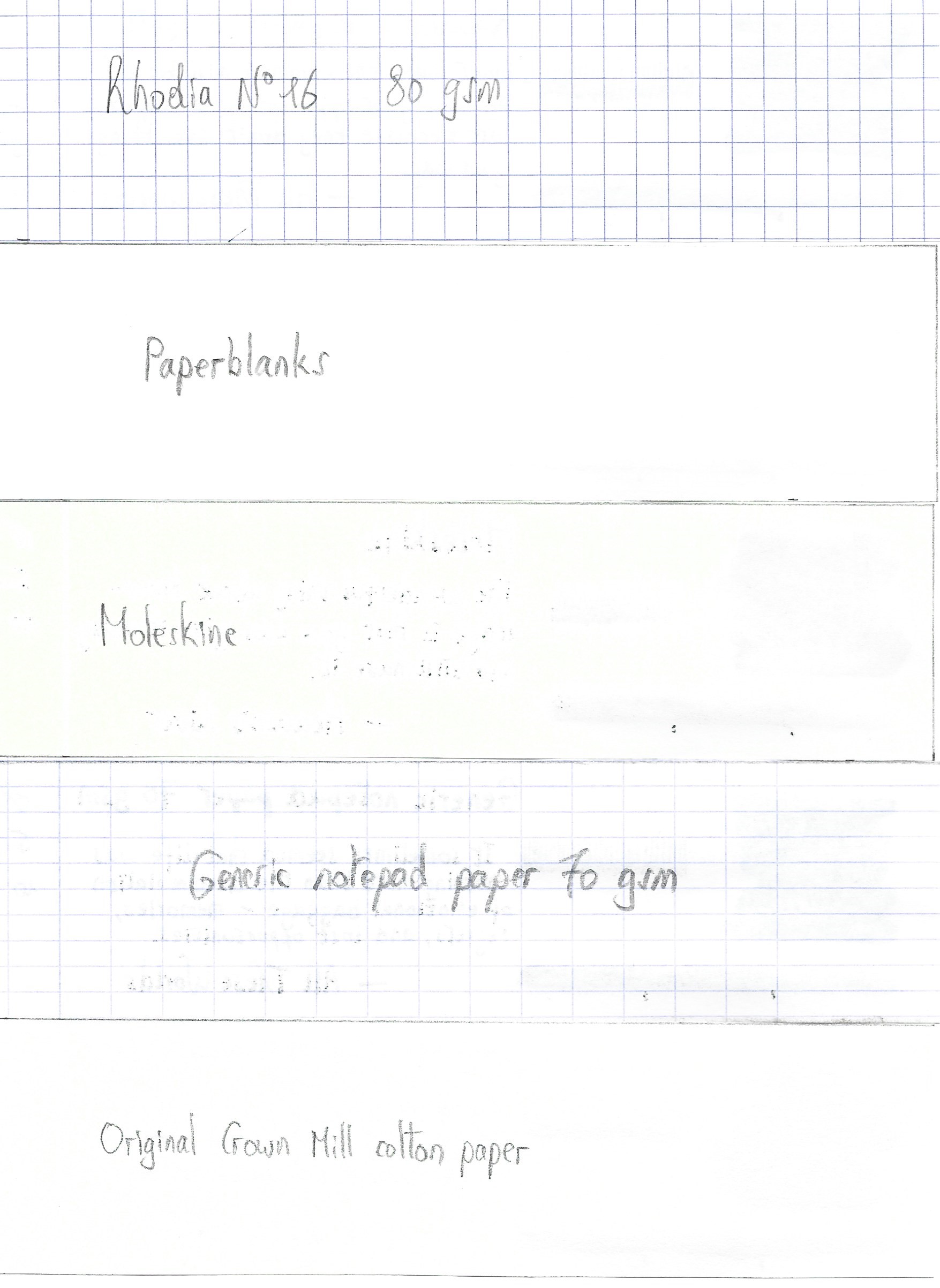
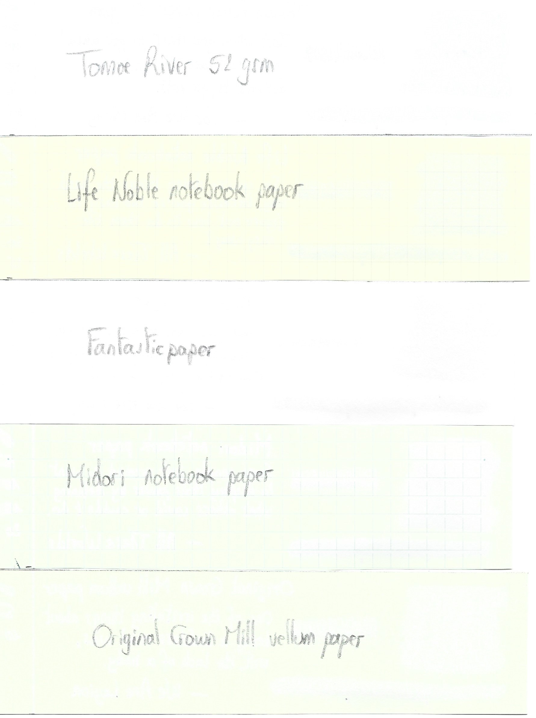
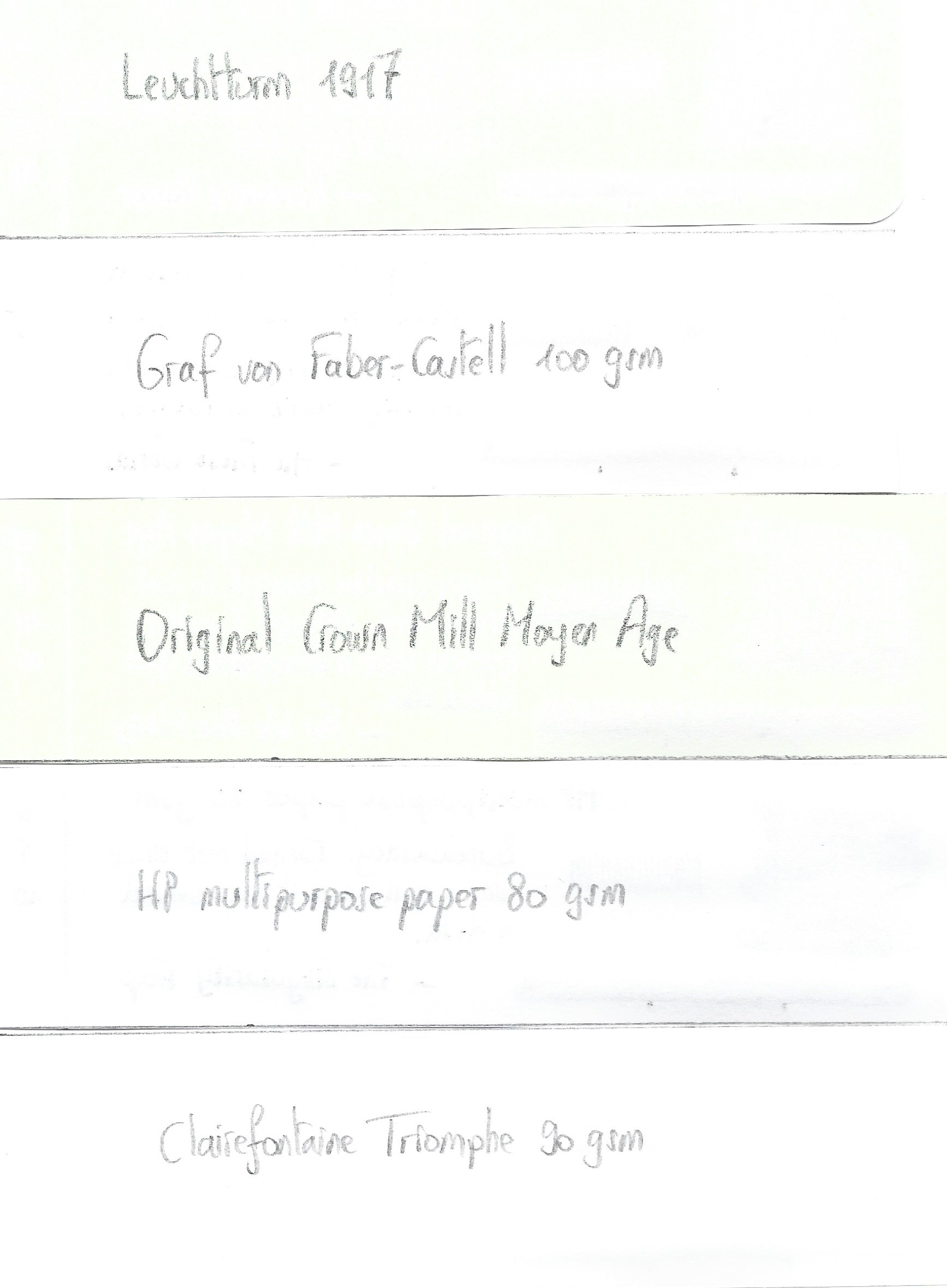
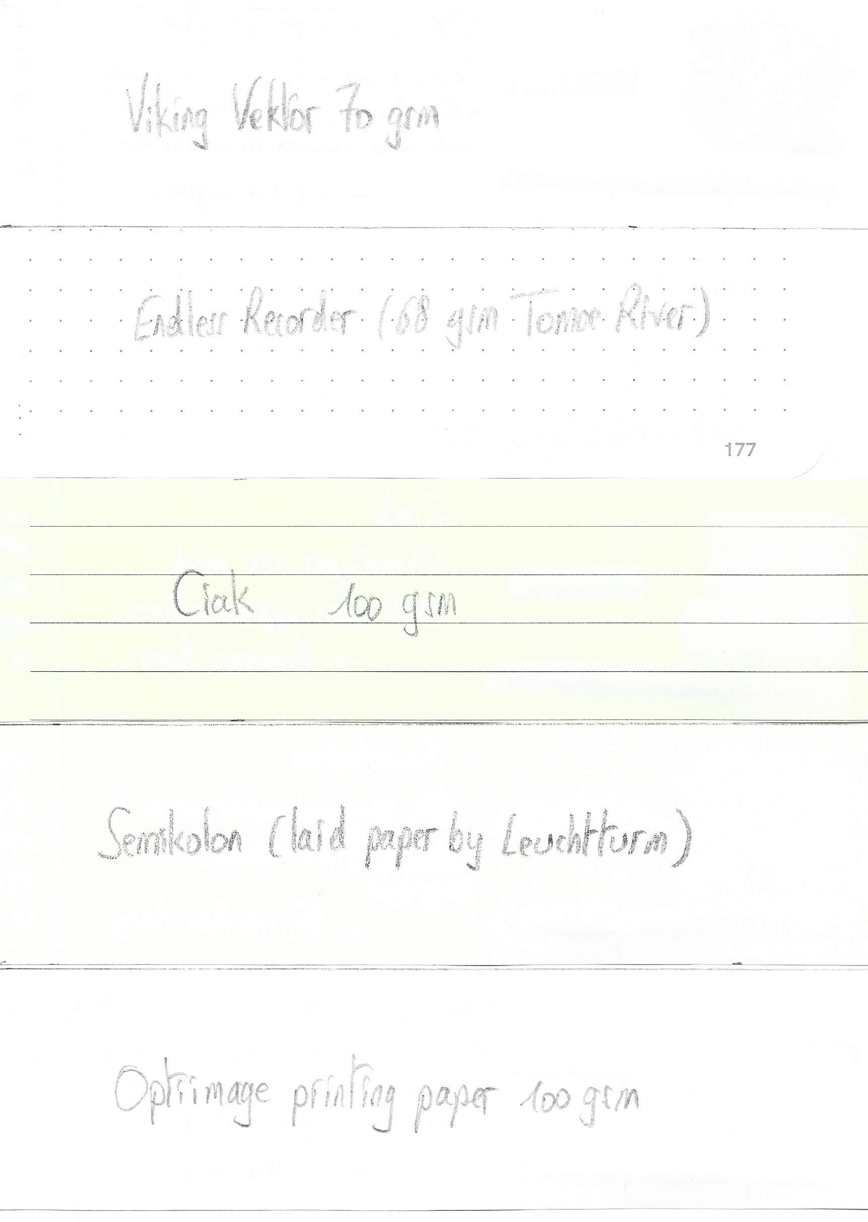
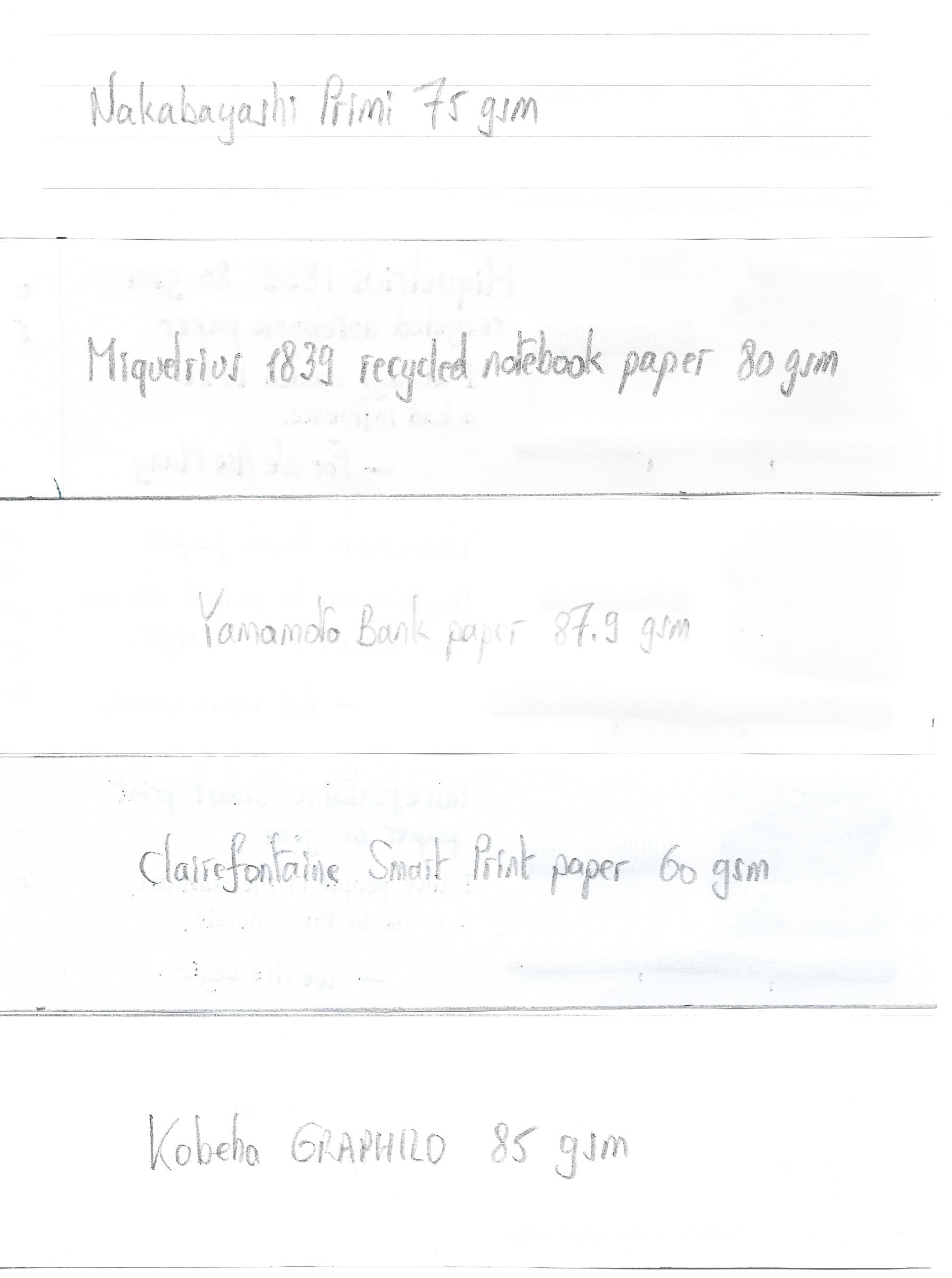
I’ve tested the ink on a wide variety of paper – from crappy Moleskine to high-end Tomoe River. On every small band of paper I show you:
- An ink swab, made with a cotton Q-tip
- 1-2-3 pass swab, to show increasing saturation
- An ink scribble made with an M-nib Lamy Safari
- The name of the paper used, written with a B-nib Lamy Safari
- A small text sample, written with the M-nib Safari
- Source of the quote, written with a Pelikan M405 with cursive-italic F-nib
- Drying times of the ink on the paper (with the M-nib Safari)
Sabimidori looks good on all types of paper, but I personally like it best on the more cream-coloured variety which enhances its green complexion. No feathering in general, just a teeny tiny bit on HP multipurpose paper. Some bleed-through on low-quality paper, but nothing too excessive. The ink expresses itself totally different, depending on the paper used – from blue- to green-leaning teal. I simply love this complexity … you get totally different experiences from a single bottle! Drying times for sabimidori are on the long side, with up to 30 seconds on hard-surface paper.
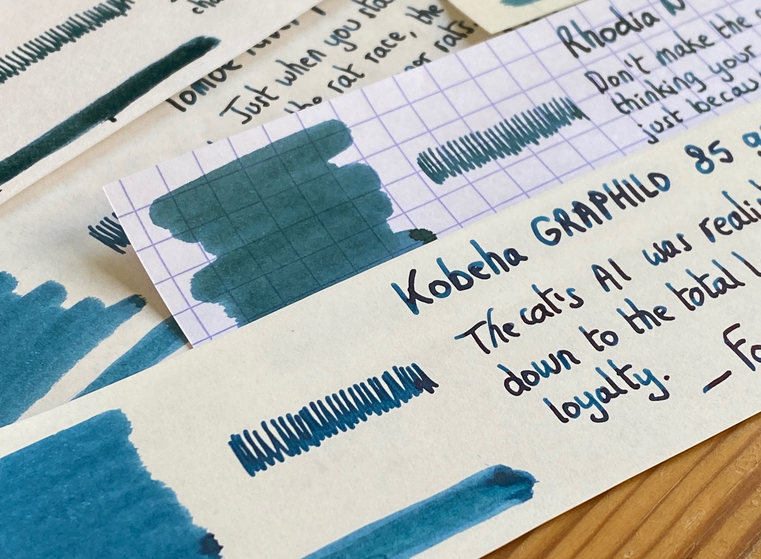
I’ve also added a few photos to give you another view on the ink. Scanned images and photos often capture different aspects of the ink’s colour & contrast. That’s why I present them both. In this case, scan & photo are very close-matched, with the photo closest to what my eyes can see.
One thing that I feel obliged to mention: sabimidori is not the easiest ink to clean out of your pens. It stains a lot, and needed extra effort to completely remove. It’s devilishly difficult to remove it from non-shiny plastic: I couldn’t completely clean it from re-used cartridges using only tap water: soap and hot water were needed. This is not an ink I would use in a clear demonstrator!
Writing with different nib sizes
The picture below shows the effect of nib sizes on the writing. The EF-nib already shows the shading that the ink is capable of. Depending on the nib, you get more blue or green, but always a good-looking result. Shading truly is a feast for the eyes – it is heavy, but the blue & green parts complement each other really well, resulting in an aesthetically pleasing look.

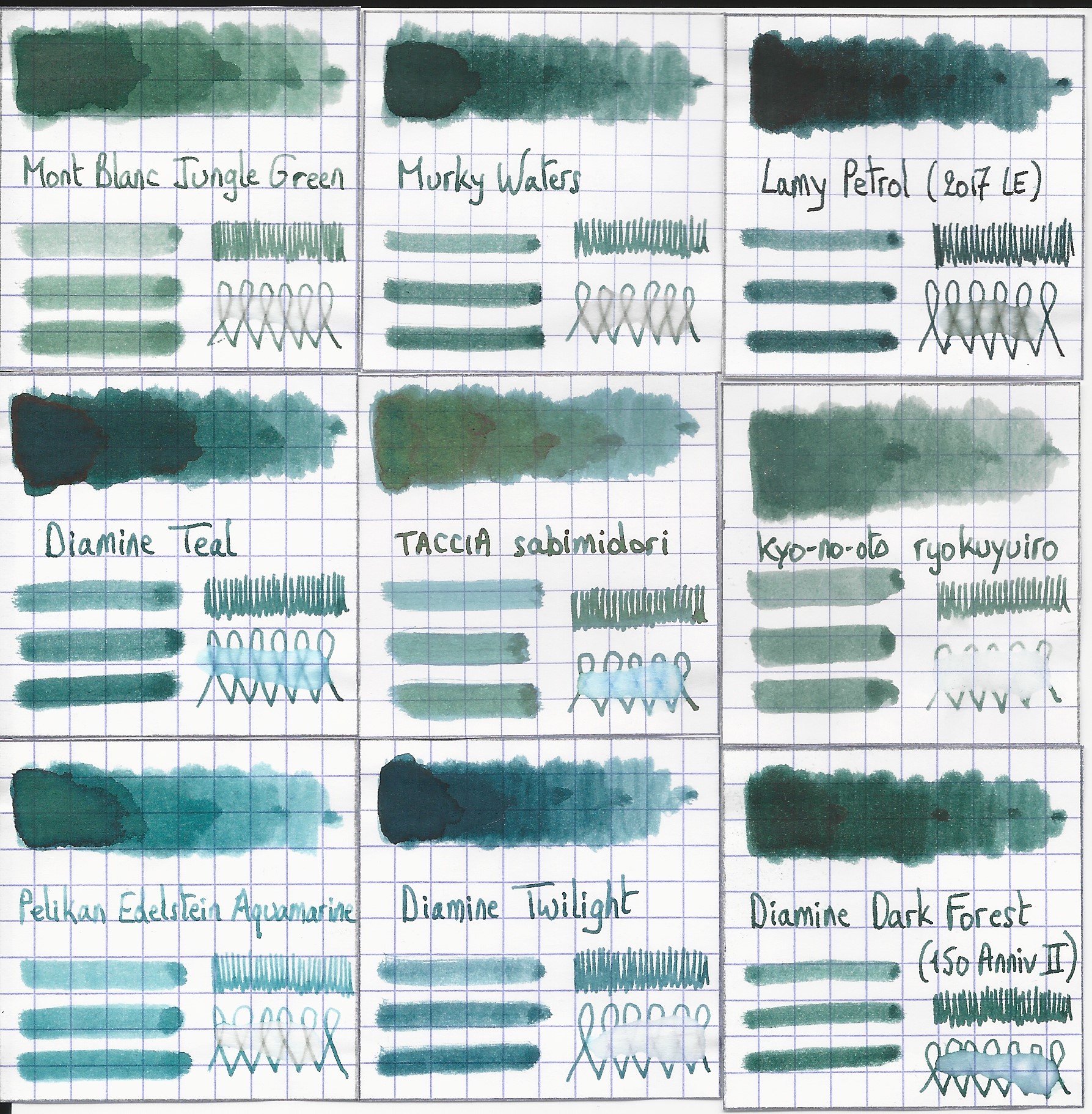
Related inks
To compare sabimidori with related inks, I use my nine-grid format with the currently reviewed ink at the center. This format shows the name of related inks, a saturation sample, a 1-2-3 swab and a water resistance test – all in a very compact format. The ink is different from other green-leaning teals in my collection. Murky Waters is a mix of my own: 3 parts Pelikan Edelstein Jade with 2 parts Edelstein Onyx.
Inkxperiment – Cradle of Life
With every review, I try to create a drawing using only the ink I am reviewing. These small one-ink pieces are an excellent way to show the colour-range nuances that are hidden within the ink. And I totally enjoy the fun couple of hours these inkxperiments provide me: playing around with the ink in a creative way. Not surprisingly, the inkxperiment is for me the most enjoyable part in the making of a review 😉
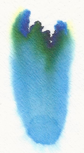
Inspiration for this inkxperiment comes from the namesake Lara Croft movie I revisited recently: a fun constant-action adventure movie. Definitely not a brainy movie, but the title got me thinking about the origins of life. In puddles of nutrient-rich water on infant Earth, complex molecules arose, that – given aeons of time and billions of tries – resulted in self-replicating structures, that ultimately form the building blocks of life. And from these humble beginnings come the variety of species we know today, like the majestic pine forest…
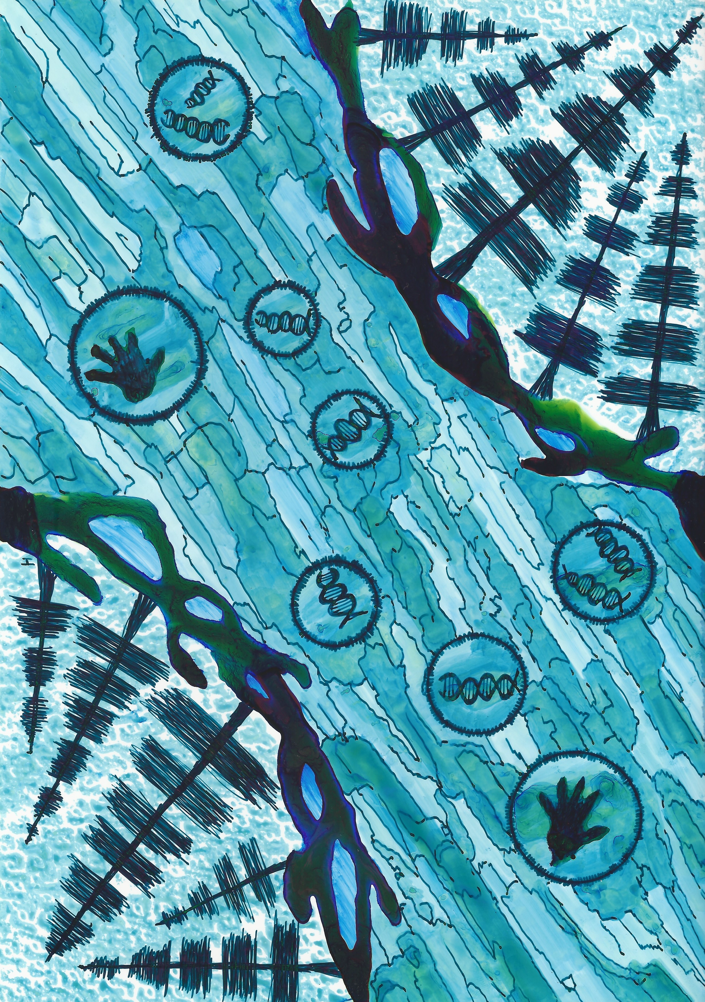
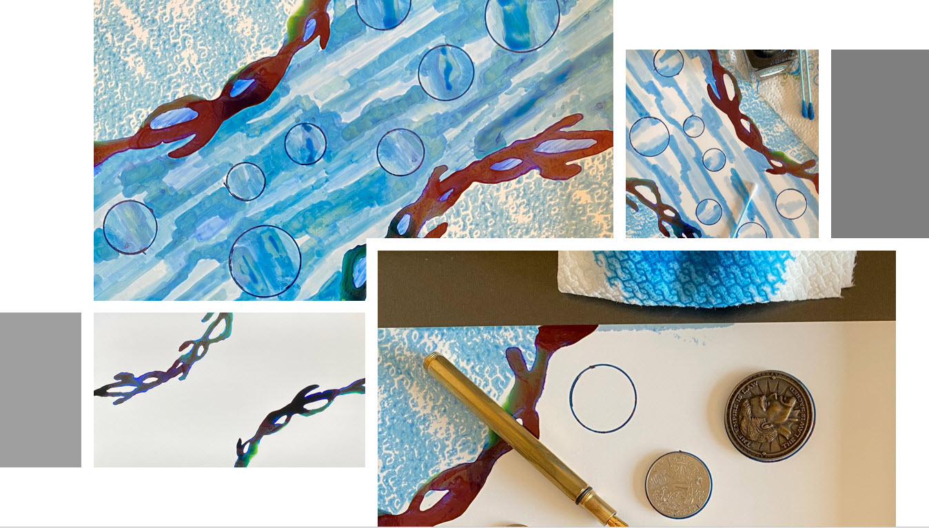
For this drawing, I started with a piece of A4 HP photo paper. I first drew the land borders, drawing them with water into which I dripped pure ink. The colours are real… bright blue, bright green, teal – all this from that single sabimidori bottle. Next I created the sky for the pine forest, printing a pattern with a piece of kitchen paper dipped in ink. I then drew the spheres where the “life cooking” happened, that created the complex molecules. All that in puddles of nutrient-rich water, which I drew with Q-tips dipped in multiple water/ink ratios. Finally I used my fountain pen to draw the pine forests, and to add some texture to the water. The final picture gives you a good idea of what can be achieved with sabimidori as a drawing ink.
Inkxpired – computational art
I love experimenting with pen/ink/paper, and have added another layer as part of the hobby. I’m exploring computational art, inspired by the ink drawings I do during ink reviews. Another fun offshoot of the hobby… and all that starting with a few drops of dye-coloured water on paper.

Conclusion
TACCIA Ukiyo-e Hokusai sabimidori is a wonderful rust-green teal. An ink with unexpected complexity, that has a lot going for it. I love its looks on paper, with the great aesthetics of shading and sheen. This is one of the nicest inks I tried this year. If you like teals, you cannot go wrong with this one: highly recommended!
Technical test results on Rhodia N° 16 notepad paper, written with Lamy Safari, M-nib
Back-side of writing samples on different paper types
[Originally published on the Fountain Pen Network, on 18 July 2022]
