L’Artisan Pastellier is a small company in southern France that specialises in natural pigments, and offers customers authentic and reliable products in beautiful colours based on mineral or vegetable pigments. In a collaboration with Loic Rainouard from Styloplume.net, the chemist Didier Boinnard from L’Artisan Pastellier created the line of Callifolio fountain pen inks. These pastel-coloured inks are traditionally crafted, and can be freely mixed and matched. Overall these inks are only moderately saturated, and have low water-resistance. The inks were specifically designed to work well with all types of paper, and all types of fountain pens.
Being pastel-tinted, these inks have a watercolour-like appearance, and are not only fine inks for journaling, but are also really excellent inks for doodling & drawing. I only recently discovered them, and they are already the inks I gravitate towards for personal journaling.
In this review the centre stage is taken by Bleu Méditerraneé, one of the many blue inks of the series. The blue Callifolio inks are named after rivers, lakes and oceans. In this case the ink takes its name from the Mediterranean Sea, that separates Europe from Africa. The ink’s colour is best described as a light-blue – definitely not a sky/cerulean blue. It’s a really nice soft blue colour, that I find quite appealing.
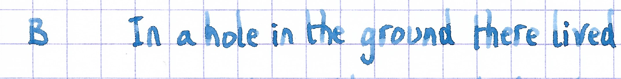
For a Callifolio ink, this one wrote quite well in my Lamy Safari test pens. It didn’t show the typical dry feeling with subpar lubrication that is a staple of many Callifolio inks. Shading is strongly present but still subtle due to the light blue nature of the ink. The result is an aesthetically pleasing look. Overall quite a nice writing ink. Well executed!
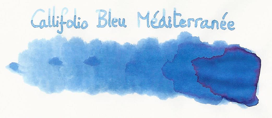
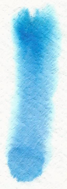
To show you the impact of saturation on the ink’s look & feel on paper, I made some scribbles where I really saturated portions of the Tomoe River paper with ink. This gives you a good idea of what the ink is capable of in terms of colour range. As you can see, this ink has a wide colour span ranging from a wispy light blue with a tiny bit of purple to a relatively dark light-blue. Heavily saturated parts also show a bit of a red sheen.
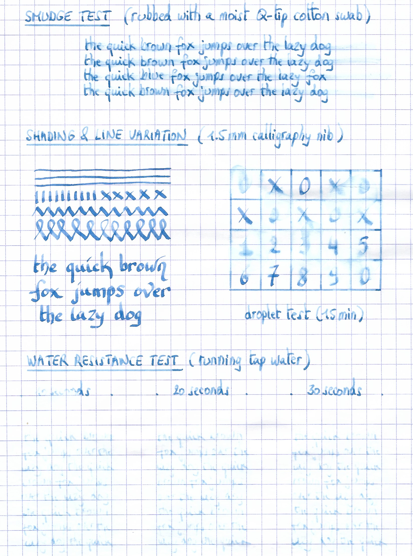
On the smudge test – rubbing text with a moist Q-tip cotton swab – Blue Méditerranée shows its weakness. Lots of smearing, although the text remains legible. Water resistance is also quite low. There is still some ink left on the paper, but what remains is heavily smudged and near unreadable. The droplet test with non-moving water sitting on the paper for 15 minutes is still acceptable. But once running water comes into play, the dyes quickly disappear leaving only an unreadable residue. The chromatography shows that this is a rather monochromatic ink, without much colour variation in the component dyes.
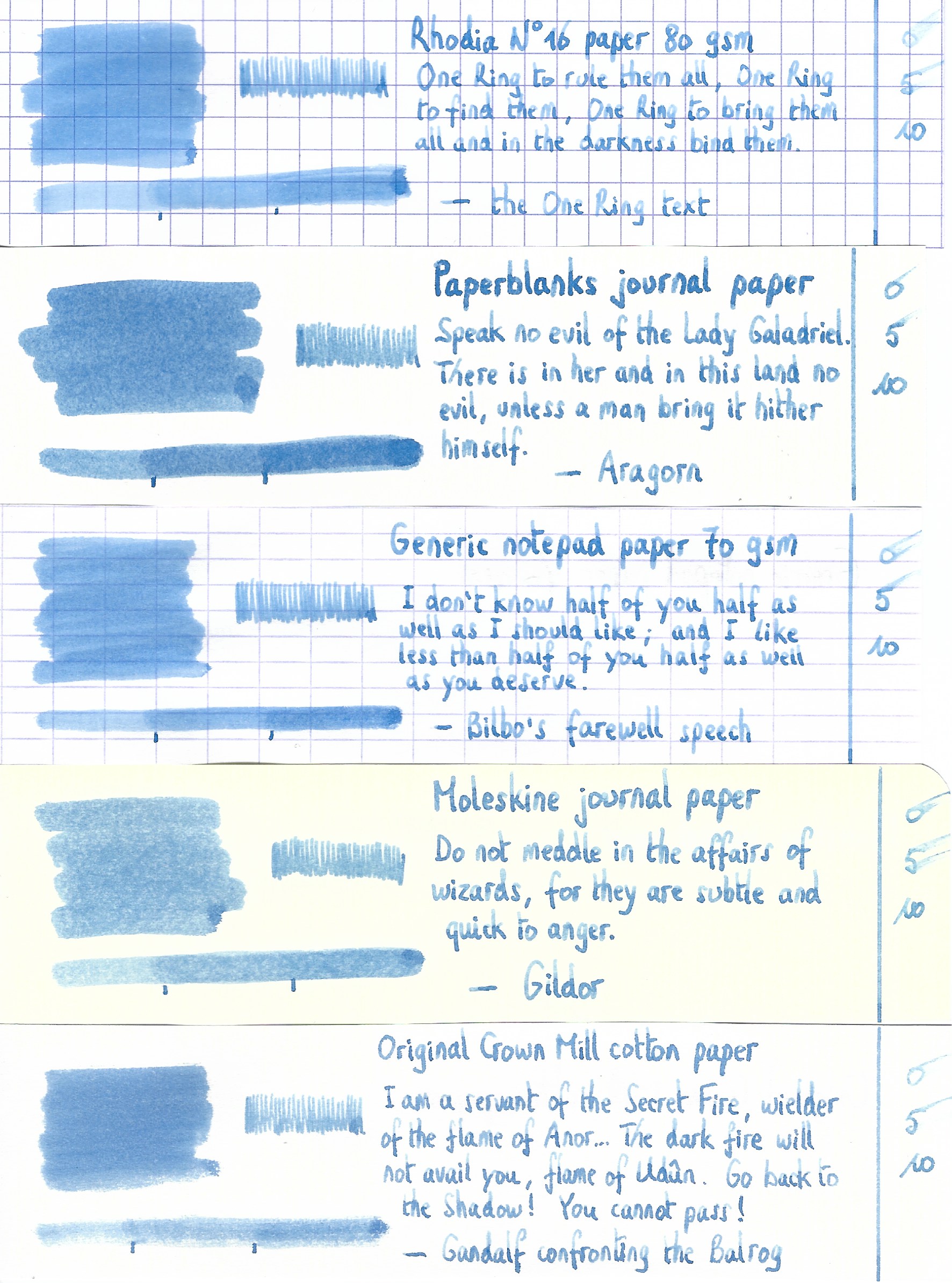
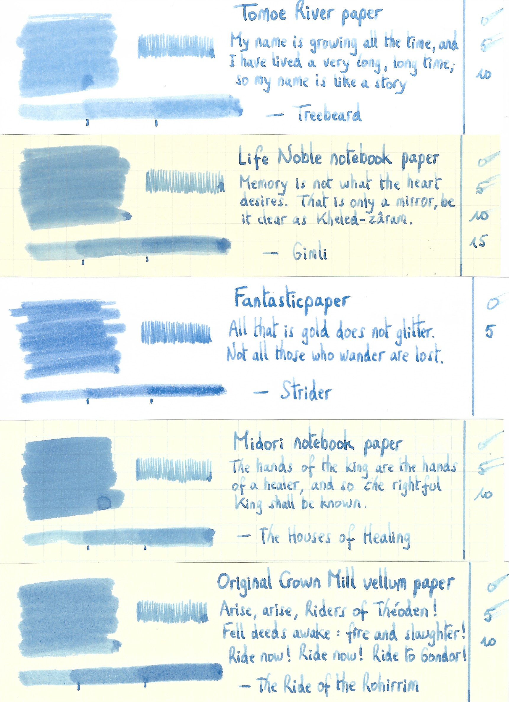
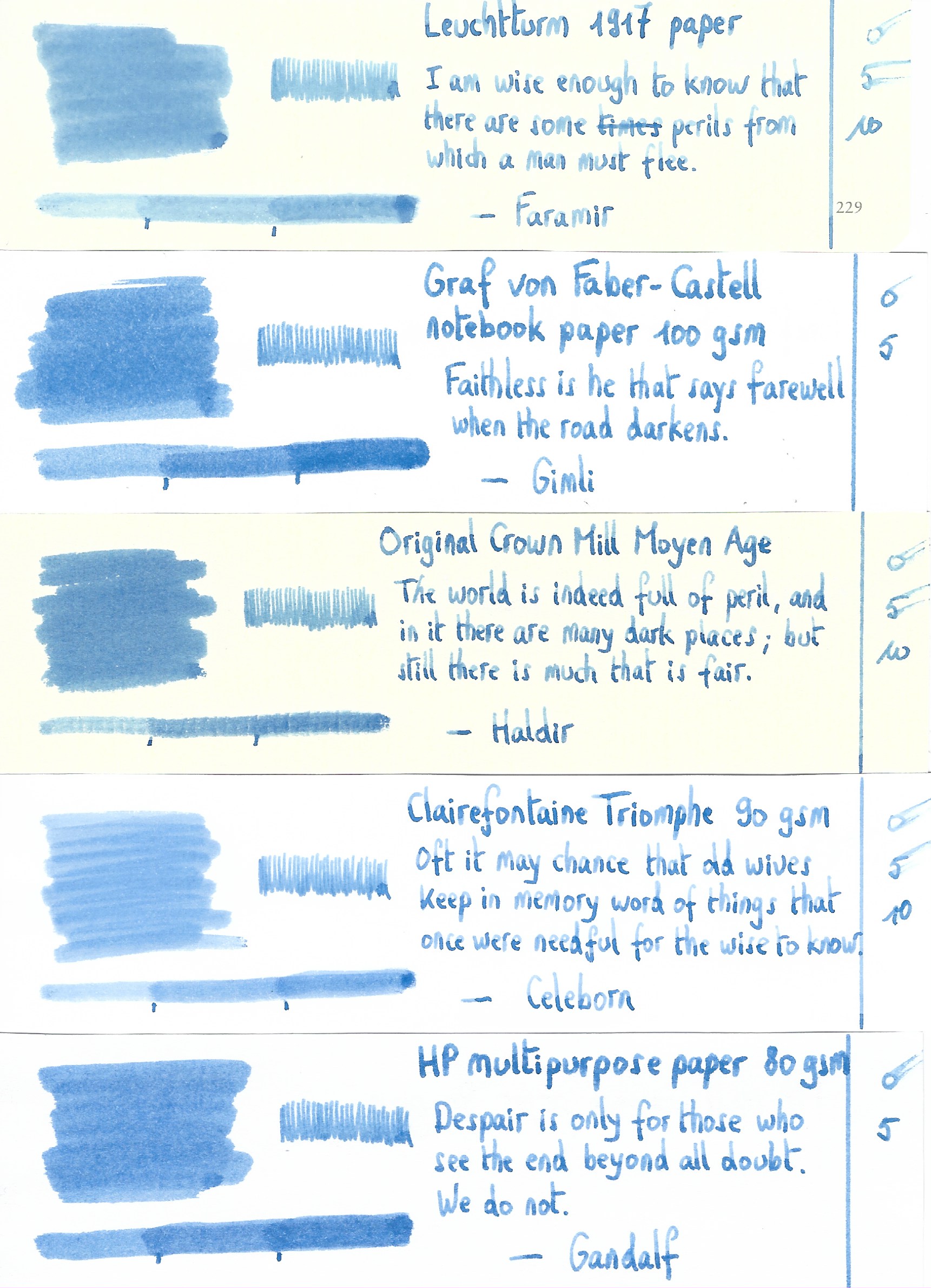
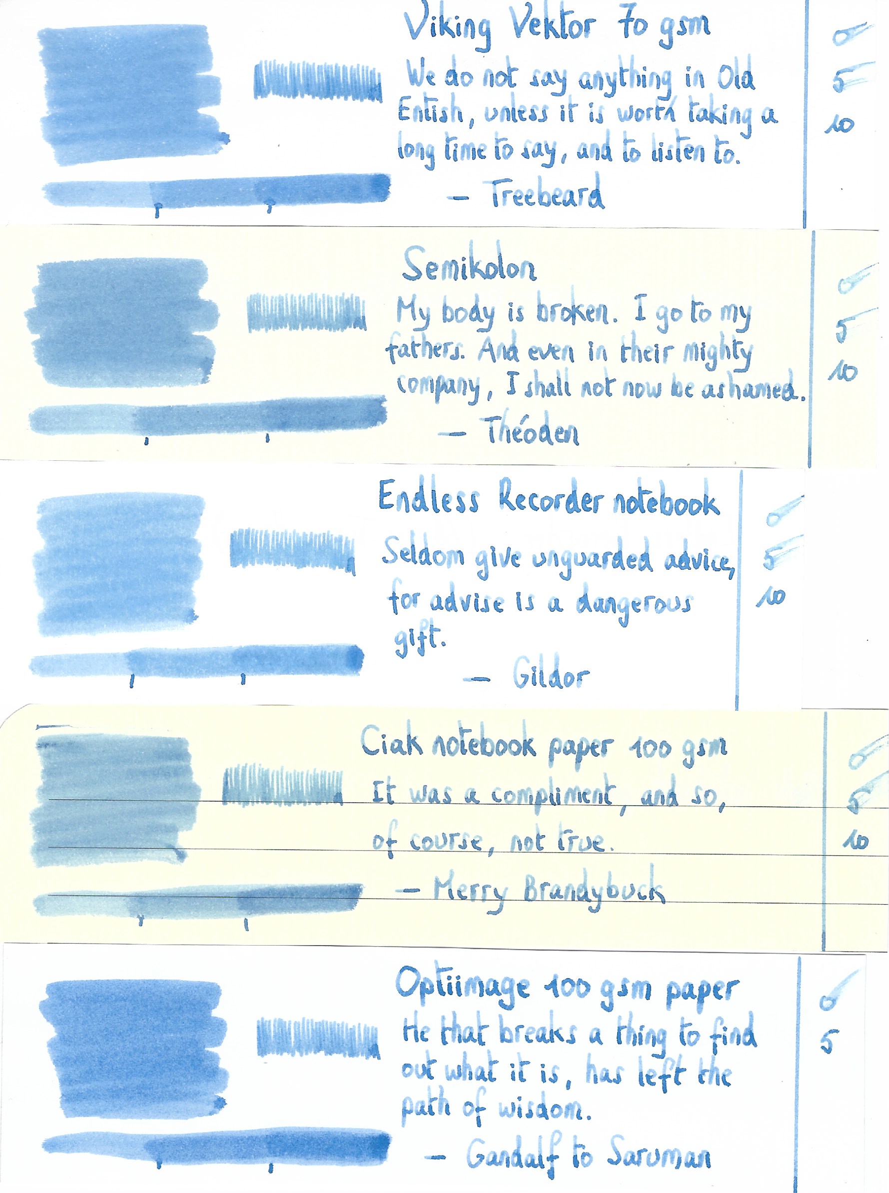
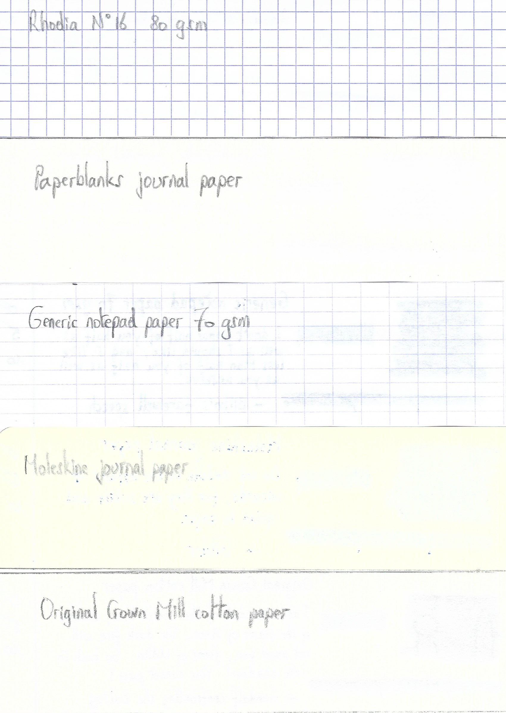
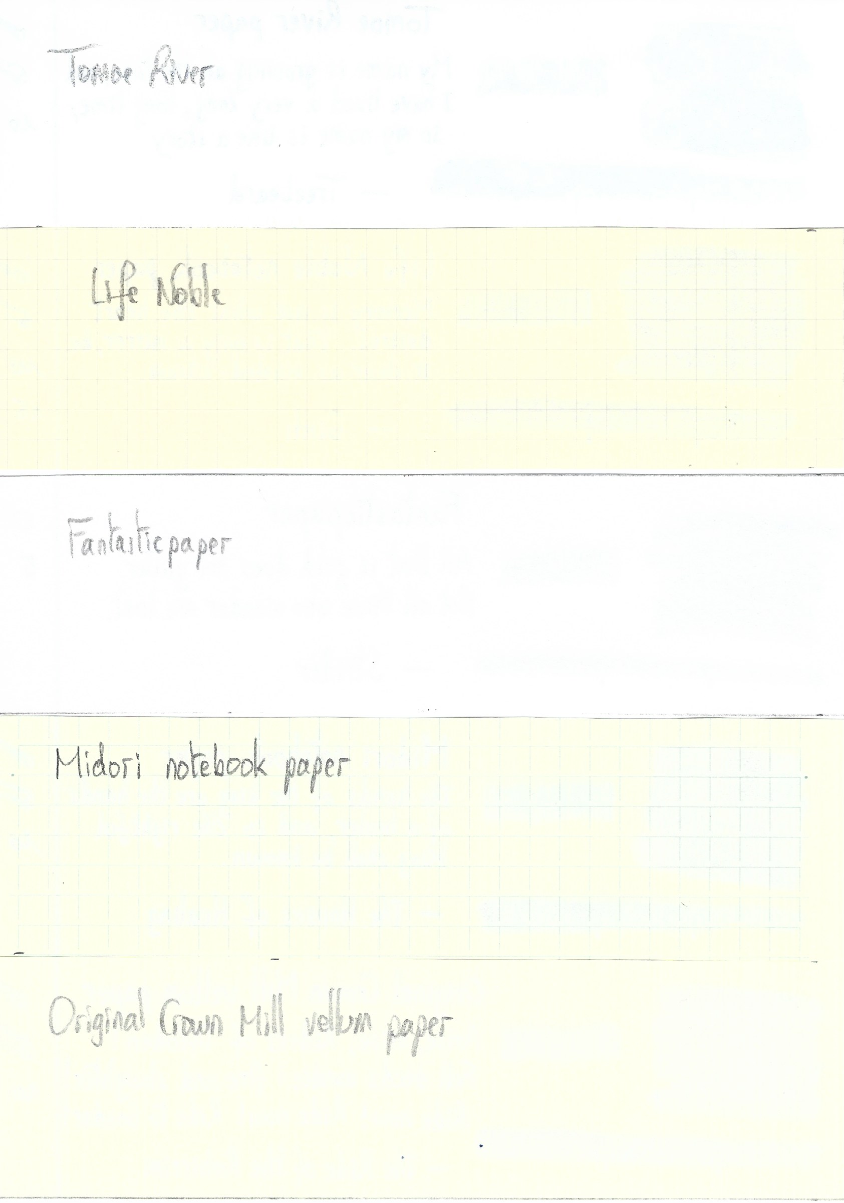
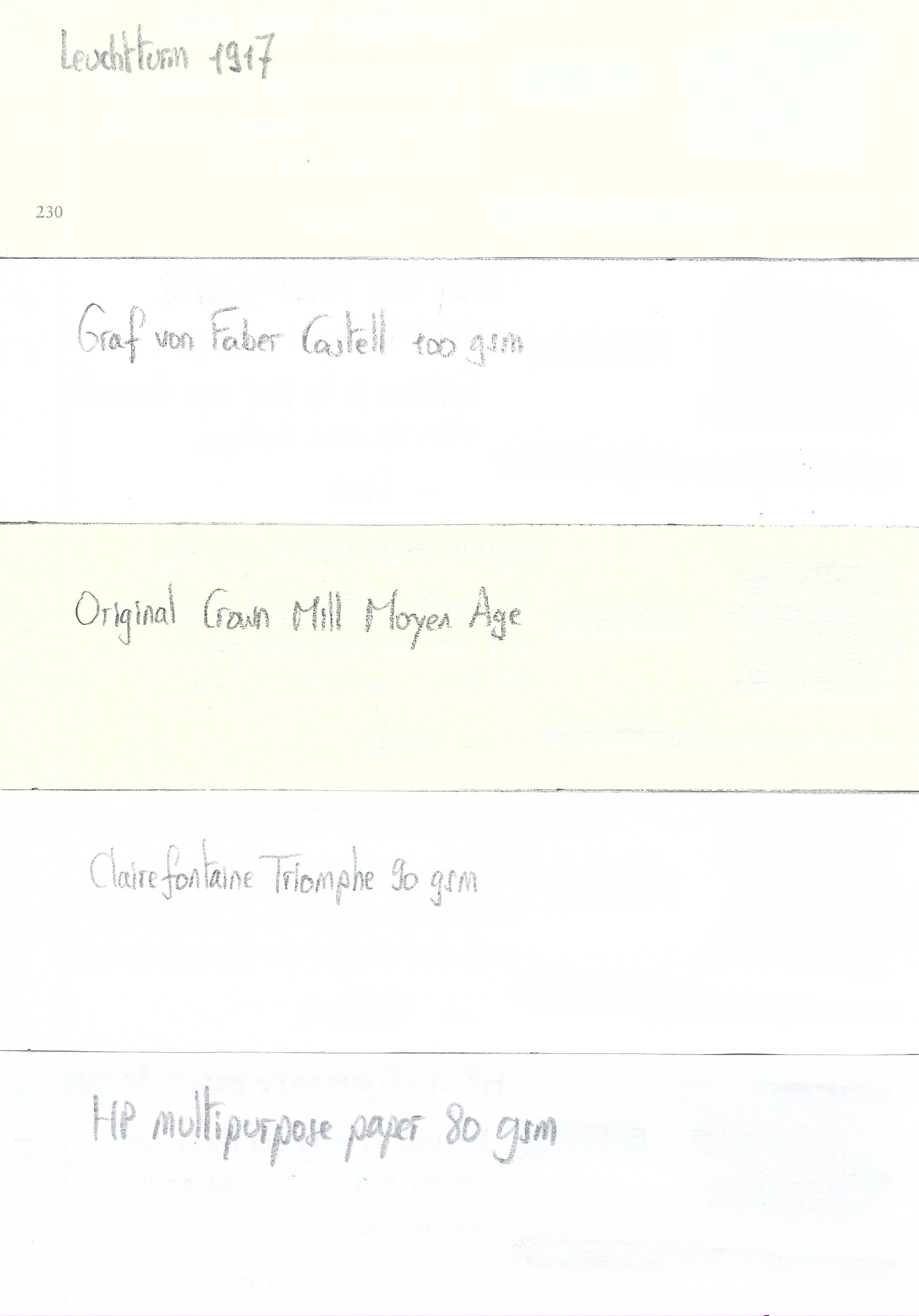
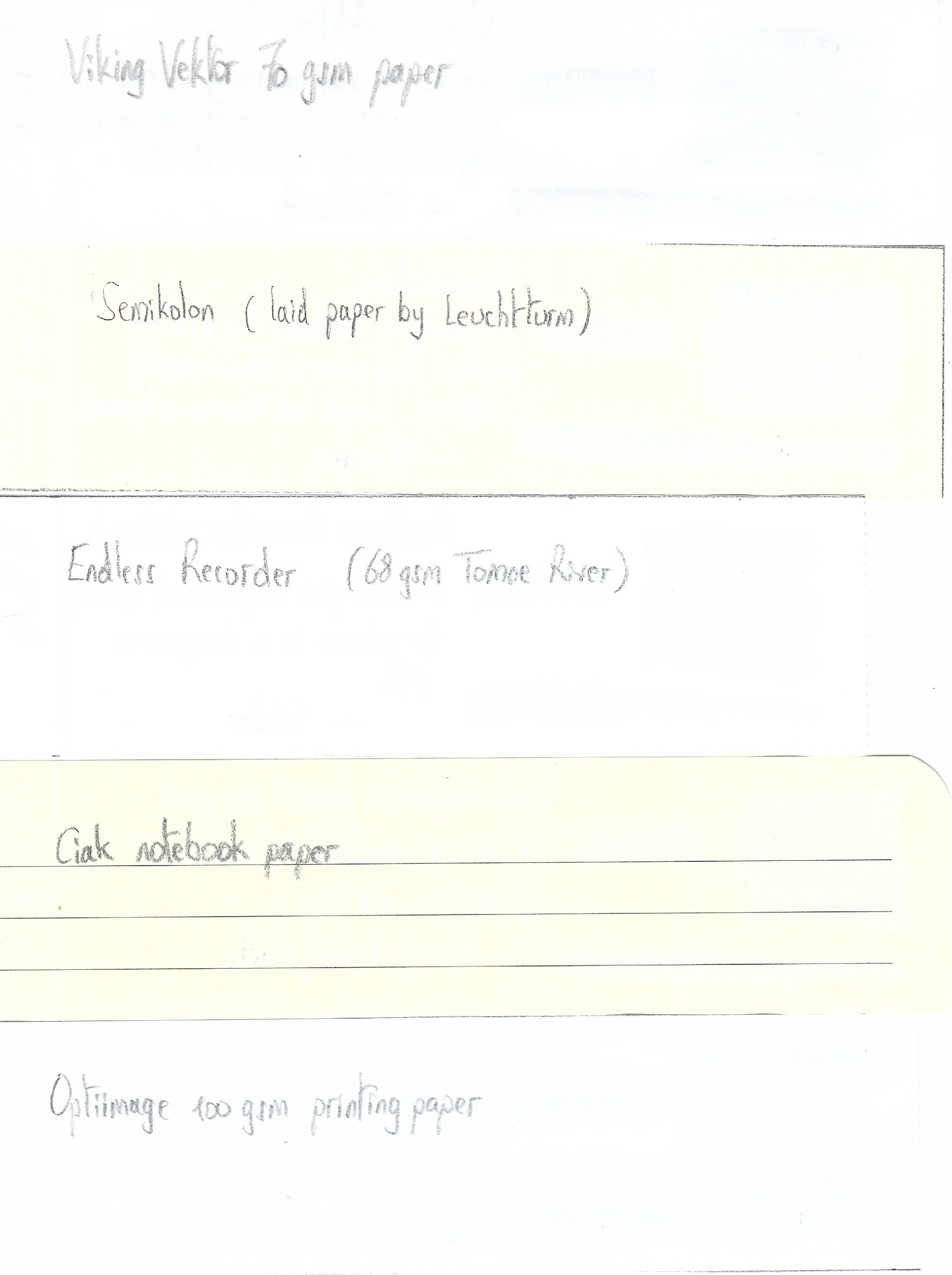
I’ve tested the ink on a wide variety of paper – from crappy Moleskine to high-end Tomoe River. On every small band of paper I show you:
- An ink swab, made with a cotton Q-tip
- 1-2-3 pass swab, to show increasing saturation
- An ink scribble made with an M-nib fountain pen
- The name of the paper used, written with a B-nib
- A small text sample, written with an M-nib
- Drying times of the ink on the paper (with the M-nib)
Bleu Méditerranée behaved perfectly on all the paper types, with no apparent feathering even on the lower quality papers in my test set. Even Moleskine paper behaved quite well with this ink – no visible feathering, but still some bleed-through. Drying times are mostly around the 10 second mark. The ink works really well with both white and more yellowish paper. The ink also shows a remarkably consistent appearance across a wide range of paper types – well done!
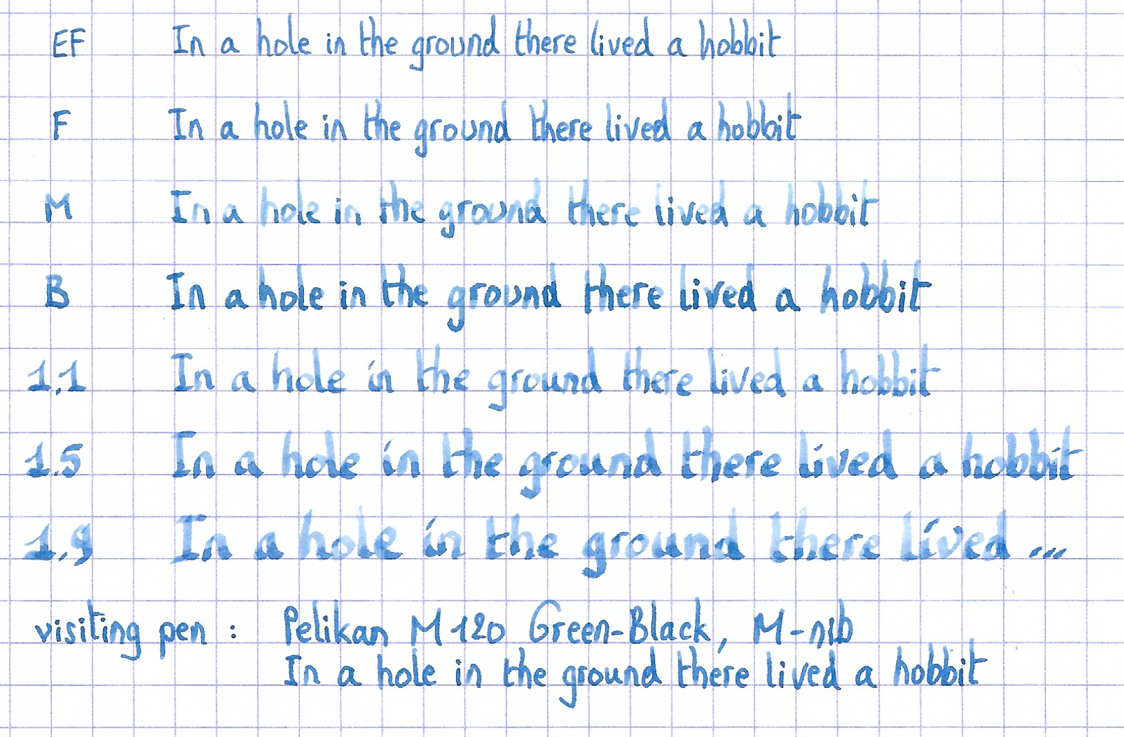
Writing with different nib sizes
The picture below shows the effect of nib sizes on the writing. All samples were written with a Lamy Safari, which is typically a dry pen. I also added a visiting pen – a wet-writing Pelikan M120 Green-Black with an M-nib. With this wet nib, the ink writes much more saturated, losing a bit of the more prominent shading you get with a drier pen.
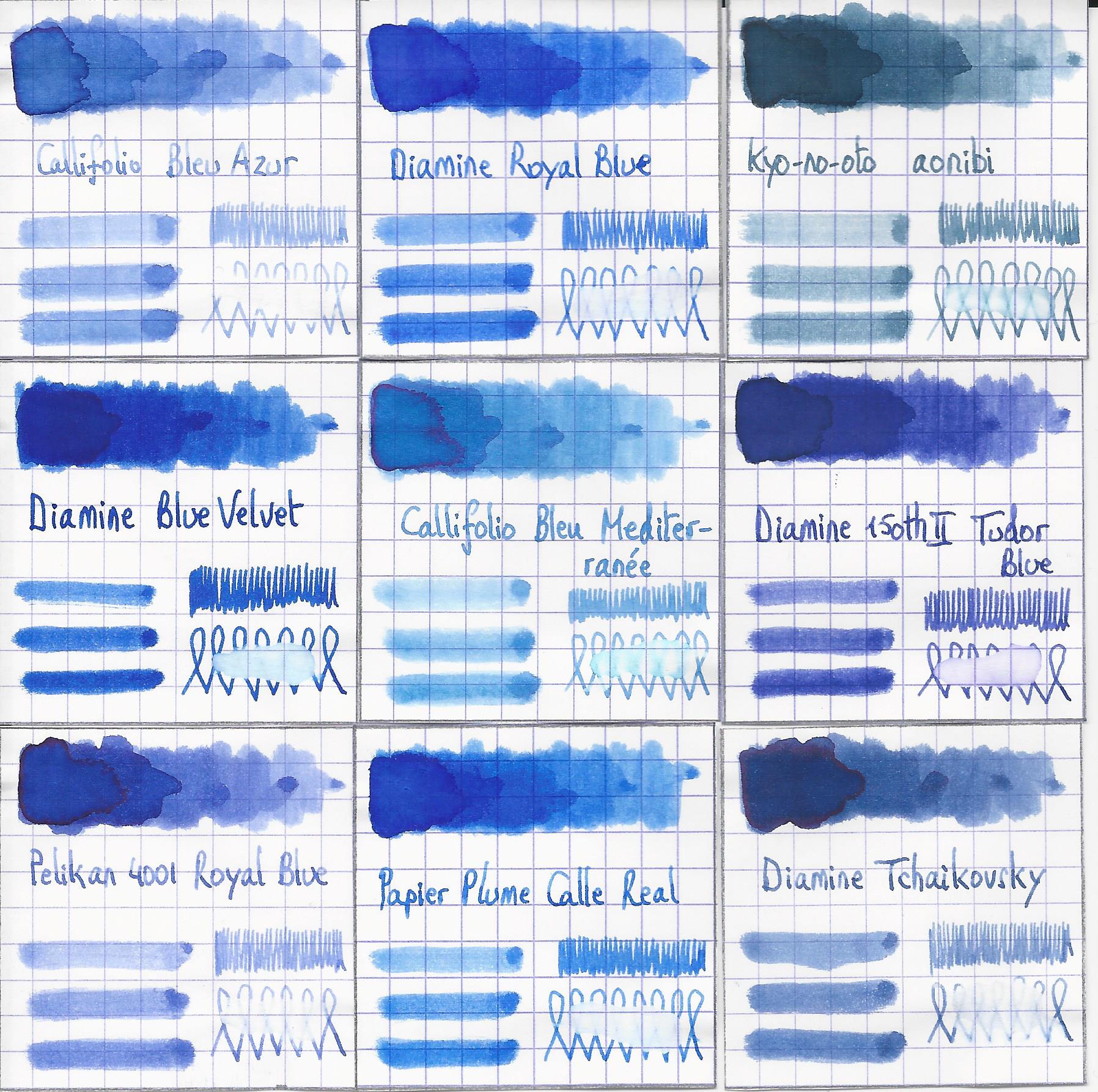
Related inks
To compare Blue Méditerranéé with related inks, I use my nine-grid format with the currently reviewed ink at the centre. This format shows the name of related inks, a saturation sample, a 1-2-3 swab and a water resistance test – all in a very compact format.
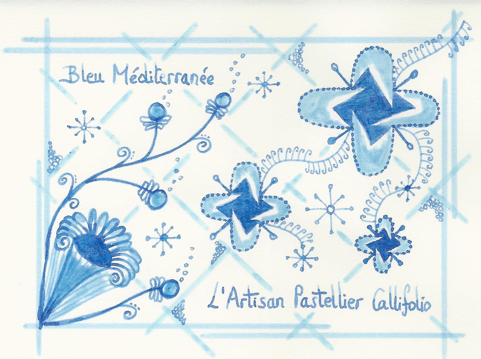
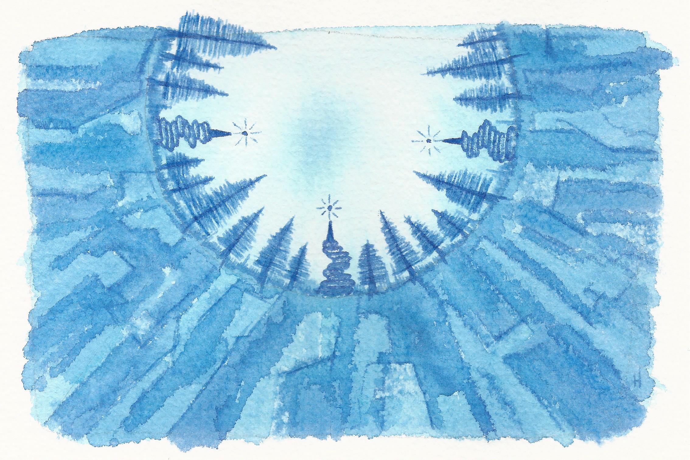
Inkxperiment – Rendez-Vous with Rama
As a personal challenge, I try to create interesting drawings using only the ink I’m reviewing. These single-ink drawings are great for stretching my drawing skills, and – above all – they are lots of fun. With these small pieces, I try to give you an idea of what the ink is capable of in a more artistic setting. This drawing is inspired by the 1973 novel of Arthur C. Clarke, where a huge cylindrical spaceship moves through our solar system. I started off with 300 gsm watercolour paper, on which I painted the background using heavily water-diluted ink. I next used Q-tips to draw in the Rama landscape, using different water/ink ratios. The cylindrical horizon line with the mysterious Rama machinery and vegetation was added with an M-nibbed Safari using pure Bleu Méditerranée. I finished the drawing by adding some accents to the Rama landscape with my Lamy Safari pen. I quite like the colour variation that this Callifolio ink allows. The end result gives you a good idea of what can be obtained with Bleu Méditerranée as a drawing ink.
Conclusion
Callifolio Bleu Méditerranée is an ink that works great as both a writing and drawing ink. It has a pleasing light-blue appearance with prominent but still subtle shading. Overall a good-looking blue ink, that rightfully deserves your attention.
Technical test results on Rhodia N° 16 notepad paper, written with Lamy Safari, M-nib
Back-side of writing samples on different paper types
[Originally published on the Fountain Pen Network, on 04 October 2019]
