L’Artisan Pastellier is a small company in southern France that specialises in natural pigments, and offers customers authentic and reliable products in beautiful colours based on mineral or vegetable pigments. In a collaboration with Loic Rainouard from Styloplume.net, the chemist Didier Boinnard from L’Artisan Pastellier created the line of Callifolio fountain pen inks. These pastel-coloured inks are traditionally crafted, and can be freely mixed and matched. Overall these inks are only moderately saturated, and have low water-resistance. The inks were specifically designed to work well with all types of paper, and all types of fountain pens.
Being pastel-tinted, these inks have a watercolour-like appearance, and are not only fine inks for journaling, but are also really excellent inks for doodling & drawing. I only recently discovered them, and they are already the inks I gravitate towards for personal journaling.

In this review the spotlight is on Bordeaux, one of the purples of the Callifolio collection. Bordeaux is presumably named after its namesake French wine – capturing the colour of this delicious produce of red grapes. The ink captures the wine’s colour really well, but as an ink it is underwhelming. The ink has low saturation, and fails to give an “acte de présence” on the paper. Colour-wise, I consider the ink to be too light a purple, leaning towards the pink side. I prefer my purples a lot darker. The ink also suffers from sub-par lubrication, giving it a scratchy feel while writing.
Shading is present, but only in broader nibs (starting at M). With fine nibs the shading is almost absent, giving the ink a flat look on the paper. With broader nibs, I find the shading a bit too aggressive, with a tad too much contrast between light and darker parts. Overall, the looks of Bordeaux failed to wow me.

To show you the impact of saturation on the ink’s look & feel on paper, I made some scribbles where I fully saturated portions of the paper with ink. This gives you a good idea of what the ink is capable of in terms of colour range. Bordeaux shows an average dynamic range. The image shows that this is an ink with low saturation – even the heavily saturated part remains rather underwhelming. For me, this ink lacks personality, and did not impress me.

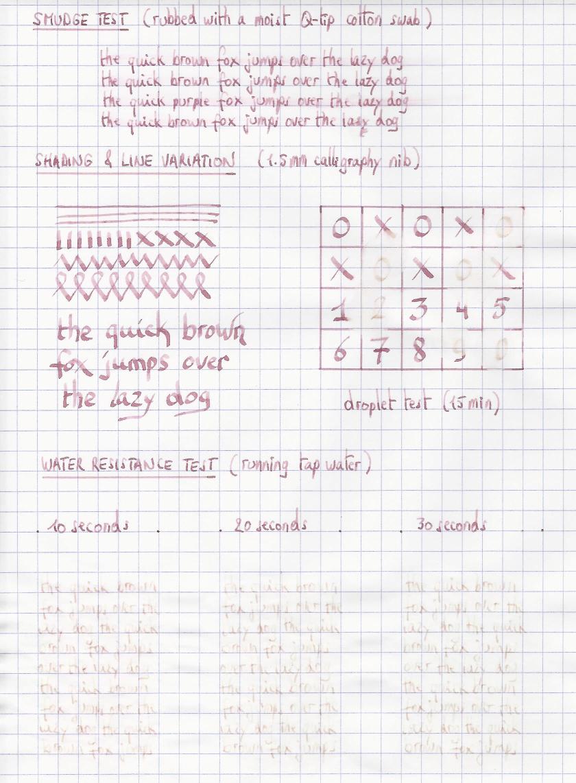
On the smudge test – rubbing text with a moist Q-tip cotton swab – Bordeaux behaved very well, with limited smearing and without impacting readability of the text, which remains crisp and clear. Water resistance is almost totally absent though. Both still and running water quickly obliterate all colour, leaving only a faint brownish ghost image on the page, which is barely decipherable.

I’ve tested the ink on a wide variety of paper – from crappy Moleskine to high-end Tomoe River. For the Callifolio reviews, I’m using small strips to show you the ink’s appearance and behaviour on different paper types. On every band of paper I show you:
- An ink swab, made with a cotton Q-tip
- 1-2-3 pass swab, to show increasing saturation
- An ink scribble made with an M-nib fountain pen
- The name of the paper used, written with a B-nib
- A small text sample, written with an M-nib
- Drying times of the ink on the paper (with the M-nib)
Bordeaux behaved perfectly on all the paper types, with no apparent feathering even on the lower quality papers in my test set. Only with the infamous Moleskine paper, a tiny bit of feathering is present. Drying times are mostly around the 10 second mark, making it a fast drying ink. Not really suited for lefties though, because it lays down a rather wet line, albeit one that dries relatively fast. The ink looks at its best on pure white paper. On more yellowish paper, I quite dislike the colour. Overall, the ink fails to impress me… it looks too much like writing with wine, leaving low saturated wine stains on the paper.


Writing with different nib sizes
The picture below shows the effect of nib sizes on the writing. All samples were written with a Lamy Safari, which is typically a dry pen. I also added a wet visiting pen – a Pelikan M101N Lizard with M-nib. This pen shows a much more saturated line, but loses most of the shading.

Related inks
I have recently changed my format for presenting related inks to a nine-grid format, with the currently reviewed ink at the centre. The new format shows the name of related inks, a saturation sample, a 1-2-3 swab and a water resistance test – all in a very compact format. I hope that you’ll find this way of presenting related inks more useful. It’s a bit more work, but in my opinion worth the effort for the extra information you gain.

Conclusion
Bordeaux from L’Artisan Pastellier is a wine-coloured purple ink with low saturation. I find this to be a rather dull ink, without much character. Technically, the ink worked fine with all the papers in my test set, albeit with sub-par lubrication. Overall, not an ink I’m impressed with. I like the wine a lot better!
Technical test results on Rhodia N° 16 notepad paper, written with Lamy Safari, M-nib
Backside of writing samples on different paper types


See also: inkxperiment : L’Artisan Pastellier Callifolio Bordeaux
[First published on the Fountain Pen Network, on 04 February 2019]
