TACCIA is a Japanese stationery company, that – as far as I know – is now part of the Nakabayashi group. They offer high-quality fountain pens, inks, pen-rolls, notebooks, etc. More specifically, TACCIA produce a line of inks, inspired by the unique look of Ukiyo-e paintings from Japan’s Edo period (17th century). Ukiyo-e prints are woodblock prints where the work of an artist is carved into wood by woodworkers, and pressed onto paper by printers. This allows the production of multiple prints of an artwork with some different colours as well.
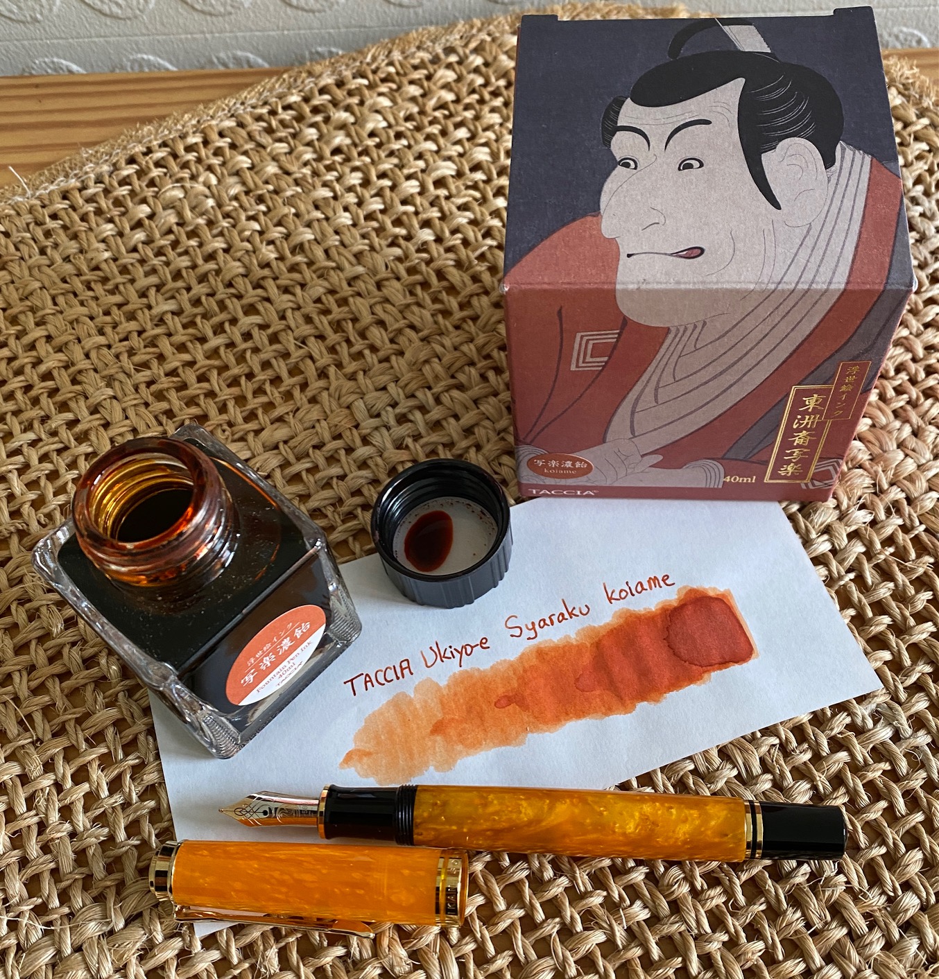
In this review, the spotlight shines on koiame, a dusty reddish orange ink that is inspired by the work of Syaraku (Sharaku), an artist that is best known for his iconic portraits of kabuki actors. Inspiration for this colour comes from the portrait of Ichikawa Ebizo IV, playing as Takemura Sadanoshin. In June 1794 at the Kawarazaki Theater, this Kabuki actor portrayed a father who commits suicide after being disgraced by his daughter who has had a child out of wedlock. The intense expression of the mouth and eyes demonstrates the conventional pose used by actors to show heightened emotion. Koiame’s burnt-orange is modelled after the colour of the actor’s kimono.
Koiame is a beautiful deep burnt orange, that writes a wet & saturated line. This ink works well with all nib sizes, even the finest ones. It is a strong-shading ink, even in the EF nib, but with a smooth gradient that is easy on the eye and aesthetically very pleasing. The expression you get on the page is simply wonderful – the shading on this ink really is exceptionally well done. Bravo! I also like the dustiness of this orange, which makes for a tranquil look on the page. The ink comes in a 40 ml bottle, that is packaged in a beautiful box showing the corresponding Ukiyo-e painting. Lovely packaging for an excellent ink.
To show you the impact of saturation on the ink’s look & feel on paper, I made some scribbles where I really saturated portions of a strip of 52 gsm Tomoe River paper with ink. This gives you a good idea of what the ink is capable of in terms of colour range. Koiame has a medium dynamic range, without too much contrast between the light and darker parts. This translates to excellent shading qualities: a strong-shading ink with a smooth gradient from light to darker parts. Shading is most obvious in wider nibs, but you already get some with the EF nib, which is quite impressive. The aesthetics are superb, and add tons of character to your writing.

The ink’s chromatography shows an amazing complexity, with grey, brown, orange, yellow and even some rose-purple in the mix. Not at all what I expected from this orange colour. These complex undertones also surface in the writing. It’s clearly a dusty burnt-orange, but in saturated writing those hints of rose-purple do shine through. This phenomenon is lost in the scans, but clearly visible when looking at the writing in person. This koiame ink is really well put together – congrats to TACCIA’s ink makers Hiroshi Ishiguro and Hanse Matsumoto for their craftsmanship.

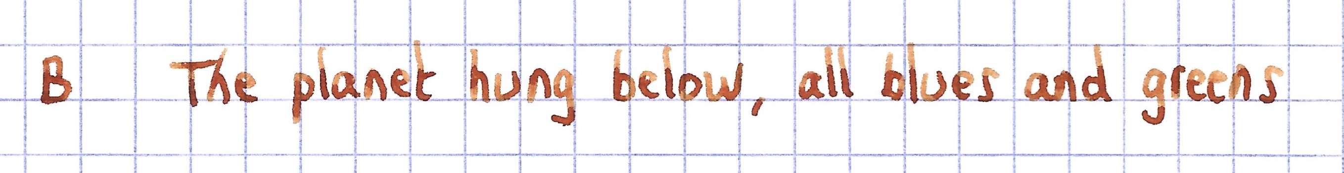
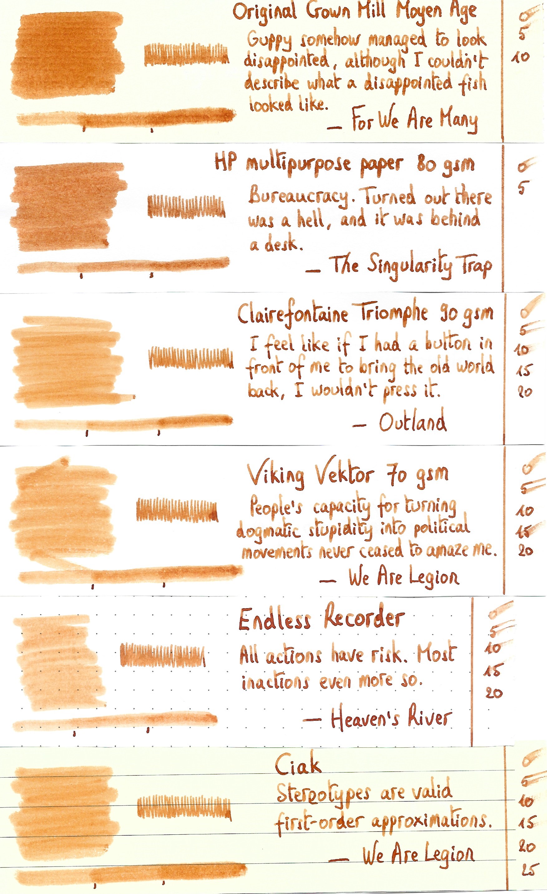
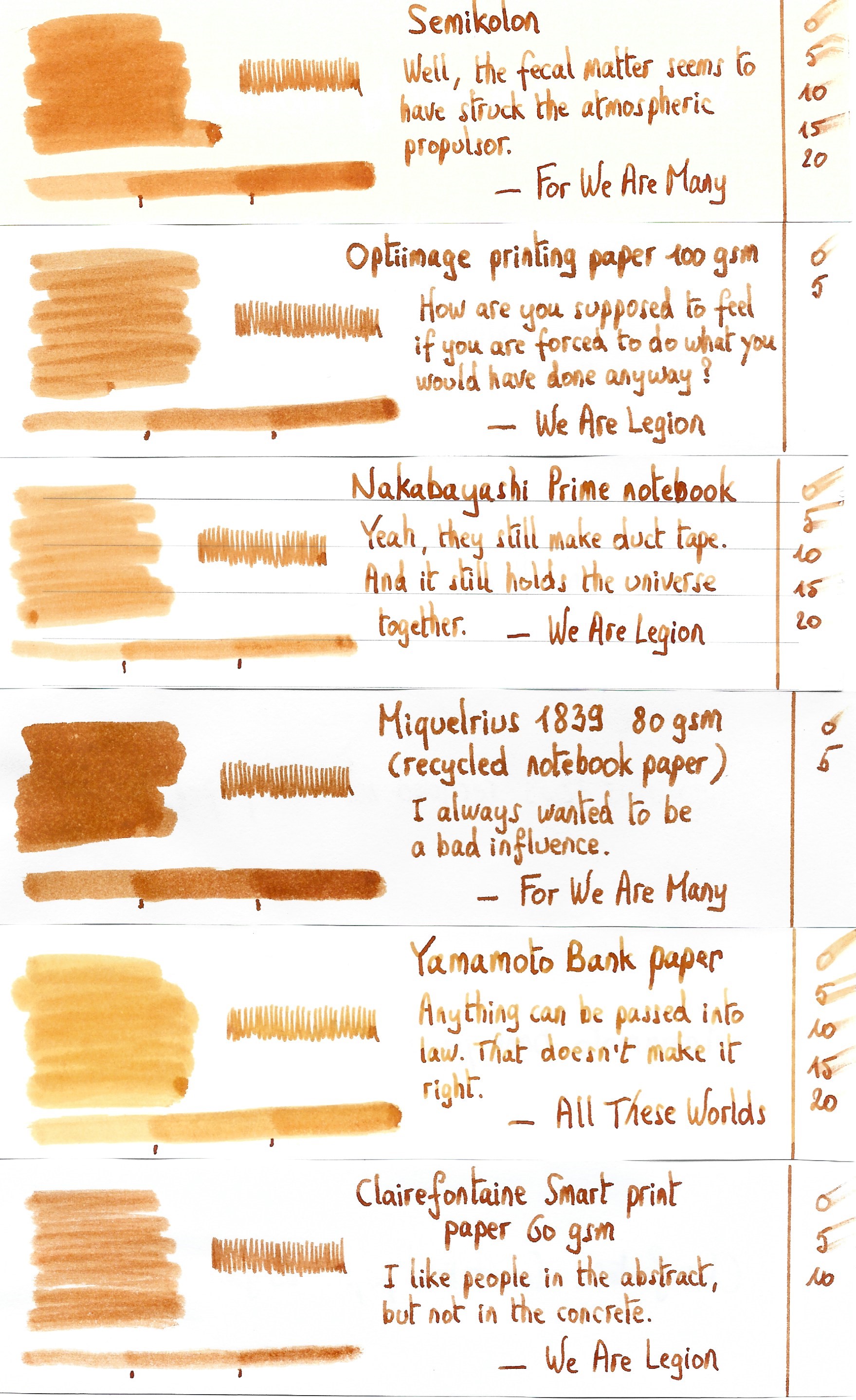
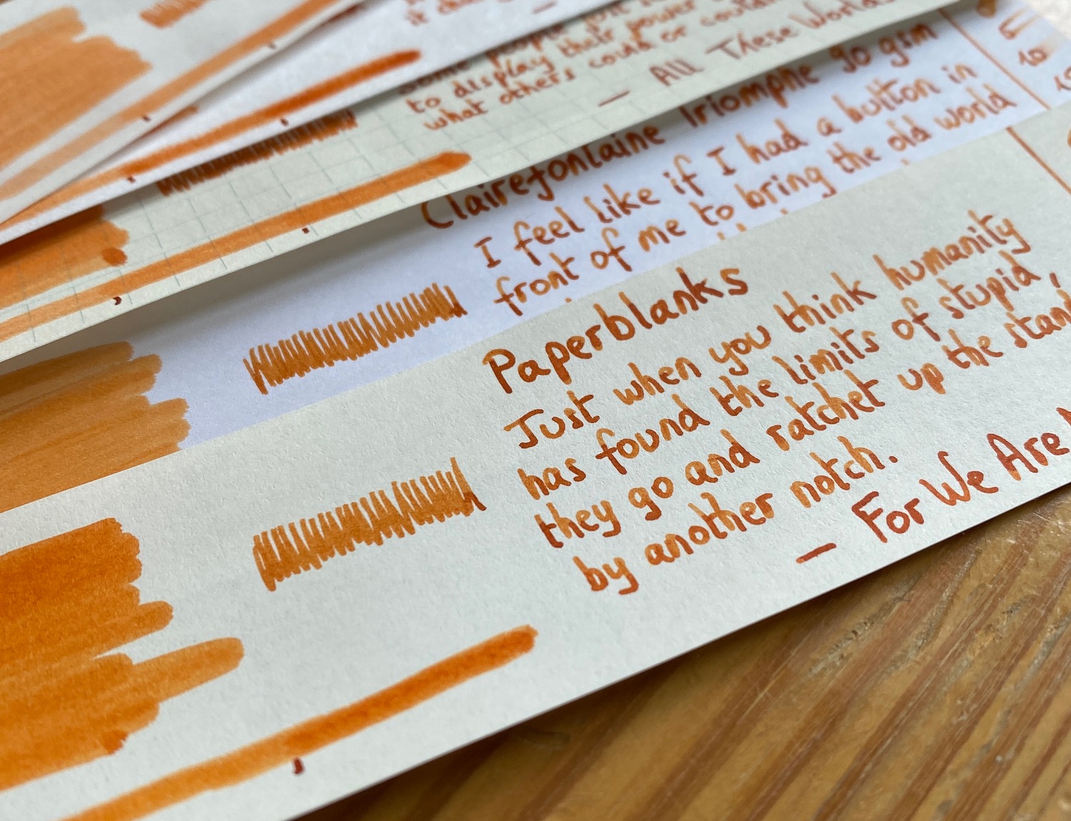
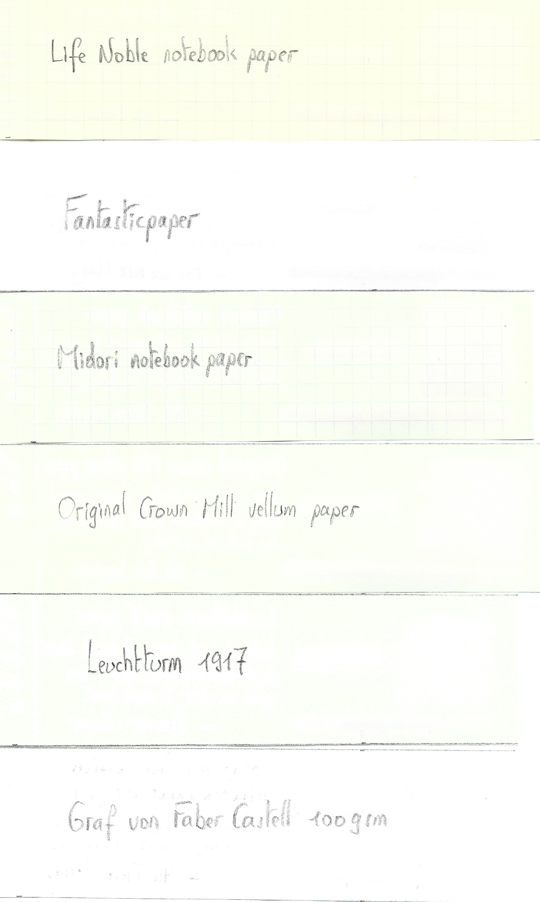
I’ve tested the ink on a wide variety of paper – from crappy Moleskine to high-end Tomoe River. On every small band of paper I show you:
- An ink swab, made with a cotton Q-tip
- 1-2-3 pass swab, to show increasing saturation
- An ink scribble made with an M-nib Lamy Safari
- The name of the paper used, written with a B-nib Lamy Safari
- A small text sample, written with the M-nib Safari
- Source of the quote, written with a Pelikan M600 F-nib
- Drying times of the ink on the paper (with the M-nib Safari)
Koiame looks good on all types of paper, but I personally like it best on the more cream-coloured variety. No feathering in general, just a teeny tiny bit on Moleskine. The ink lays down a wet line, and dries very slowly. With the M-nib Safari even up to 20-25 seconds on hard-surfaced paper. With more absorbent paper, drying times were very reasonable (5-10 second range). With low-quality paper, expect to see quite some show-through and even a bit of bleed-through.


I’ve also added a few photos to give you another view on the ink. Scanned images and photos often capture different aspects of the ink’s colour & contrast. That’s why I present them both. In this case, scan & photo are very close-matched.

Writing with different nib sizes
The picture below shows the effect of nib sizes on the writing. The EF-nib already shows the shading that the ink is capable of. But it’s with the broader nibs that koiame’s gorgeous shading really comes to play. This aesthetically very pleasing shading undoubtedly is this ink’s strong point. With wetter pens/nibs, the ink’s rose-purple undertones come to the surface (an effect that is lost in the scans), resulting in a more red-leaning orange colour.

Related inks
To compare koiame with related inks, I use my nine-grid format with the currently reviewed ink at the center. This format shows the name of related inks, a saturation sample, a 1-2-3 swab and a water resistance test – all in a very compact format. Koiame reminds me of Pelikan Edelstein Mandarin, but a bit more dusty of character and certainly not as dry as the Edelstein ink.

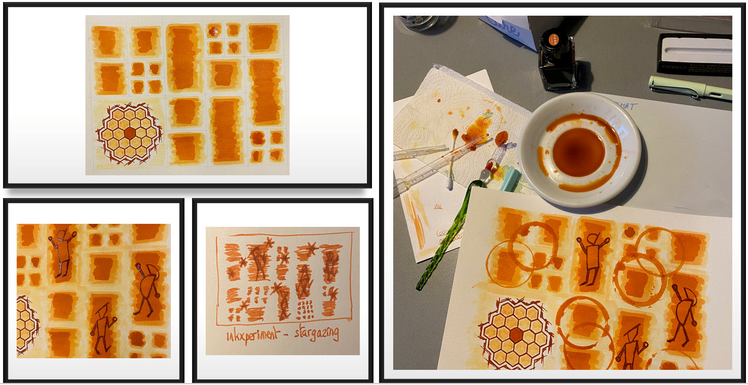
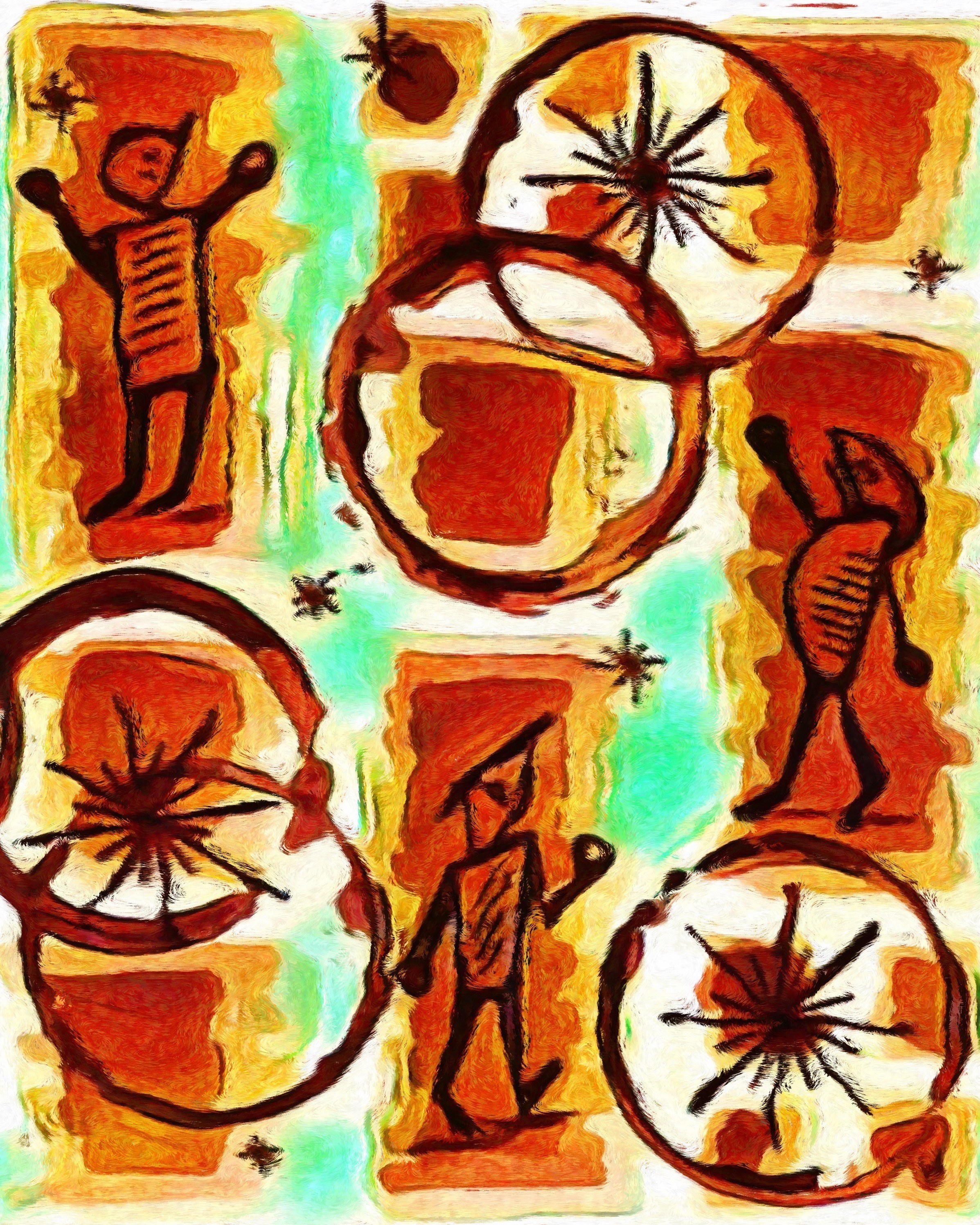
Inkxperiment – stargazer
With every review, I try to create an inkxperiment using only the ink I am reviewing. These one-ink drawings are excellent pieces for showing the colour-range nuances that can be achieved with the ink. And it’s always great fun to experiment with inks in a more artsy context – for me it’s one of the more enjoyable moments during the making of a review.
Inspiration for this inkxperiment comes from the James Webb Space Telescope, that is undergoing calibration right now, and will become fully operational in the coming months. Really exciting stuff for science nerds like myself. I’m looking forward to the first real pictures from this wonderful instrument. The array in the bottom-left corner of the drawing is taken from the actual mirror configuration of the telescope – 18 hexagonal segments that combine to create a gigantic 6.5 meter primary mirror.

For this drawing, I started with a piece of 300 gsm watercolour paper, on which I painted the background: some squares and rectangles drawn in with Q-tips using multiple water/ink ratios. I used my B-nib Safari to draw the mirror segment outlines, filling them using a felt-tip pen dipped in water-diluted ink. Next, I used a glass dip pen to draw in the stargazer stick figures, and stamped in the circles with the bottom of a jar, dipped in ink. Final details were added with the glass pen dipped in pure ink. Koiame is a great drawing ink with a good range of colour tones – I liked using it. The final picture gives you an idea of what can be achieved with this TACCIA ink in a more artsy context.
Inkxpired – computational art
I love experimenting with pen/ink/paper, and am now adding another layer as part of the hobby. I’m exploring computational art, inspired by the ink drawings I do during ink reviews. Another fun offshoot of the hobby… and all that starting with a few drops of dye-coloured water on paper.
Conclusion
TACCIA Ukiyo-e Syaraku koiame is a gorgeous-looking burnt-orange. But the real strong point of this ink is its amazing shading capacity – very well done! The one downside of koiame are the long drying times, especially on hard-surfaced paper. But this I can tolerate for the beauty I get in return. Another nice ink from TACCIA, and one well worth exploring.
Technical test results on Rhodia N° 16 notepad paper, written with Lamy Safari, M-nib

Back-side of writing samples on different paper types


[Originally published on the Fountain Pen Network, on 03 April 2022]
