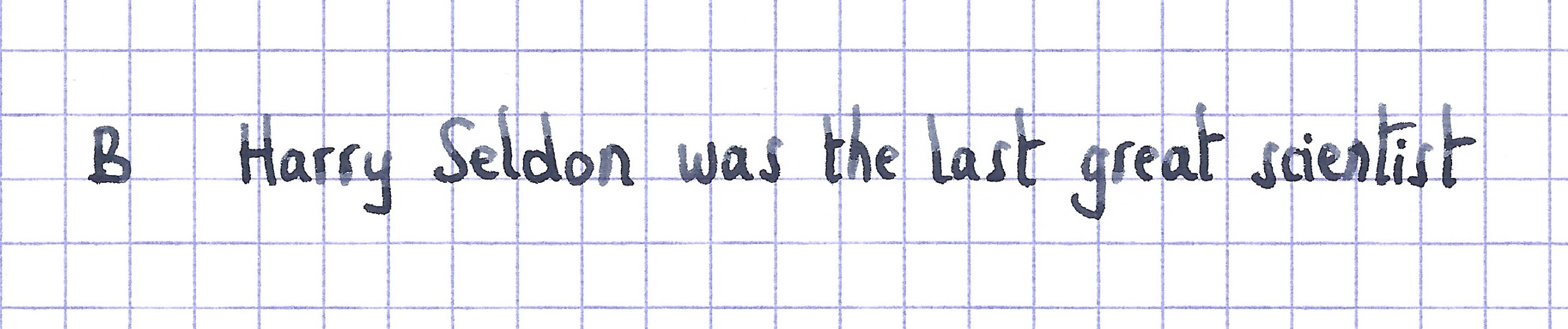
The ink maker from Liverpool is one of the staple brands in ink-land. They consistently produce solid inks for a very reasonable price. In 2017, Diamine teamed up with the Reddit community to produce a special-edition ink — Earl Grey. This ink colour was chosen by the members of the r/fountainpens group, a wonderful Reddit community of fountain pen enthusiasts.

LizEF’s EFNIR review on the Fountain Pen Network mentioned in the comments that the ink’s colour doesn’t look anything like the tea. Well… this triggered me to do my own examination. In writing, this Diamine ink lays down a dark grey line, slightly purple-leaning. There’s indeed nothing there that resembles the tea. But… if you look at the ink’s chromatography, you’ll discover some unexpected complexity: there’s a lot going on here… grey, purple, cyan-blue, green… a whole kaleidoscope of colours. And these colours do reappear when you look at dry Earl Grey tea, which also shows a dark shimmer of these same colours. For me, that’s good enough to approve the choice of this ink’s name.
Diamine Earl Grey writes wet and well saturated. While writing, there is a green tinge to the ink, which disappears when the ink dries, leaving a dark grey line. Saturation is very good — this ink can easily be used with the whole nib range, from EF to B and beyond. But I also noticed some technical issues: Earl Grey has a tendency to feather and bleed on quite a number of papers, mainly the cheaper ones. With high-quality and/or hard-surface paper, the ink works really well. It’s on the more absorbent paper that I noticed some real problems. Furthermore, for some reason, this ink loves to stain my fingers. Every time I opened the bottle, I got ink on my hands — even when I was extra careful. Not sure why…

To illustrate the colour span of this Diamine ink, I did a swab on 52 gsm Tomoe River paper, where I really saturated portions of the paper with ink. Earl Grey has a fairly narrow colour span, without much contrast between the light and darker parts. This translates to soft shading when writing. Shading is prominently there, starting with F nibs and above. Due to the narrow colour range, it never gets harsh — exactly the way I like it.

On the smudge test — rubbing text with a moist Q-tip cotton swab — the ink behaved perfectly, with very limited smearing. Water resistance is totally absent though — both with still and running water. With Earl Grey, you cannot survive watery accidents. This is also apparent from the lower part of the chromatography — almost no dyes remain attached to the paper. As such, not a good ink to use at the office. A pity because the ink’s colour and saturation would translate well to a work environment. The chroma clearly shows the complexity of the dye mix. Who would have guessed that this combination of dyes translates to a dark grey colour?
I’ve tested the ink on a wide variety of paper — from crappy Moleskine to high-end Tomoe River. On each scrap of paper, I show you:
- An ink swab, made with a cotton Q-tip
- 1-2-3 pass swab, to show increasing saturation
- An ink scribble made with a Lamy Safari M-nib fountain pen
- The name of the paper used, written with a Lamy Safari B-nib
- A small text sample, written with the Lamy Safari M-nib
- Source of the quote, written with a Pelikan M405 Stresemann with cursive italic F-nib
- Drying times of the ink on the paper (with the M-nib Safari)
The multi-paper writing test shows Earl Grey’s biggest weakness. This ink only works well with certain types of paper. You really need hard-surface paper for best results. Otherwise, you will get some feathering and show-through/bleed-through. This Diamine ink definitely won’t cooperate with the cheaper copy paper you find at the office! Earl Grey is a bit snobbish — with a definite preference for high-quality paper. Drying times for this ink are in the 5-10 second range with a Lamy Safari M-nib.


Because scans don’t always capture an ink’s colour and contrast with good precision, I also add a few photos to give you an alternative look on this Diamine ink.


Writing with different nib sizes
The picture below shows the effect of nib sizes on the writing (written on Rhodia N°16 80 gsm paper). All samples were written with a Lamy Safari. I also added a visiting pen: a Pelikan M405 Stresemann with a nice cursive-italic F-nib. On the hard-surfaced Rhodia paper, Earl Grey looks really nice, and can handle all nib sizes without a problem. Shading is hinted at with the EF-nib, but is definitely present with F-nibs and above.

Related inks
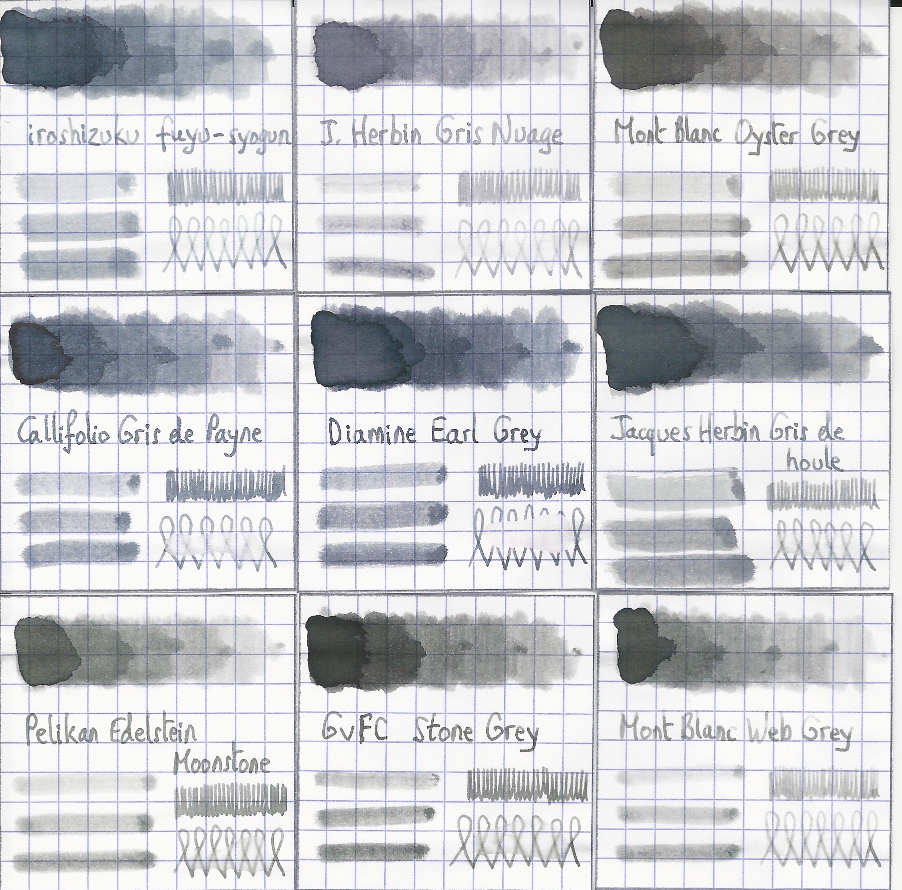
To compare Diamine Earl Grey with related inks, I use my nine-grid format, with the currently reviewed ink at the centre. This format shows the name of related inks, a saturation sample, a 1-2-3 swab and a water resistance test — all in a very compact format. Earl Grey is a bit on the blue-purple side, and looks like a slightly more saturated version of Callifolio Gris de Payne.
Inkxperiment — Wheel of Time
As a personal challenge, I try to create interesting drawings using only the ink I’m reviewing. I find this to be a fun extension of the hobby, and these single-ink drawings often present a real challenge. These inkxperiments allow me to explore the colour-range nuances that are present in the ink. I love doing them!
Inspiration for this drawing comes from the cycle of life. While recently playing with the 3 and 5-year-old youngest members in the family, I couldn’t help but notice two things: 1/ their world is huge and full of wonder — a trip to the playground is an adventure, the small cluster of trees at the end of the garden a strange and unexplored continent. And 2/ — time is stretched out for a child — when you are constantly discovering new things and experiences, hours can seem like days. While growing older, a subtle change takes place, and spacetime seems to shrink: your world appears to grow smaller, and time has a tendency to fly… I tried to capture these aspects in Earl Grey’s inkxperiment.
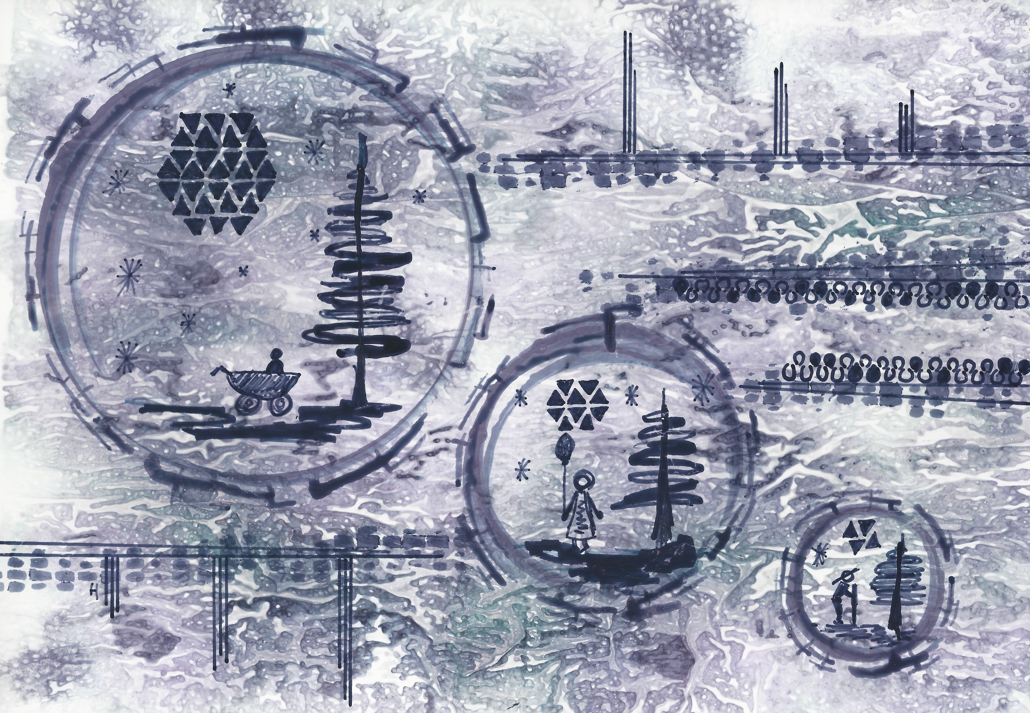
I started with an A4 piece of HP photo paper. I covered the paper with a kitchen towel, and dripped some water-diluted Earl Grey on it. The ink separated in its component dyes, that colour the underlying photo paper. This produced a really nice background, with grey, purple, and green colour tints. Quite surprising… I had expected a greyish background, not the kaleidoscope of colours that you can see. I next used different sized glass jars to stamp in the life circles. The scenes in the circles and the background details were painted in with a combination of B-nibbed fountain pen and glass dip pen. The end result gives you a good idea of the colour range that can be achieved when using Earl Grey in a more artistic context. An interesting ink to draw with!

Conclusion
Diamine Earl Grey looks like a fairly standard dark grey when writing. The ink definitely prefers high-quality paper, and doesn’t tolerate the cheaper papers in my test set. With the right paper, Earl Grey is a pleasure to use, writing wet and nicely saturated, and working well with all nib-sizes. But it’s when using this ink for drawing that the magic happens: Earl Grey contains within a kaleidoscope of colours that simply don’t surface in everyday writing. An unexpected pleasure that — for me — lifts this dark grey above the crowd.
Technical test results on Rhodia N° 16 notepad paper, written with Lamy Safari, M-nib

Backside of writing samples on different paper types


[Originally published on the Fountain Pen Network, on 11 July 2021]
