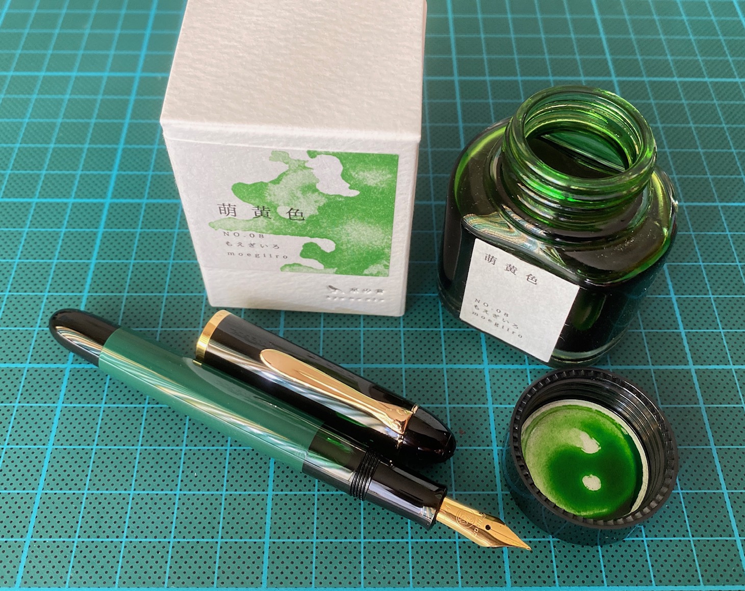
TAG is a stationary shop in Kyoto (Japan) that produces some interesting soft watercolour-style inks. With the kyo-no-oto series they produce a line of inks that replicates traditional Japanese dye colours. According to available only info, the manufacturing process of the kyo-no-oto inks follows traditional dying techniques dating back to the Heian era between the years 794 and 1185. The inks come in 40 ml bottles, packaged in luxurious thick paper with a texture that feels like heavy watercolour paper.
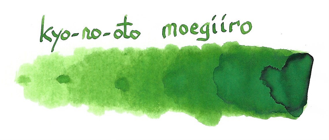
In this review I take a closer look at moegiiro. This is a great-looking yellow-green ink, beautiful colour and shading, well-saturated in all nib sizes and on top of that… a happy colour that makes you almost smell the fresh sprouting leaves on spring trees. I guess you can already feel that I’m smitten with this ink 😉
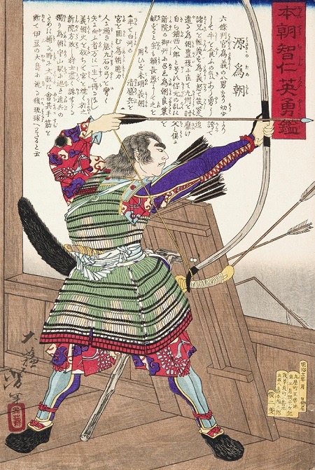
Inspiration for this ink’s colour comes from fresh green sprouts in early spring: the Japanese word moegiiro derives from the words “moe” (to sprout) and “negi” (onion). During the Heian era, this fresh yellow-green colour was particularly fashionable as the colour of youngsters. In the tales of Heike, the famous kyudo (Japanese archery) master Nasuno Yoichi wears armour painted in the moegiiro colour as a symbol for the young warrior.
The ink writes with good lubrication in my Safari test pens, not at all dry like some other kyo-no-oto inks. The colour is simply wonderful … I personally like yellow-greens a lot: fresh looking, spring feeling, happy, feel-good. This moegiiro ticks all my boxes, and I immediately took a liking to it. A prime candidate for my 2020 top 3 of inks. I’ve tried a number of TAG Kyoto inks to date, and love them all. These inks totally fit my tastes. I’m so glad I tried them.
The ink feels at home with a broad spectrum of pens, nibs and paper. It writes with good lubrication, even with dry pens like my Safari. The line it produces is nicely saturated, even with fine nibs. Shading is great, without too much contrast between the light and darker parts – just as I like it. And this elegant shading is even present in finer nibs!
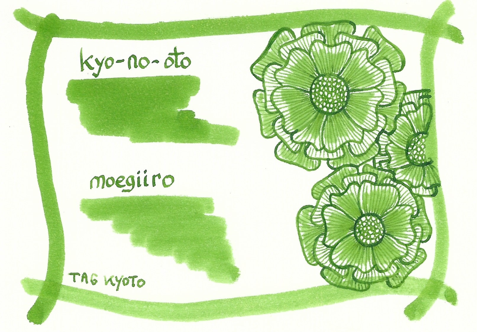
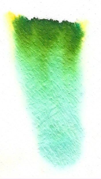
To show you the impact of saturation on the ink’s look & feel on paper, I made some scribbles where I really saturated portions of the Tomoe River paper with ink. This gives you a good idea of what the ink is capable of in terms of colour range. As you can see, moegiiro has a medium colour range. The ink moves from a light yellow-green to a much darker light-green, without a sharp contrast between these extremes. In writing, this translates to subtle shading which is aesthetically very pleasing.
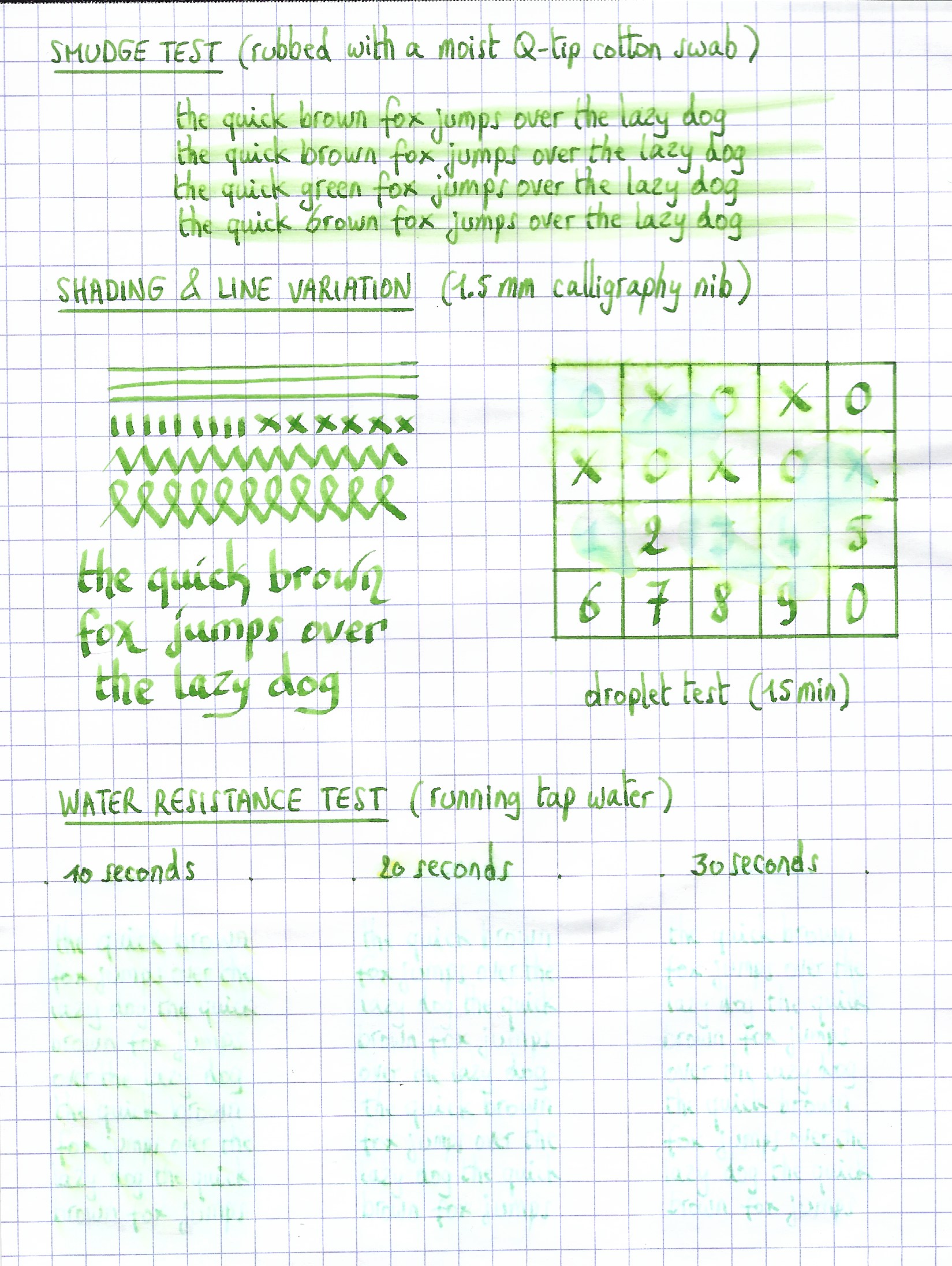
The ink’s chromatography shows a wonderful complexity with light-blue, yellow and the resulting light-green in the mix. The light-blue dyes fix more readily to the paper, while the yellow dyes are much less water-resistant. The bottom part of the chromatography seems to indicate a small measure of water-resistance. In practice, a very faint light-blue ghost of your writing remains when the ink comes into contact with water. It can still be read when you put some effort to it, but this is definitely not a water-resistant ink.
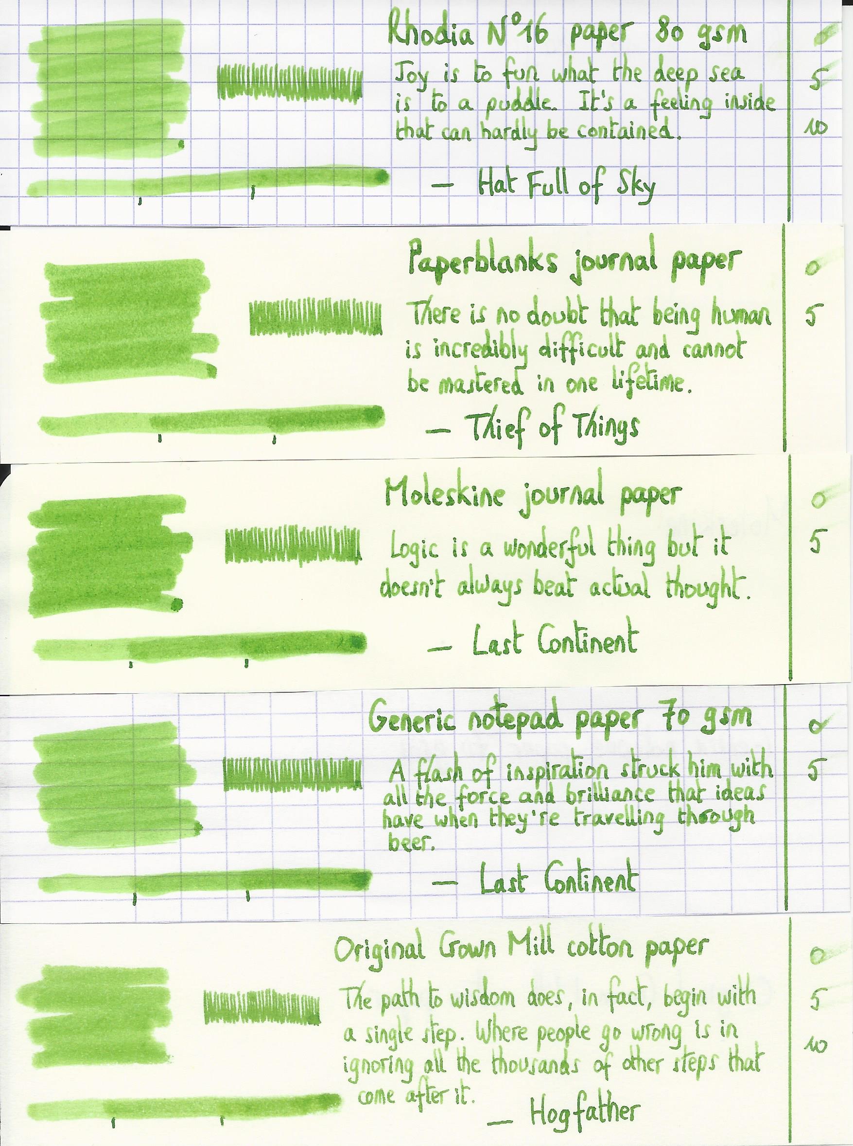
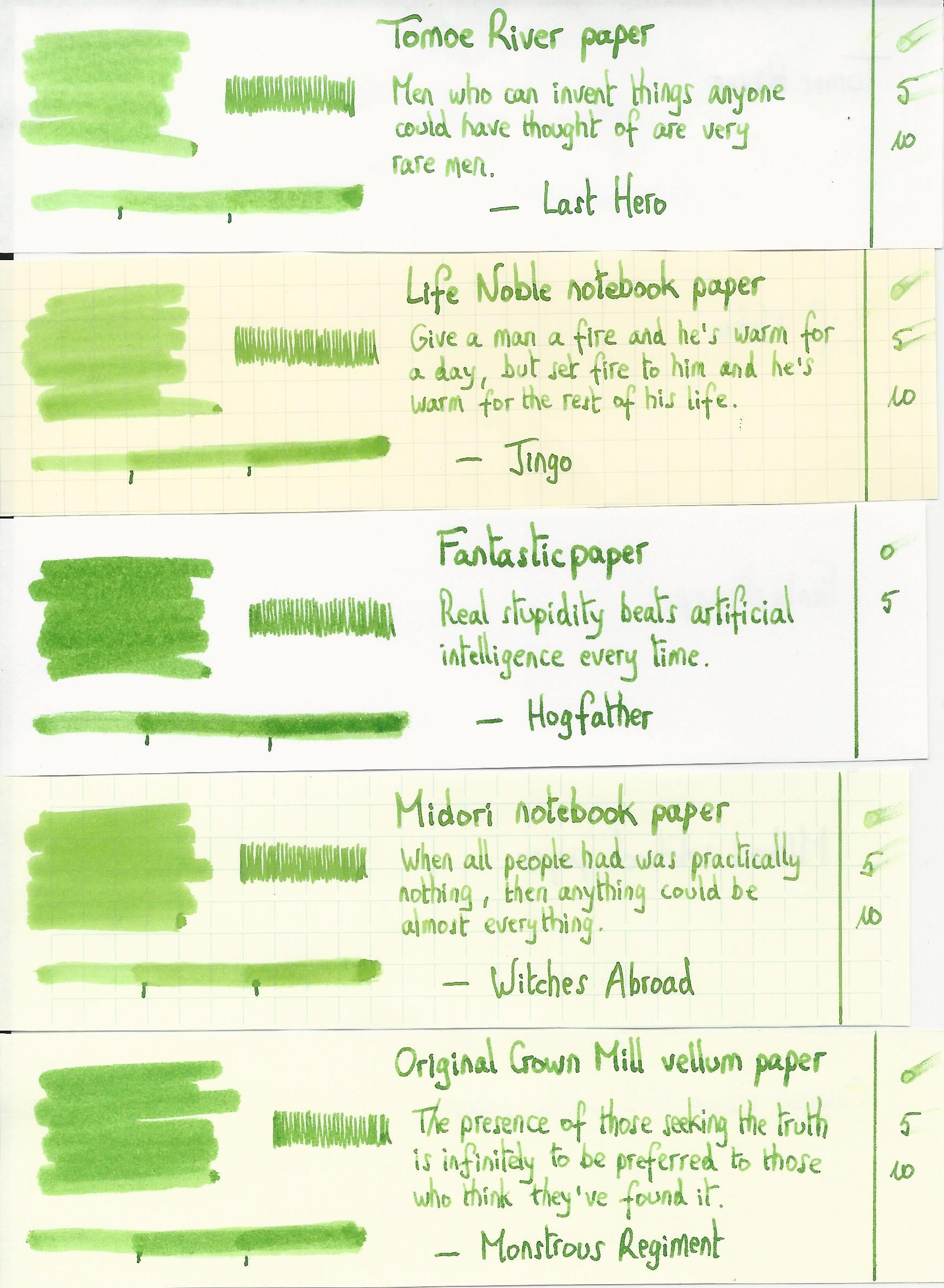
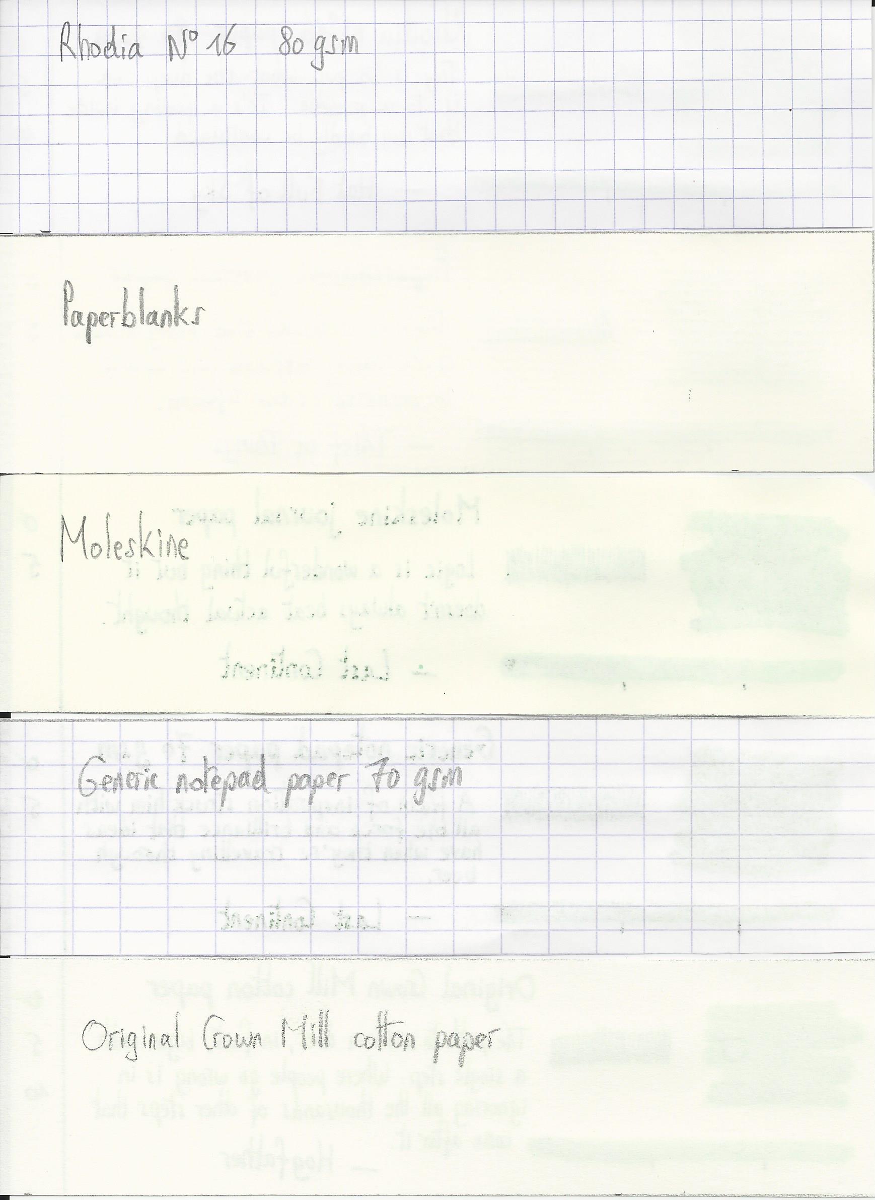
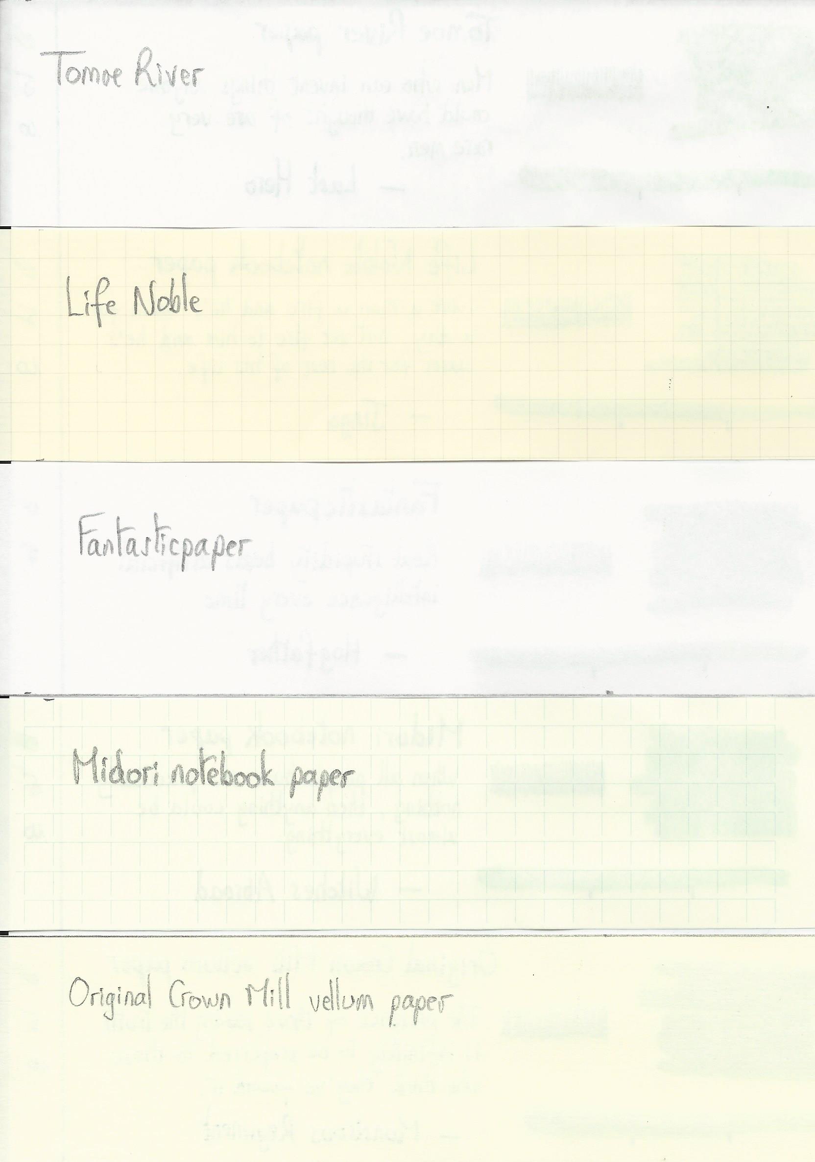
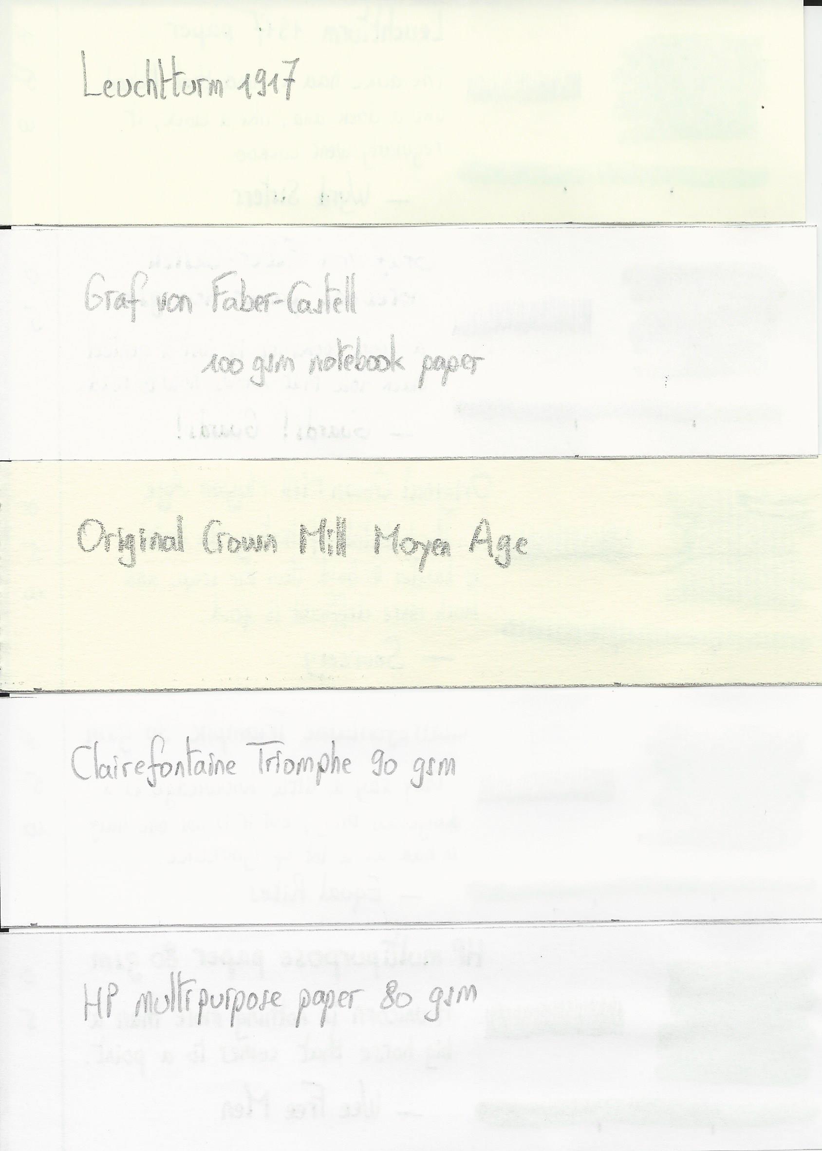
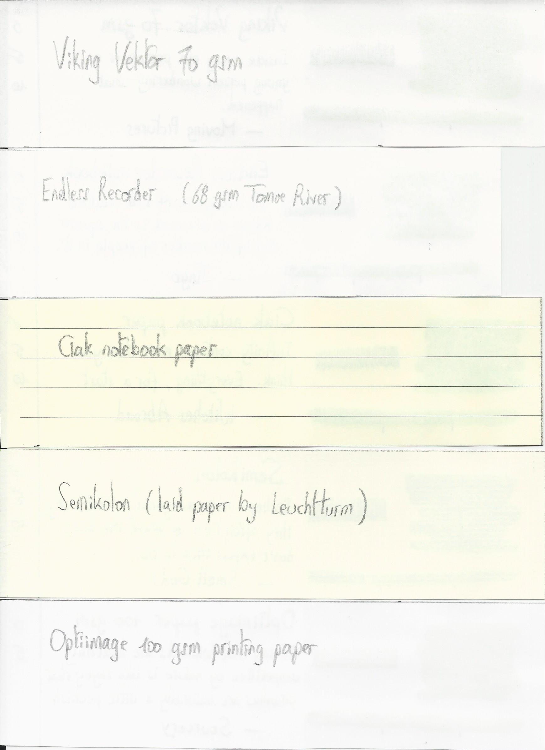
I have tested the ink on a wide variety of paper – from crappy Moleskine to high-end Tomoe River. On every small band of paper I show you:
- An ink swab, made with a cotton Q-tip
- 1-2-3 pass swab, to show increasing saturation
- An ink scribble made with an M-nib Lamy Safari
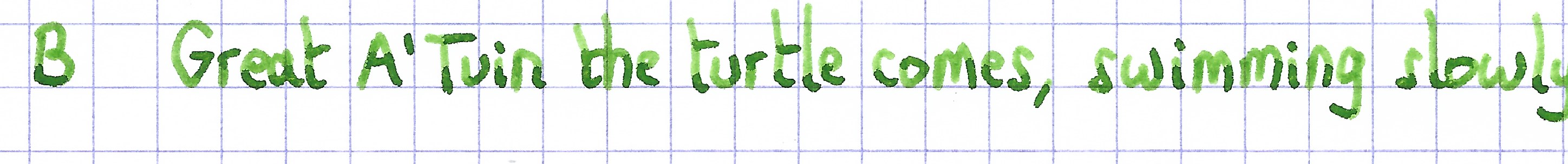
- The name of the paper used, written with a B-nib Lamy Safari
- A small text sample, written with the M-nib Safari
- Source of the quote, with a Pelikan M120 with F nib
- Drying times of the ink on the paper (with the M-nib Safari)
Moegiiro looks great on all my test papers, with no visible feathering. With the lower-quality papers there is some bleed-through present. Drying times were mostly just above the 5 second mark with the Lamy Safari M-nib. The ink looks great on both white and more yellow paper, and behaves well across all my test papers.
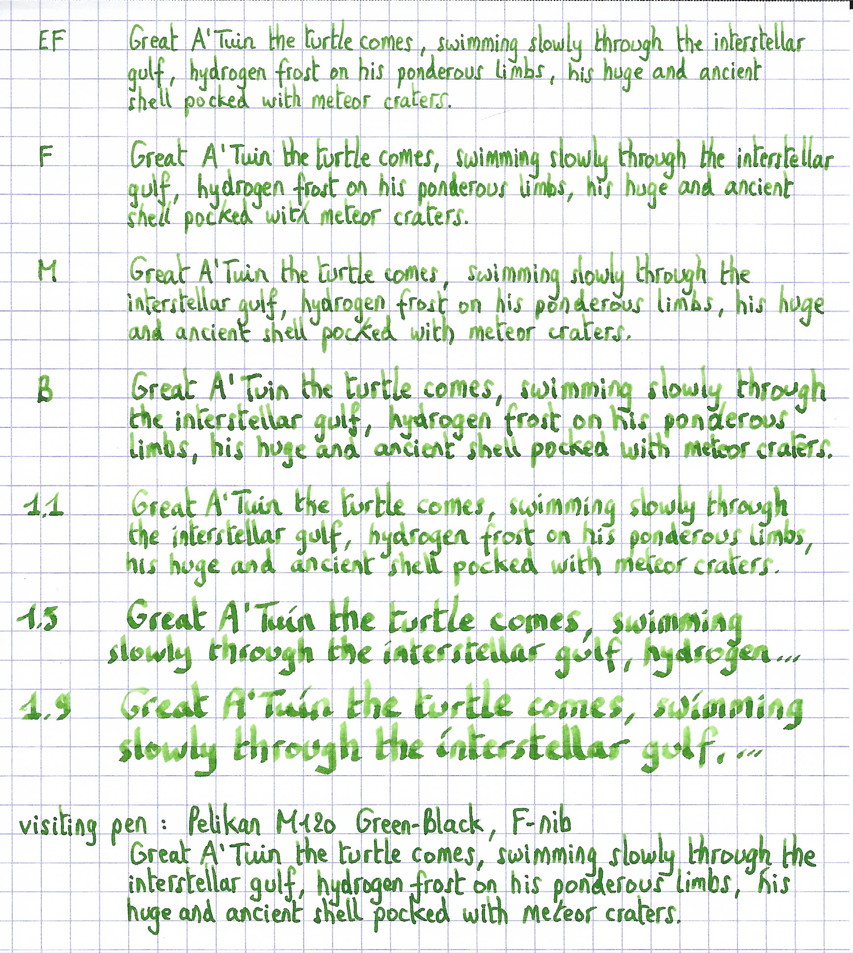
Writing with different nib sizes
The picture below shows the effect of nib sizes on the writing. Kyo-no-oto moegiiro can handle all nib sizes without a problem. With the EF nib, you still get a nicely saturated line with even a touch of just-visible shading. Shading is elegantly present starting with the F-nib, and looks beautiful in broader nibs. Because of moegiiro’s medium colour span, shading is never harsh and looks very eye-pleasing.
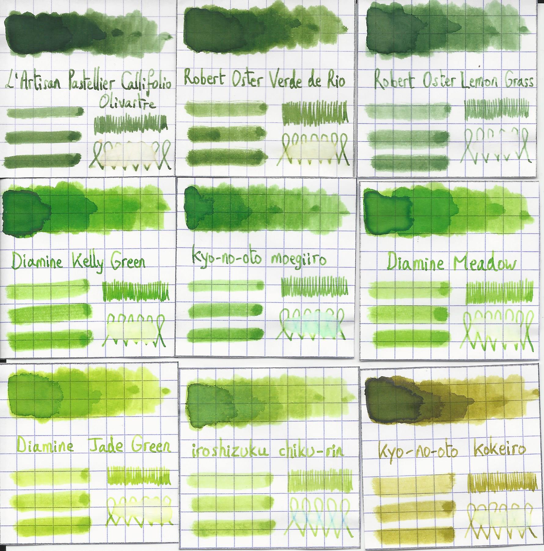
Related inks
To compare the yellow-green moegiiro with related inks, I use my nine-grid format with the currently reviewed ink at the centre. This format shows the name of related inks, a saturation sample, a 1-2-3 swab and a water resistance test – all in a very compact format. This kyo-no-oto ink is different from my other light greens, although Diamine Kelly Green and Meadow come close (the Diamine inks have a touch more yellow in them than this TAG Kyoto ink).
Inkxperiment – the Ellcrys
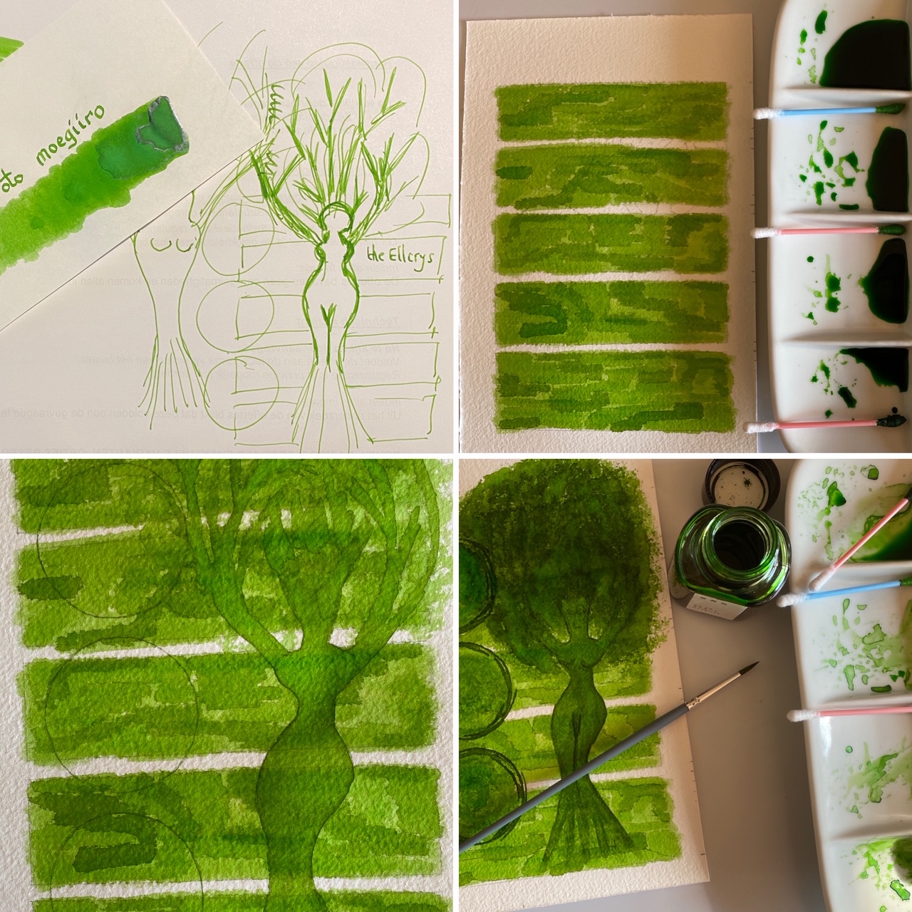
With every review, I try to create an inkxperiment using only the ink I’m working on. Such a one-ink drawing is a great way to show off the colour-range nuances that are present in the ink. These inkxperiments are the favourite part of my reviews: always great fun and a good way to stretch my creativity and drawing skills.
The yellow-green freshness of moegiiro is reflected by the springtime leaves on the trees outside my window. This inspired me to use a tree as the subject of this inkxperiment. I love the Shannara fantasy novels of Terry Brooks. In the “Elfstones of Shanarra” the Elven princess Amberle Elessedil melts with the Elcryss – the magic sapient tree that protects the border with the Forbidding where the demons reside.
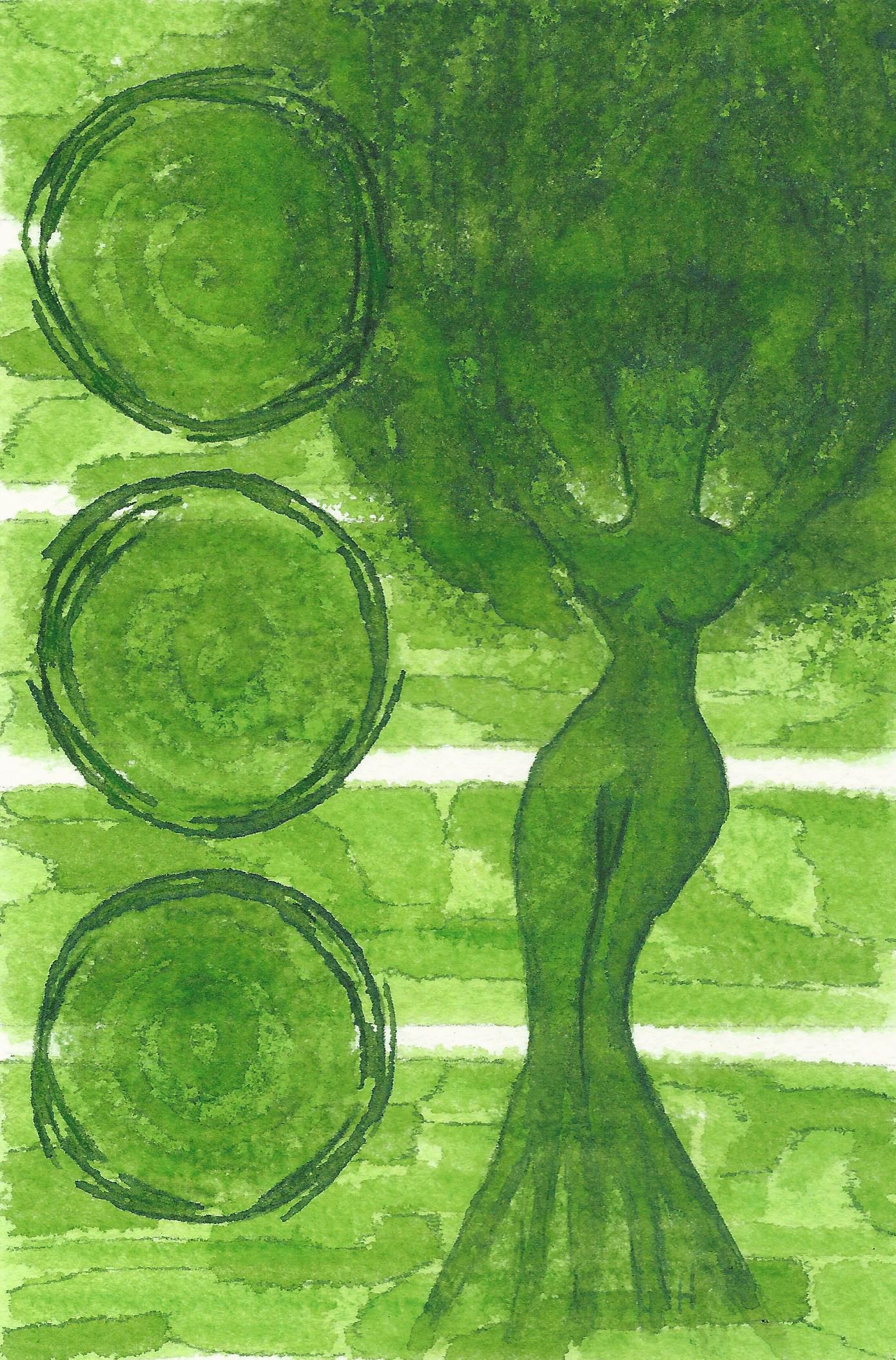
I started with a quick outline sketch of the drawing I wanted to make. I then used a piece of 300 gsm rough watercolour paper, on which I drew a background with Q-tips using water-diluted ink in a number of different ratios. Next I drew in the Ellcrys tree with my Safari M-nib fountain pen. The three circles represent the three incarnations of the Ellcrys. The first Ellcrys was born of Aleia Omarosian, the second Ellcrys arose with Amberle Elessedil, and the third incarnation appears in the NexFlix Shannara Chronicles when Arlingfant Elessedil merges with it. The foliage of the tree was stamped in with a piece of dishwashing sponge and different water/ink ratios. Final highlights were added with a brush and pure moegiiro. The resulting picture shows quite well the colour-range nuances that can be achieved with kyo-no-oto moegiiro as a drawing ink.
Conclusion
TAG kyo-no-oto moegiiro is an awesome yellow-green! A fresh happy colour that is a pleasure to write and draw with. This ink works great with any combination of pen/nib/paper: lovely fresh colour, great shading, good saturation. I really enjoyed using it. If you like yellow-greens, you owe it yourself to get a bottle of this!
Technical test results on Rhodia N° 16 notepad paper, written with Lamy Safari, M-nib
Back-side of writing samples on different paper types
[Originally published on the Fountain Pen Network, on 25 April 2020]
