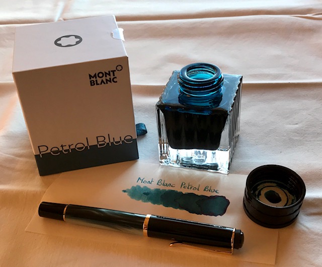
For the past few years, Mont Blanc has followed the tradition of bringing out a Limited Edition “Colour of the Year” ink. These come in a 50 ml square bottle, and are typically available for a limited time only. In this review, I take a closer look at Petrol Blue, the colour of the year 2019.

The ink’s packaging is both stylish and functional, and gives an idea of the ink’s colour. In the box you’ll find the nice square bottle, with a decent amount of ink (50 ml). Not so nice is the ink’s price point – at about 35 EUR for a bottle, this definitely is an expensive ink.
To my eye, Petrol Blue is a teal-leaning blue, and one that looks quite nice. Also well saturated – which is quite a relief after some of the more recent watered-down MB colours. I personally like teal-style colours, and this one is different enough from my other teals to make it interesting. The ink writes rather wet, even in my typically dry Lamy Safari test pens – no complaints there. The ink shades strongly… very noticeable even in finer nibs. The contrast between light and darker parts is prominent, but still aesthetically pleasing. Overall, I quite like what I see.

Petrol Blue has a rather broad dynamic colour span. To illustrate this, I did a swab on Tomoe River paper where I really saturated portions of the paper with ink. This beautifully illustrates the ink’s colour range. The ink moves from a light-blue to a very dark teal. You’ll also notice a reddish sheen in very saturated parts.

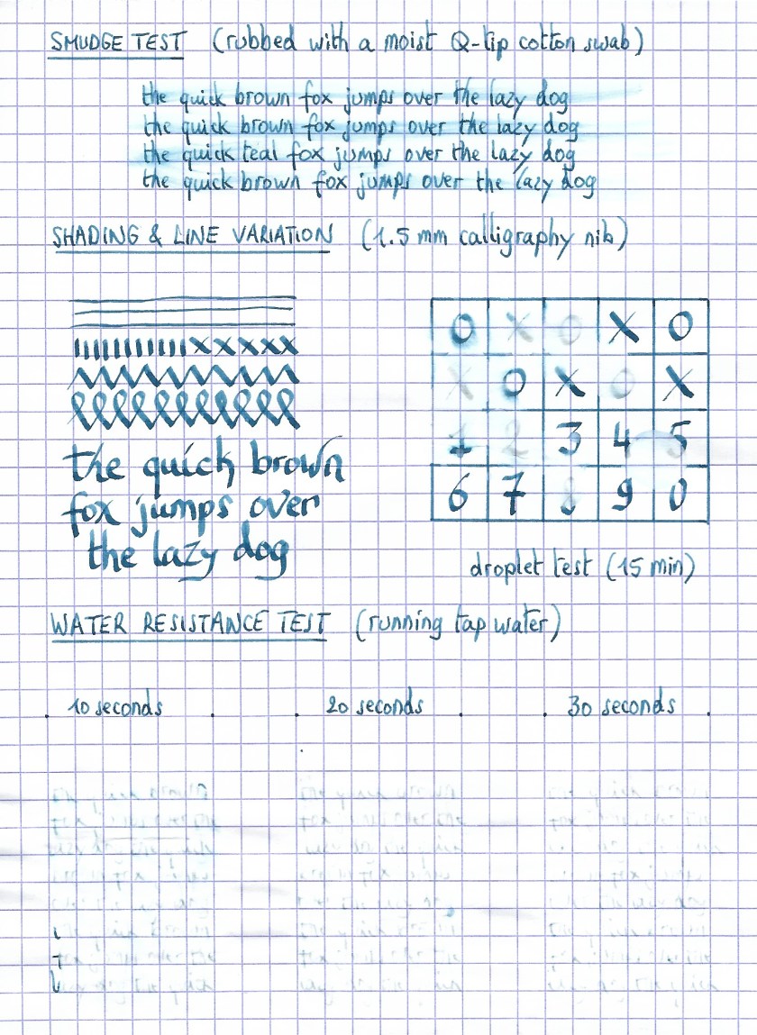
On the smudge test – rubbing text with a moist Q-tip cotton swab – the ink behaved reasonably well. There is quite some smudging, but the text itself remains perfectly readable. Water resistance is totally absent though. All colour quickly disappears from the page, leaving almost no residue. Definitely not an ink to use in the workplace. A word of warning: this ink will stain your fingers, requiring quite some scrubbing to remove it. On the positive side, I found it easy to clean from the syringe-filled cartridges that I used for my test pens.

Petrol Blue is a fast-drying ink – with typical drying times in the 5-10 second range with my Lamy Safari (M-nib). As such, this ink is also suitable for lefties (when using finer nibs).
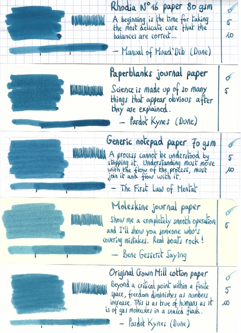
I’ve tested the ink on a wide variety of paper – from crappy Moleskine to high-end Tomoe River. I have recently expanded my paper testbed to include 20 different paper types. As such, you will get a good idea of the performance of this ink on a broad range of papers. On each scrap of paper I show you:
- An ink swab, made with a cotton Q-tip
- 1-2-3 pass swab, to show increasing saturation
- An ink scribble made with a Lamy Safari M-nib fountain pen
- The name of the paper used, written with a Lamy Safari B-nib
- A small text sample, written with an M-nib
- Drying times of the ink on the paper (with the M-nib)
This Mont Blanc ink looks really nice on all my test papers. This is an ink that looks good on any type of paper, both the white and more yellow ones. With the exception of Moleskine and the HP 80 gsm printing paper, I didn’t notice any feathering. With lower-quality paper, you get some see-through and even a bit of bleed-through. All-in-all though, this is a well-behaving ink.


Writing with different nib sizes
The picture below shows the effect of nib sizes on the writing. All samples were written with a Lamy Safari, which is typically a dry pen. I also added a visiting pen – a wet-writing Pelikan M200 Classic Green-Marbled with an F-nib. Here the ink leaves a much more saturated line, with somewhat less pronounced shading. The ink works well with all nib sizes I tested it with.

Related inks
To compare Petrol Blue with related inks, I use a nine-grid format with the currently reviewed ink at the centre. This format shows the name of related inks, a saturation sample, a 1-2-3 swab and a water resistance test – all in a very compact format. I hope that you’ll find this way of presenting related inks useful. It’s a bit more work, but in my opinion worth the effort for the extra information you gain.

Inkxperiment – the eagle has landed (celebrating the fiftieth anniversary of the first moon landing)
As a personal experiment, I try to create interesting drawings using only the ink I’m reviewing, keeping things simple and more-or-less abstract. For me, this broadens the scope of the hobby, and allows me to stretch my drawing skills. It is great fun to explore an ink’s colour range in a more artistic context. For this drawing, inspiration comes from the first moon landing fifty years ago, with Neil Armstrong announcing that “the Eagle has landed”. So in this drawing, you also get an eagle 😉 I started off with a 10x15cm piece of HP Premium photo paper, on which I painted multiple layers of ever more saturated ink to create the background. I then used my Lamy Safari with pure Petrol Blue to pencil in the trees and the eagle. Overall I’m quite pleased by the use of the photo paper as a medium for ink paintings – the ink’s character shows off really well.

Conclusion
Mont Blanc’s Petrol Blue “Colour of the Year 2019” LE ink is quite a good-looking teal-leaning blue, that is at home with all types of nibs and all types of paper. I really enjoyed using it. My only real complaint is that the ink is too expensive – it’s not different enough from similar inks like Diamine Eau de Nil to warrant the hefty price tag.
Technical test results on Rhodia N° 16 notepad paper, written with Lamy Safari, M-nib
Backside of writing samples on different paper types


See also: inkxperiment : Mont Blanc Petrol Blue (Ink of the Year 2019)
[Originally published on the Fountain Pen Network, on 09 July 2019]
