
TACCIA is a Japanese stationery company, that is part of the Nakabayashi group. They offer high-quality fountain pens, inks, pen-rolls, notebooks, etc. More specifically, TACCIA produce a line of inks, inspired by the unique look of Ukiyo-e paintings from Japan’s Edo period (17th century). Ukiyo-e paintings are woodblock prints where the work of an artist is carved into wood by woodworkers, and pressed onto paper by printers. This allows the production of multiple prints of an artwork with some different colours as well.

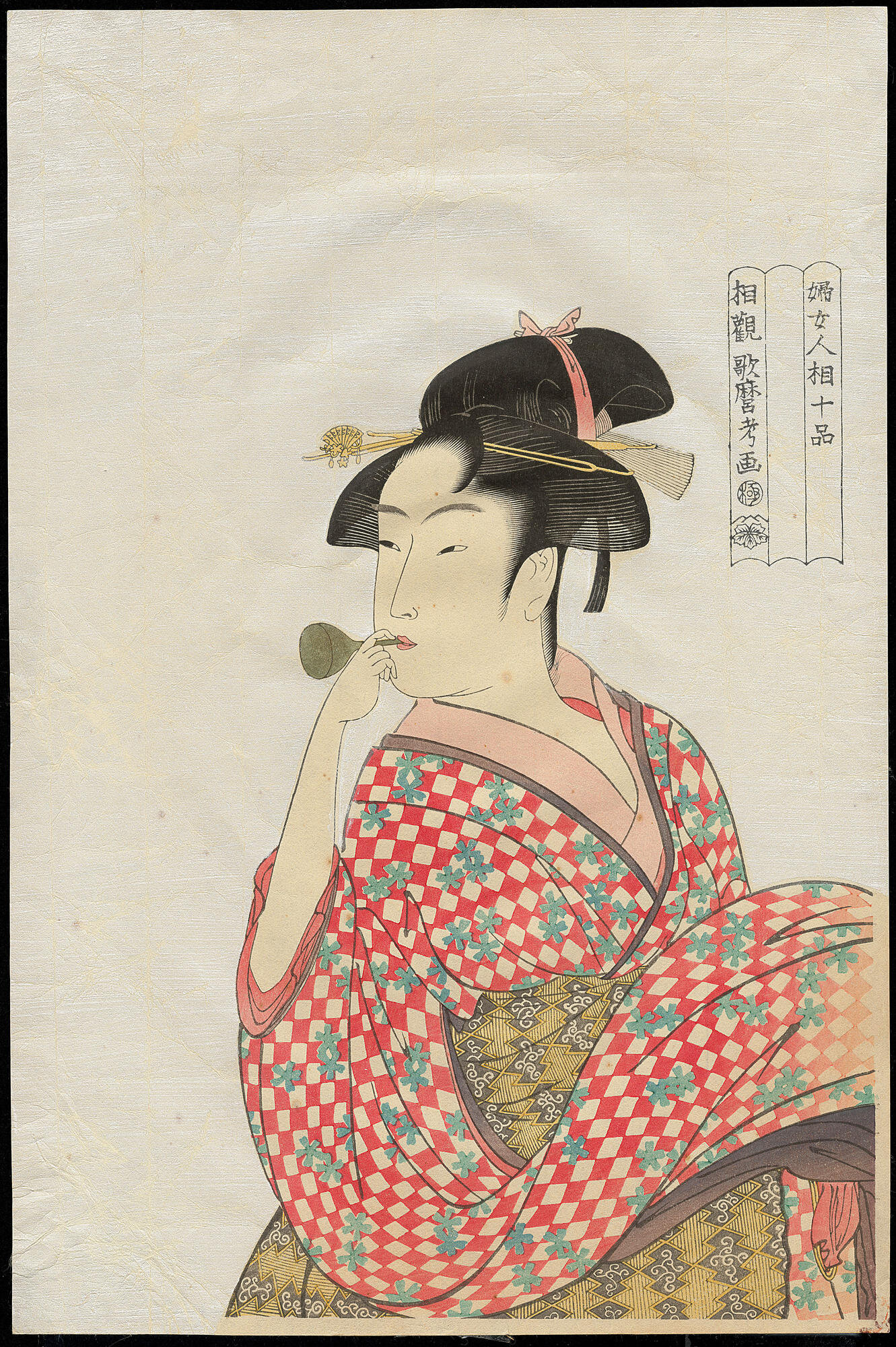
In this review I take a closer look at benizakura, a very bright red ink with a strong yellow-gold sheen. The colour is inspired by the red squares of the young girl’s dress in the painting “Girl blowing a glass toy”, painted by the Japanese artist Kitagawa Utamaro around 1792-1793. This is one of his drawings from the series “Ten Physiognomic Aspects of Women”. The portrait shows a young woman with a Taka-shimada coiffure, playing with a glass toy, known as a “popen”. This thin glass object has a bulb covered with a thin diaphragm at one end and a pipe at the other. When the pipe is blown or sucked, the diaphragm makes a popping sound.
Benizakura is a very bright and saturated orange-leaning red, that moves towards rose-pink in its most unsaturated form. In places of high saturation, the ink presents a heavy yellow-golden sheen on the right kind of paper (like e.g. Tomoe River). To be honest, this TACCIA ink is too saturated and bright for my personal taste, so I’m not going to use it in its raw form after this review. I’ll probable darken it up a bit by adding some grey or black. Even so, I know there are lots of people that like their inks bright and strong, so I’ll do my best to give an objective review below.

The ink comes in a 40 ml bottle, that is packaged in a beautiful box showing the corresponding Ukiyo-e painting. Lovely packaging for an excellent ink.

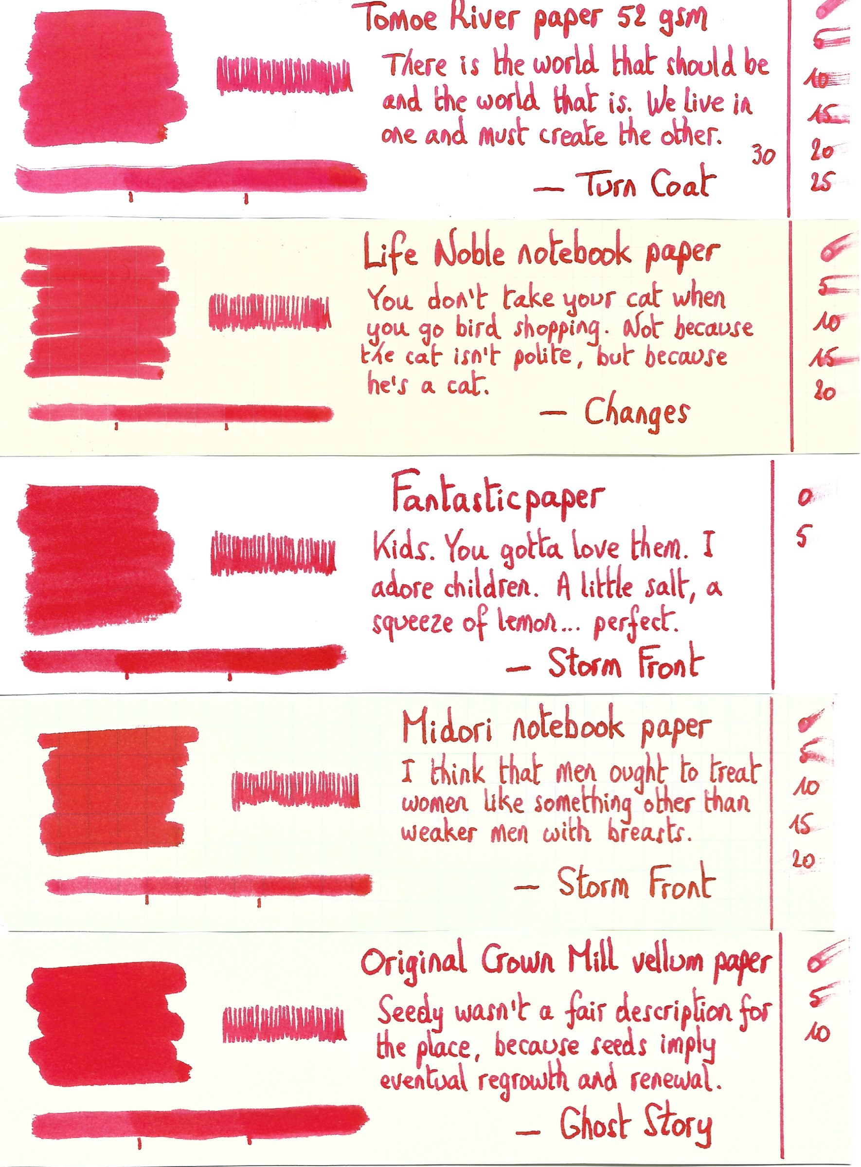
To show you the impact of saturation on the ink’s look & feel on paper, I made some scribbles where I really saturated portions of a strip of 52 gsm Tomoe River paper with ink. This gives you a good idea of what the ink is capable of in terms of colour range. Benizakura has a fairly narrow colour span, with not a lot of difference between the light and dark parts. With a moderately wet pen, your writing will lean towards the more saturated part of the swab below. This translates to writing that shows little in the way of shading – the ink is too saturated for that. I only got shading when using a dry-writing Safari with broad italic nibs.

The ink’s chromatography shows some unexpected complexity. The bright red is there, plus the rose-pink undertones. And there’s even some yellow in the mix, that makes this an orange-leaning red that looks fairly nice. The bottom part of the chroma already shows that most of the colour will disappear from the page when the ink comes into contact with water. This is confirmed in the water test: some rose-pink remains, but it gets heavily smeared out, and your writing will be mostly gone. Not a good ink when some measure of water resistance is on your wish list.
This might be a good place to issue a word of warning. Red inks often stain a lot, but this benizakura is a real b*tch. Get it on your fingers, and you’ll probably walk around with bloody fingertips for a couple of days. In my case, people at work got curious: “did you hurt yourself?” … and I had to explain several times that inky fingers are a hazard of the hobby. Also… good pen hygiene is a must. To clean benizakura out of my review pens took 3 times the normal cleaning regimen, and I even had to use some cleaning solution to get rid of the last remnants of ink.

I’ve tested the ink on a wide variety of paper – from crappy Moleskine to high-end Tomoe River. On every small band of paper I show you:
- An ink swab, made with a cotton Q-tip
- 1-2-3 pass swab, to show increasing saturation
- An ink scribble made with an M-nib Lamy Safari
- The name of the paper used, written with a B-nib Lamy Safari
- A small text sample, written with the M-nib Safari
- Source of the quote, written with a wet Pelikan M101N with F-nib
- Drying times of the ink on the paper (with the M-nib Safari)
Benizakura can handle both pure white and yellow-cream paper. There’s a tiny amount of feathering on lower quality paper, but nothing too bad. As can be expected from a very saturated & bright ink, there is a fair amount of see-through, even on better quality paper. And you also get quite some bleed-through on the low quality paper. Not a good ink to use on the crappy copy paper that is typically used in the workplace. Drying times are all over the place, from near eternal on high-sheen hard surface paper, to a very reasonable 10-15 seconds on absorbent papers.


I’ve also added a photo to give you another view on the ink. Scanned images and photos often capture different aspects of the ink’s colour & contrast. That’s why I present them both. In this case, the photo shows the ink’s colour a bit too dark, while the scans show a tiny bit too much pink. The intro pic with the ink bottle looks about right.

Writing with different nib sizes
The picture below shows the effect of nib sizes on the writing. The top lines are written with my dry-writing Lamy Safari test pens, and show a small amount of shading that increases with nib width. With wet pens – like the Pelikan and Parker – the shading disappears due to the increased saturation of the ink. On the Rhodia paper used below, I didn’t see any of that beautiful yellow-golden sheen. You really need the right kind of paper to capture that. In my test set, most of the Japanese papers produced the sheen (with Tomoe River, Kobeha GRAPHILO and Yamamoto bank paper being the super-sheeners).

Related inks
To compare TACCIA’s benizakura with related inks, I use my nine-grid format with the currently reviewed ink at the center. This format shows the name of related inks, a saturation sample, a 1-2-3 swab and a water resistance test – all in a very compact format. There are quite a number of similar-looking inks in my collection, so colourwise this benizakura is not a must have. On the other hand, the ink manages to find its own ground between the other reds – it’s still different enough to carve out its own place.

Inkxperiment – a birthday card for my sister
With every review, I try to create a drawing using only the ink I am reviewing. These small one-ink drawings are an excellent way to show the colour-range nuances that are hidden within the ink. It’s always a pleasure to do these pieces – I really enjoy the time I can play around with the ink in this more artistic context.
Inspiration for this inkxperiment was a no-brainer. My sister has her 60th birthday coming up in a couple of weeks, so I decided to draw her a birthday card – makes it a bit more personal than getting one from the magazine store. And with the same amount of effort, I got the inkxperiment drawing for this review 😉

For this drawing, I started with an A4 piece of 300 gsm watercolour paper. I first penciled in the different areas of the painting as a guideline. Next I painted in the background using heavily water-diluted ink applied through some kitchen paper. For the straight lines, I used a plastic card dipped in pure ink. The other elements were drawn in with a Lamy Safari with 1.1 calligraphy nib. While I like the design of the birthday card, this benizakura shows too little oomph to make the drawing look captivating. In my opinion, there’s just too little contrast in the painting.

Inkxpired – computational art
I love experimenting with pen/ink/paper, and have added another layer as part of the hobby. I’m exploring computational art, inspired by the ink drawings I do during ink reviews. Another fun offshoot of the hobby… and all that starting with a few drops of dye-coloured water on paper.
I’m getting more comfortable with my digital toolbox, and was fairly confident that the birthday card could be saved. I first used an art filter that extends the contrast range, and that abstracts the drawing a bit. Next I used a filter that translated the colour range to a spectrum with yellow, green and blue. I finally added a vintage filter to age the painting up a bit. I quite like the end result: happy colours, and the composition looks good to me. So this is the birthday card that will find its way to the birthday girl.

Conclusion
TACCIA Ukiyo-e Utamaro benizakura is a very bright and saturated red, with a lovely golden sheen on the right kind of paper (like Tomoe River), but not much in the way of shading. Not my type of ink, but I’m sure there are lots of you that like their inks this bold and bright.
Technical test results on Rhodia N° 16 notepad paper, written with Lamy Safari, M-nib

Back-side of writing samples on different paper types


[Originally published on the Fountain Pen Network, on 23 February 2023]
